
Studio Notes is a space where I share small observations about card design — the quiet decisions that shape how a card feels. These posts aren’t tutorials, just reflections from the studio.
Contrast plays a powerful role in how a design feels. While high contrast can be bold and dramatic, soft contrast offers a quieter way to guide the eye and create harmony within a card.
I often choose soft contrast when I want a design to feel calm and cohesive. Instead of relying on stark light and dark differences, subtle shifts in tone and color allow elements to stand apart gently. The result is a design that feels balanced rather than demanding attention.
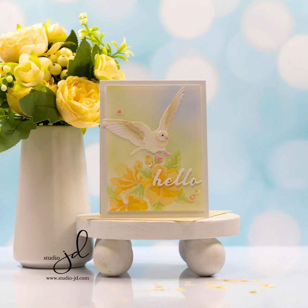
In this card, the focal imagery is defined through placement and tone rather than strong contrast. The colors sit close together on the value scale, creating a serene, unified look that invites the eye to linger without feeling overwhelmed.
This card was originally shared in the Dove in Flight post. The full supply list has been reused here for reference.


0 Comments