
")
Today’s cards feature products from the brand new Simon Says Stamp Beautiful Moments release. It is always exciting to create with a fresh release, and this one feels especially joyful and versatile.
After months of neutrals and winter tones, pulling out fresh shades of clover and lime feels like opening a window and letting light pour in. These two cards grew from that same idea. Soft white space, layered greens, and just enough detail to make everything feel intentional.
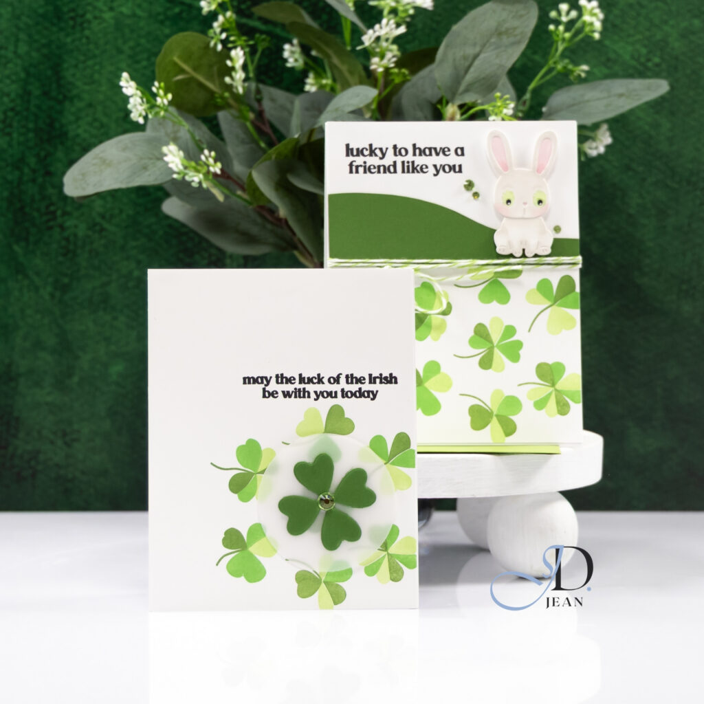
Both designs celebrate a little luck in completely different ways. One leans clean and modern with layered die cuts and subtle dimension. The other brings in pattern, texture, and a sweet focal image for a playful twist. Together they feel cohesive but distinct, which is always my favorite kind of pairing for a multi-card post.
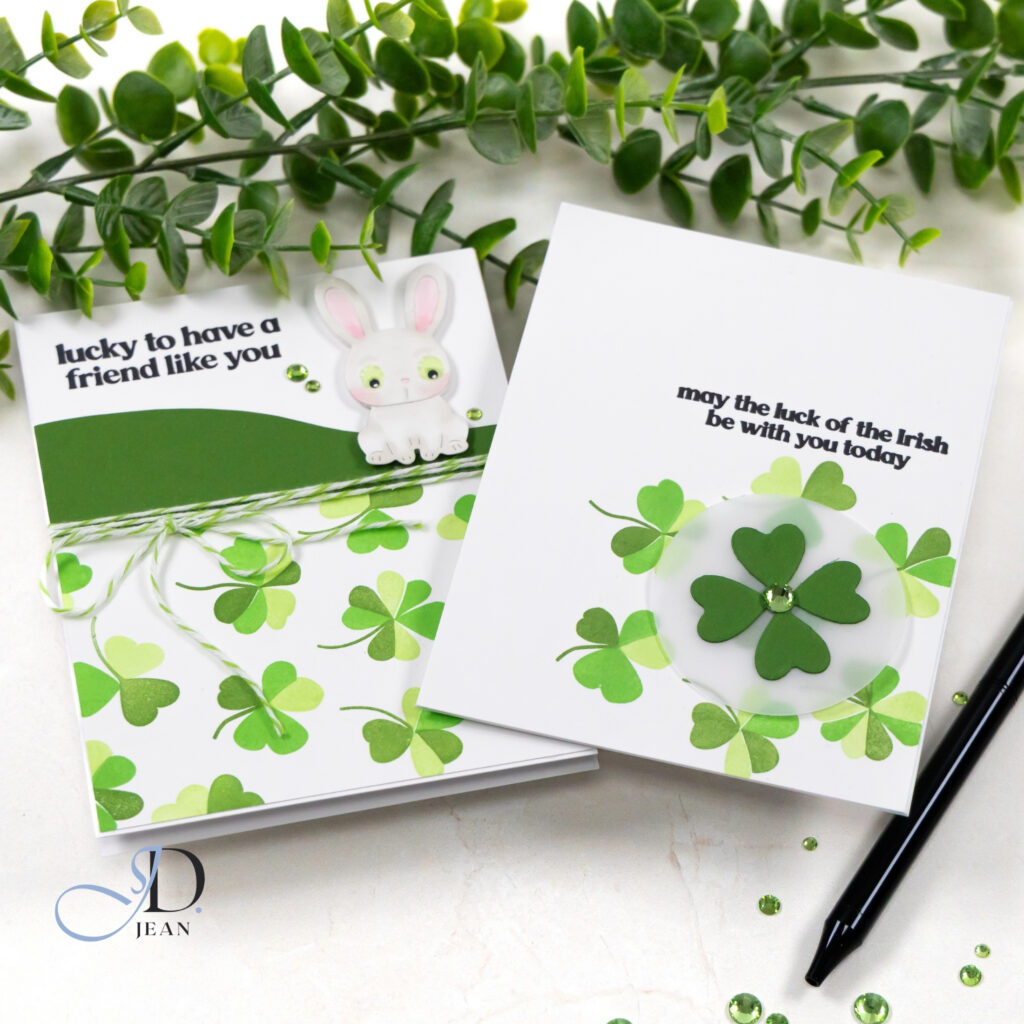
Card One: May the Luck of the Irish Be With You Today
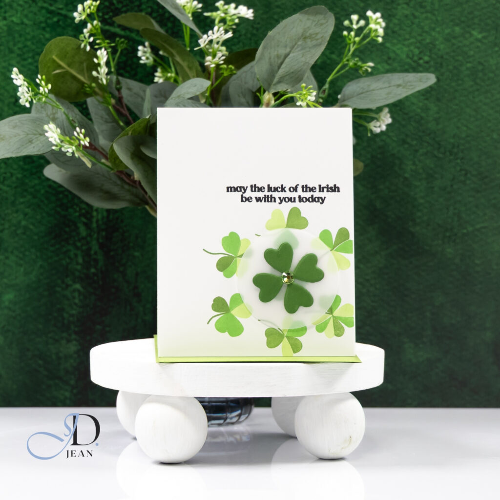
This card began with layered shamrocks arranged in a soft circular composition. I kept the base bright white so the greens could really sing. The tones range from pale citrus to deeper leafy shades, giving the design movement without overwhelming it.
At the center, I layered a dimensional four-leaf clover over a translucent vellum circle. The vellum softens everything beneath it and creates a subtle halo effect that pulls the eye inward. Instead of filling the entire space, I allowed the outer shamrocks to “float” with a bit of breathing room. That negative space keeps the design feeling fresh and modern.
The small gem in the center adds just enough sparkle without competing with the clean aesthetic. It is simple, but the layered construction gives it quiet impact.
Card Two: Lucky to Have a Friend Like You
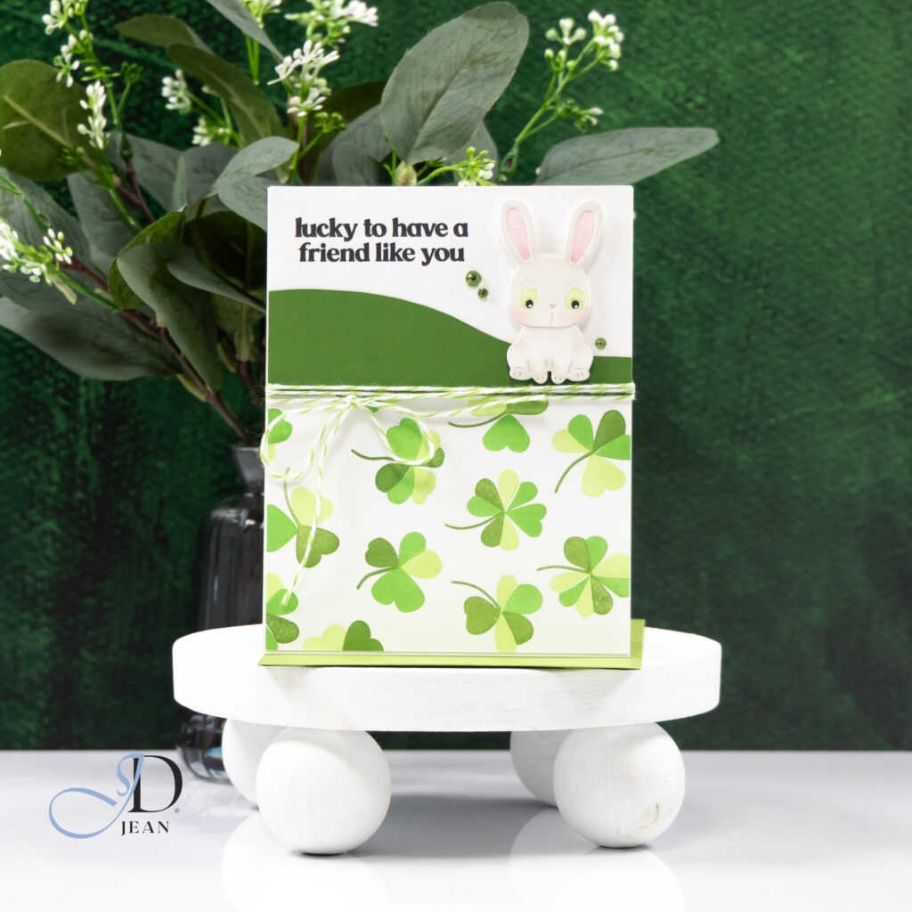
For the second card, I leaned into pattern and texture. The shamrock background brings energy, so I balanced it with a bolder panel across the top. That curve softens the geometry and creates a natural home for the sentiment.
The sweet bunny focal image adds a friendly, unexpected touch. I kept the coloring minimal with soft pink ears and light green eyes (added by hand) to coordinate with the palette. A few scattered gems near the sentiment echo the sparkle from the first card and visually tie the designs together.
To ground the layout, I wrapped green and white twine around the middle. The twine breaks up the pattern and adds tactile interest, which works beautifully against the clean die cut shapes. The result feels cheerful and layered, but still controlled.
Design Highlights
- Layered shamrocks in varied green tones for depth
- Strategic use of white space to balance bold color
- Vellum circle to create softness and focus
- Curved panel to anchor sentiment and shape the layout
- Subtle embellishments that add sparkle without clutter
Creating these two together reminded me how powerful a limited color palette can be. When you stay within a tight range of tones, you can play freely with shape, layering, and texture while keeping everything cohesive.

0 Comments