

Today is the 6th, which means the new Spellbinders Monthly Clubs are now available to non-members. For these two cards, I used products from the March 2026 clubs, including the Die of the Month, Embossing Folder of the Month, and the Stamp and Die of the Month.
My goal for these designs was to explore how the same superhero character could support two completely different storytelling environments. As I started experimenting with layouts, it became clear that the surrounding composition would shape the personality of each card.
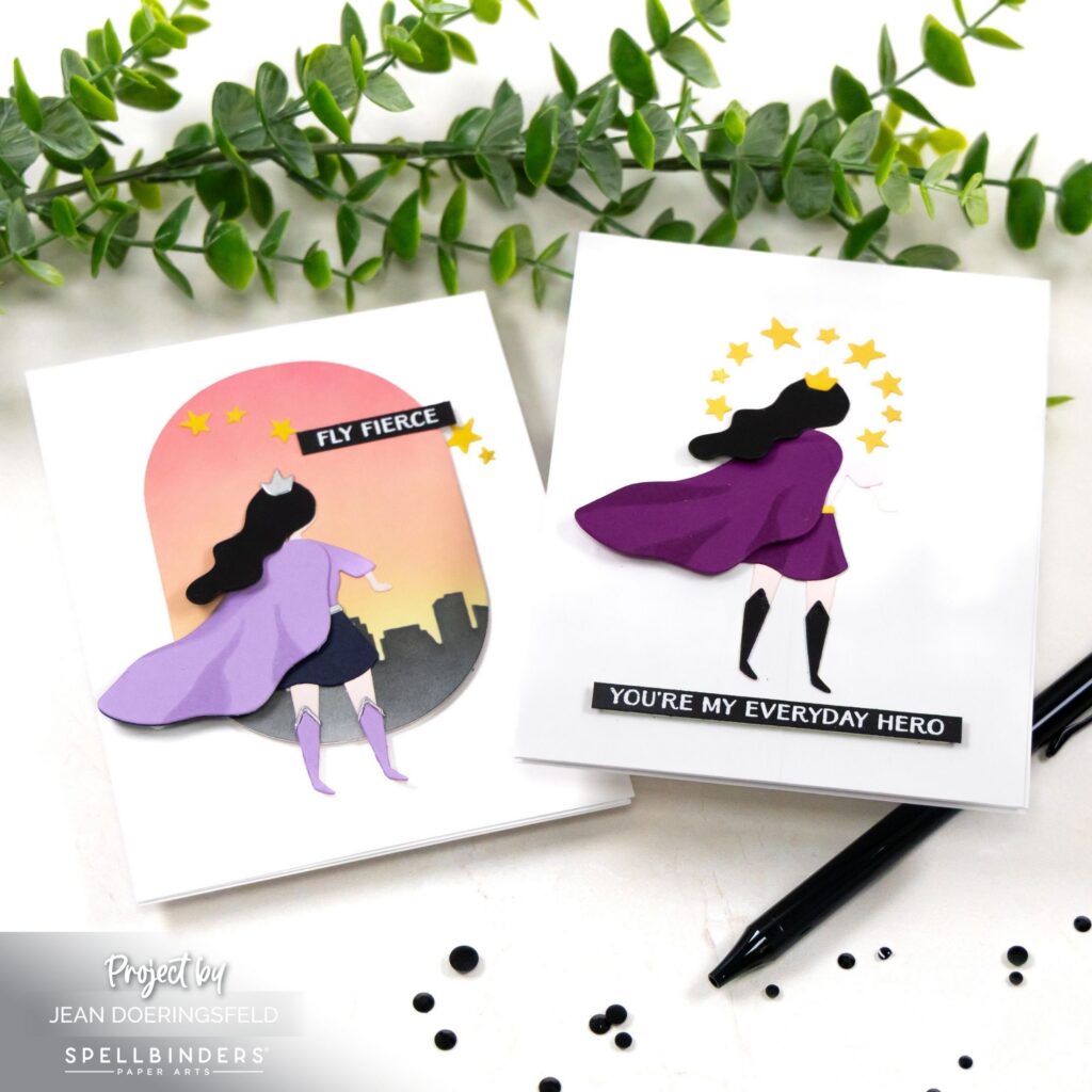
One design places the hero above a glowing city skyline while the other centers the figure within a radiant burst of stars. Even though both cards use the same focal die, the surrounding elements shift the mood and energy of the design.
Card One – Skyline Superhero
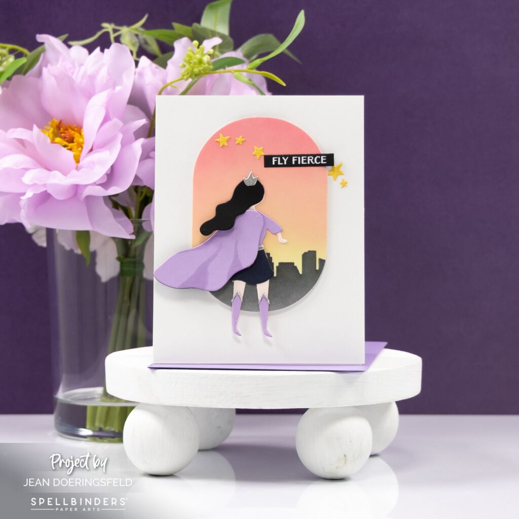
For the first card, I wanted the scene to feel cinematic, almost like a superhero surveying the city at sunset.
The tall arched panel creates a natural frame for the composition while the warm ink-blended sky builds atmosphere behind the skyline silhouette. That layered horizon line anchors the lower portion of the design and gives the hero a sense of place within the scene.
Positioning the superhero slightly off center creates a sense of movement. The cape appears to catch the wind as the figure looks toward the skyline, which helps guide the eye upward through the composition.
Small stars and the “Fly Fierce” sentiment extend that movement while reinforcing the theme of strength and possibility.
Card Two – Radiant Hero
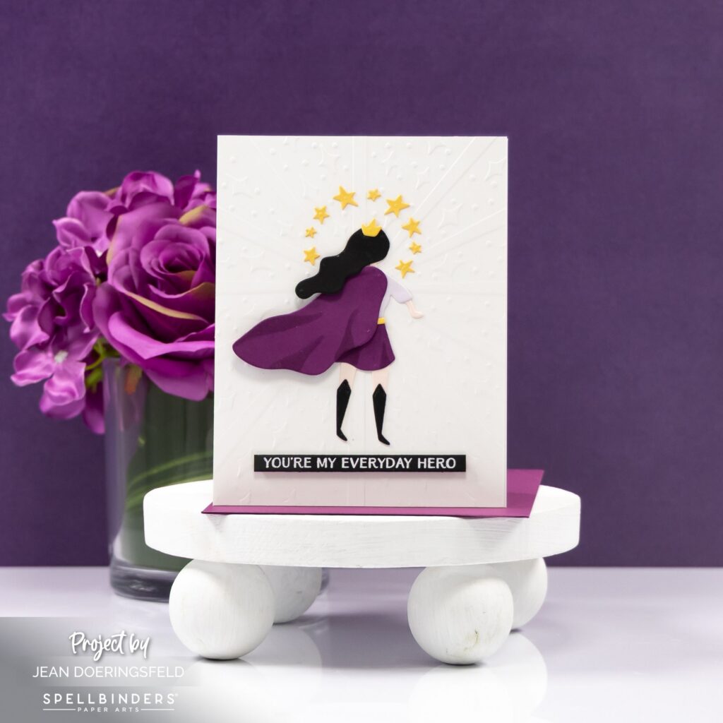
For the second card, I wanted the character to feel more iconic and symbolic.
The Embossing Folder of the Month creates a radiant burst pattern that naturally draws the eye toward the center of the card. Keeping the background white allows the superhero silhouette to stand out while the circle of stars frames the figure like a halo.
The deeper purple palette introduces contrast while maintaining a clean layout with plenty of breathing room around the focal image.
Even though both cards feature the same character die from the Die of the Month, the change in composition transforms the story from cinematic adventure to everyday heroism.
Design Highlights
• Arched frame and skyline silhouette anchor the sunset scene and create depth
• Warm ink blending builds atmosphere behind the city skyline
• Radiant embossed background guides the eye directly to the hero
• Circular star arrangement reinforces the heroic focal point
• Contrasting palettes give each card a distinct visual personality
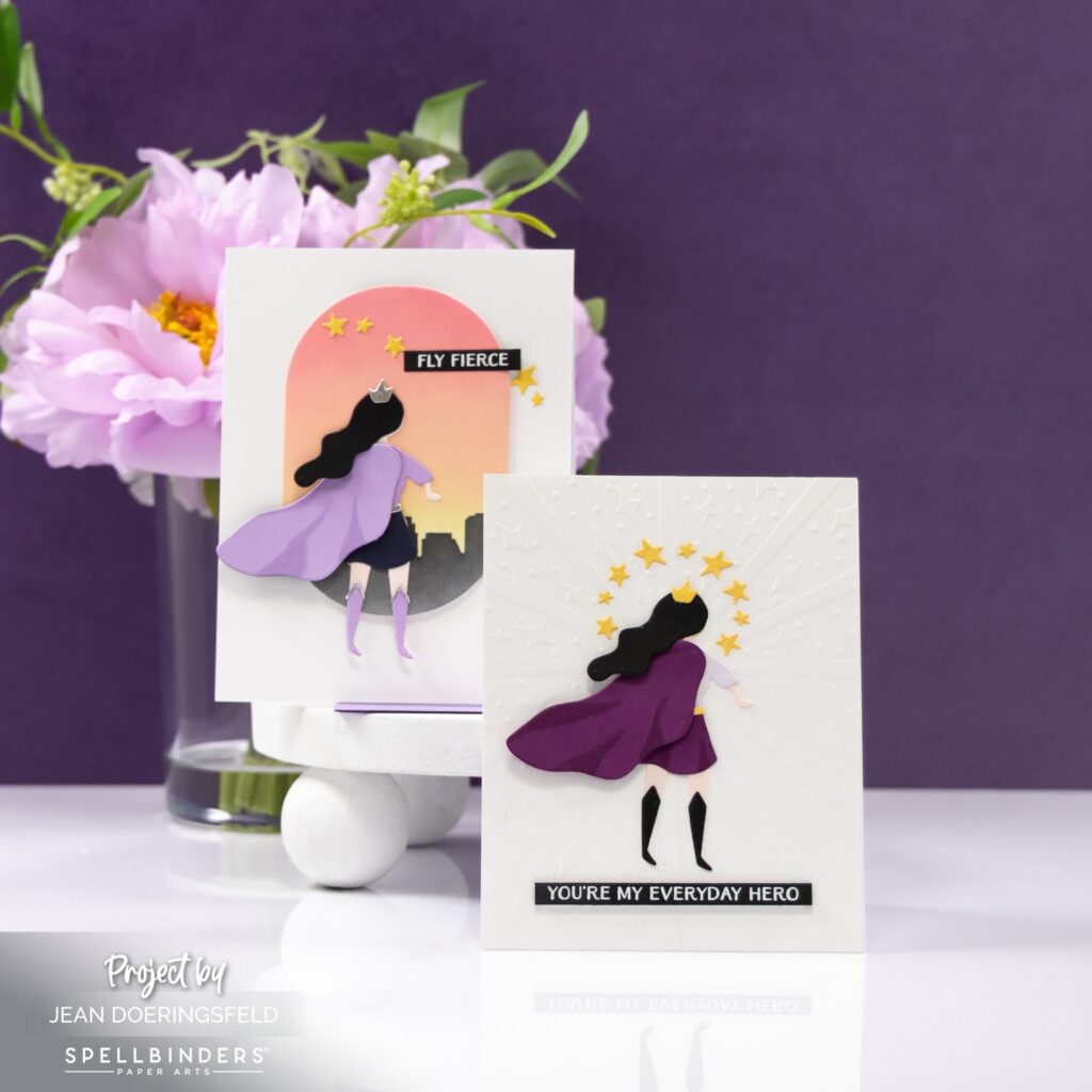
Exploring multiple layouts with the same focal die is one of my favorite ways to stretch a design set and discover how composition alone can completely change the story of a card.

0 Comments