
Together by Design is a monthly collaboration where a small group of designers all create with products from the same featured brand. Each of us chooses a favorite product and puts our own creative spin on it, showing just how many different ways one brand can inspire. Follow along, explore every project, and discover new designers and new favorites along the way.
This month’s featured brand: Distress Oxides
Here is a list of designers participating this month:
- Jessica: www.lovenotesbyjess.com/blog; @jessica.vasher
- Jean: www.studio-jd.com; @jean.studiojd
- Maggie: @teacher11494
- Tracy: https://redsas.co; @redsas
This month’s Together by Design collaboration focused on Distress Oxides, and while there are inks and sprays…about a thousand creative techniques you can do with them, I always come back to ink blending.
Every single time.
There’s just something wildly satisfying about how smooth these inks blend. The color stays soft and saturated at the same time, and somehow even bright rainbow palettes still feel velvety instead of harsh. I started this set thinking I’d make “a few simple cards” and then immediately drifted into a full rainbow spiral.
Naturally.
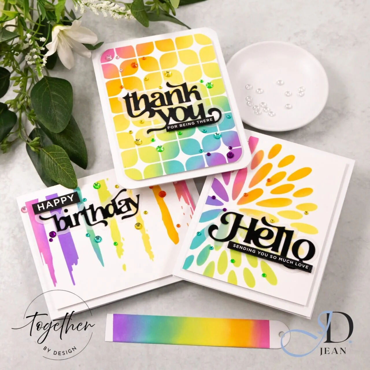
For all three cards, I blended full rainbow gradients over the stencils. That’s honestly one of my favorite things about Distress Oxides with stencil work. The ink catches the shapes differently across the design, so you still get all the color variation and movement without having to individually blend every opening. My level of patience was never going to support that kind of behavior anyway.

The first card uses a rounded geometric stencil with a bold black thank you sentiment layered over the top. I love how the repeated curved shapes soften the rainbow palette and keep it feeling playful instead of busy. The little rainbow gems may also have multiplied while I wasn’t looking.

The birthday card leans much cleaner and more graphic. The vertical drip design already creates so much movement that I kept everything else really minimal. I think the black sentiment was what finally balanced the card for me. Before that, it looked slightly like my craft room had achieved sentience and started throwing color around on its own.

The final “Hello” card might be the one that surprised me most. The radiating stencil design pulls the eye outward from the sentiment, so the rainbow blending almost feels like light spreading across the card front. It ended up softer and more open than the others while still feeling connected to the set through the repeated palette.
Also, I would like to formally apologize to my blending brushes because this project absolutely put them through something.


Absolutely beautiful ❤️Glad you have the colors listed. I struggle with putting together colors for my projects.
I love the vertical drips. All your colors are so bright and happy. What a nice Spring card.
These are beautiful and cool! I love D Oxides for skies in any kind of scene cards. They blend, to quote her Rainbow Highness Laura B, like “buttah.”
Lori S in PA