
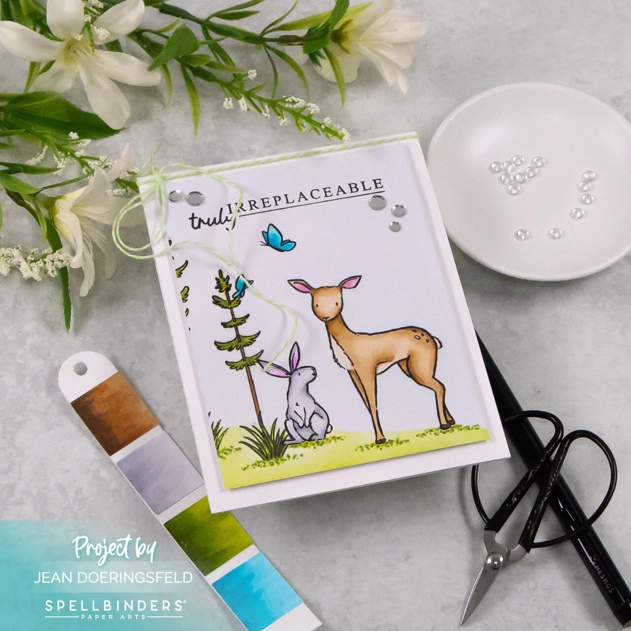
There are some products that immediately make me think about techniques. Others make me think about color.
This collection made me think about restraint.
As paper crafters, we spend a lot of time learning how to add. More layers. More texture. More dimension. More embellishments. Those things absolutely have their place, but every now and then a collection comes along that reminds me there’s just as much power in choosing not to add something.
The illustrations in Josh Griffiths’ Storybook Illustrations Collection already feel complete. They have the warmth and personality of a favorite children’s book, so instead of building elaborate scenes around them, I found myself editing. Every decision became less about what I could include and more about what actually deserved to stay.

It’s an interesting exercise because empty space suddenly has a purpose. A sentiment has to become part of the composition instead of simply filling a blank area. Even embellishments need a reason to exist.

I think that’s one of my favorite things about creating cards. Every product teaches you something different if you let it. Sometimes it’s a new coloring technique. Sometimes it’s a clever fold. And sometimes it’s simply learning that the strongest design decision is trusting beautiful artwork enough to let it speak for itself.

Hi Jean. I just love your new cards. It’s so refreshing to see Josh’s innovated style. You little critters are so whimsical and cute. The bunny reminds me of Anita Jeram’s illustrations.
Hi, Jean –
Love your card! I agree w/ the “restraint” theme. I get the same feeling from these stamps as I do / did from Anita Jeram’s work.
I love your card and placed an order using your link and my rewards points from Spellbinders. I hope you get the credit for the sale.
Lori S in PA
Hi Lori! Thank you! ❤️. The slight realism and total whimsy of these stamps make smile! Thank you, too, for using my link! I haven’t seen it go through yet, but I’m sure it will. I appreciate you so much! ❤️❤️