

Hi there!
Geometric designs do not come naturally to me. I tend to gravitate toward organic shapes, florals, and anything that feels a little more freeform. That is exactly why this card felt like such a good creative exercise. It pushed me just far enough outside my comfort zone while still letting me play with color and layering in a way that felt approachable.
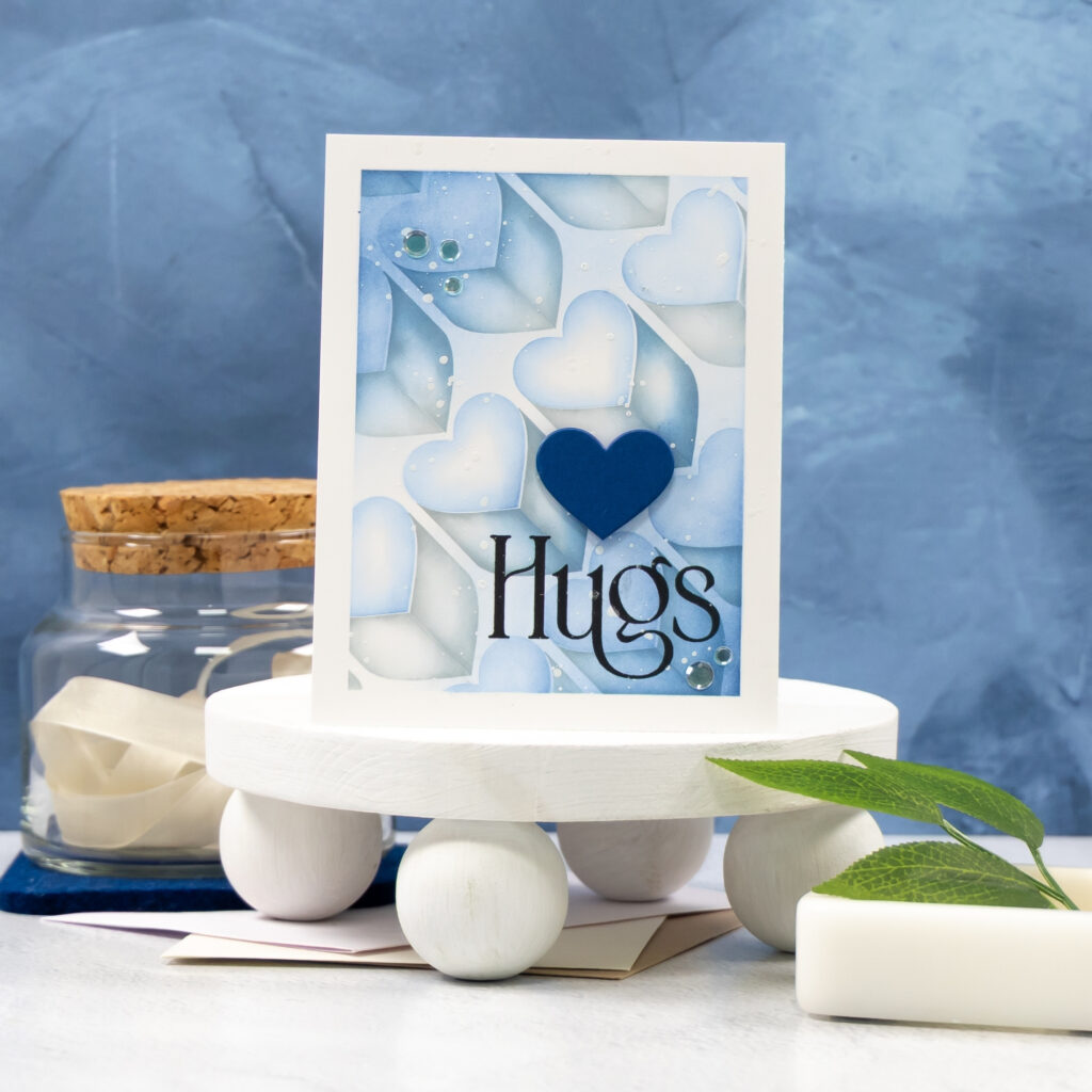
This card was created for the Heart to Heart release from Simon Says Stamp, using the Heart City layering stencil and coordinating die. The stencil does all the heavy lifting here, building a dimensional, almost architectural background with very little effort once the colors are chosen.
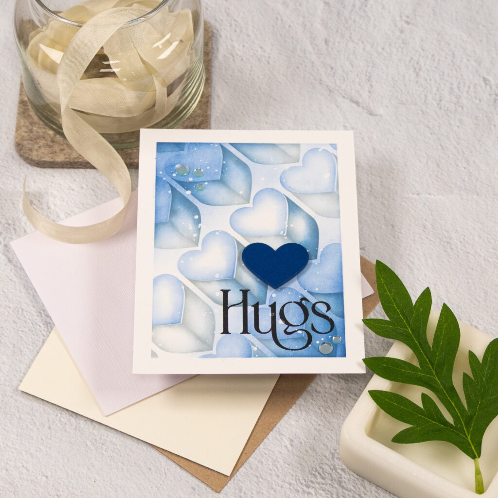
I kept the palette soft and tonal, blending shades of blue and gray to keep the design calm and cohesive. The bold heart die cut adds a strong focal point, while the sentiment anchors the design without competing with the background. A few clear embellishments add just enough interest and movement to finish it off.
This card reminded me that even when a style feels challenging, it can still be enjoyable. Sometimes the best projects are the ones that help you grow just a little.
Design Highlights 💙
• Heart City layering stencil for graphic depth
• Coordinating heart die for a bold focal point
• Soft blue palette to keep the look calm and cohesive
• Clean white frame to ground the design
• Clear embellishments for subtle shine
✂️Studio Tip: When working with geometric stencils, limiting your color palette can make a big difference. Using a few closely related shades helps the pattern feel intentional rather than busy and makes the overall design easier to balance.
Have a wonderfully creative day.

This stencil boggles my mind. It’s good to know that others struggle with geometric designs and that there’s hope. Your colors have made the background so peaceful and the sentiment and single heart are perfect to draw the eye. Thanks for the inspiration.