

Spring always feels like an invitation to reset my color palette, and for this month’s Spellbinders Club kits, I leaned fully into that idea. I built this set around soft corals, warm yellows, and fresh greens, letting that palette carry across all three cards so they feel connected without being repetitive.
My goal was to keep each design clean and intentional while still giving every focal element its own moment. I focused on placement, color balance, and subtle dimension to create a collection that feels cohesive but still varied from card to card.
Card One | Market Bag Florals
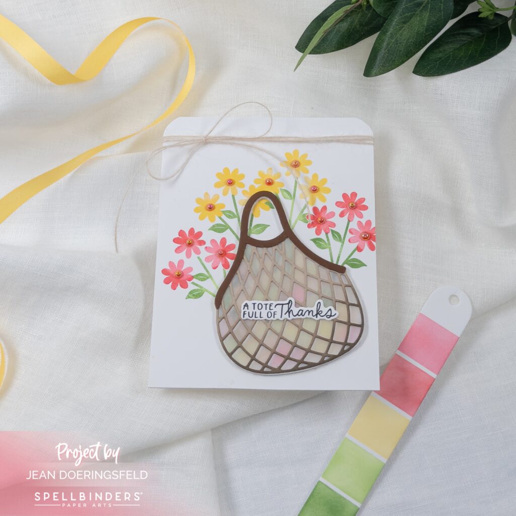
Movement became the starting point for this design. I wanted the eye to travel upward, so I allowed the florals to extend beyond the shape of the bag rather than keeping everything contained within it.
The lattice detail gave me a way to introduce texture without adding visual weight. I softened that structure by placing subtle color behind the die cut so it stays visible but still contributes to the palette. The twine detail finishes the card in a very intentional way. It frames the top edge and gives the composition a quiet anchor without competing with the florals.
Card Two | Strawberry Jar
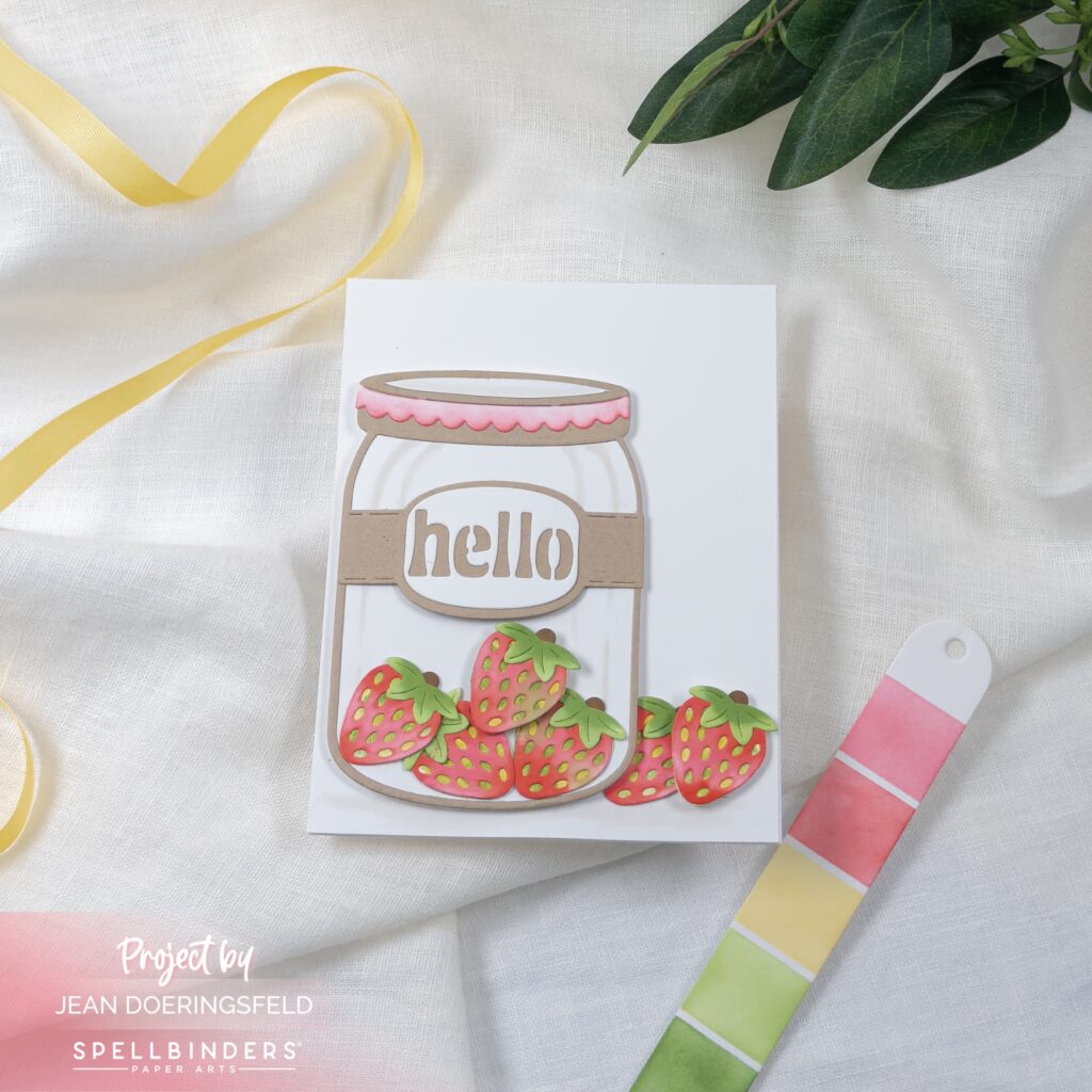
A sense of abundance shaped this design. I built that feeling by clustering the strawberries at the base and letting a few extend outward so the arrangement feels relaxed and slightly organic.
Keeping the jar neutral was a deliberate decision. It allows the color to come almost entirely from the strawberries, which makes those coral tones feel more vibrant. A soft touch of pink along the lid ties everything back into the palette so the transition between elements feels seamless.
Card Three | Potted Florals
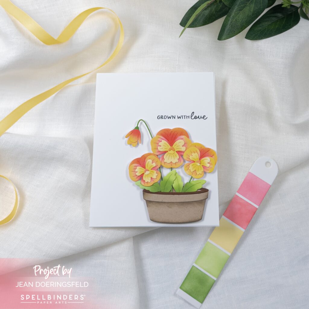
Balance and breathing room guided this layout. I placed the florals slightly lower on the panel so they feel grounded, while leaving space above for the sentiment to sit comfortably.
The color story shifts slightly warmer here. I brought in more golden tones to round out the palette while still keeping everything cohesive across the set. The background stays clean by design, and I added just enough shading to the pot to give it weight without pulling focus from the florals.
Working with a consistent palette across multiple cards always helps me build a stronger visual story. Each design stands on its own, but together they create a rhythm through color, placement, and detail that feels very much like spring.

0 Comments