

January always feels quieter in the studio. The rush of the holidays has passed, winter has settled in, and creativity starts to slow into a more thoughtful pace. This is usually when I reach for soft color, gentle texture, and designs that feel calm but hopeful.

These two cards were created using SpellbindersClub products and share the same palette and materials, while each taking on a slightly different personality. I love when Club supplies make it easy to explore variations like this without starting from scratch.
Card One: Smile in Bloom 🌼
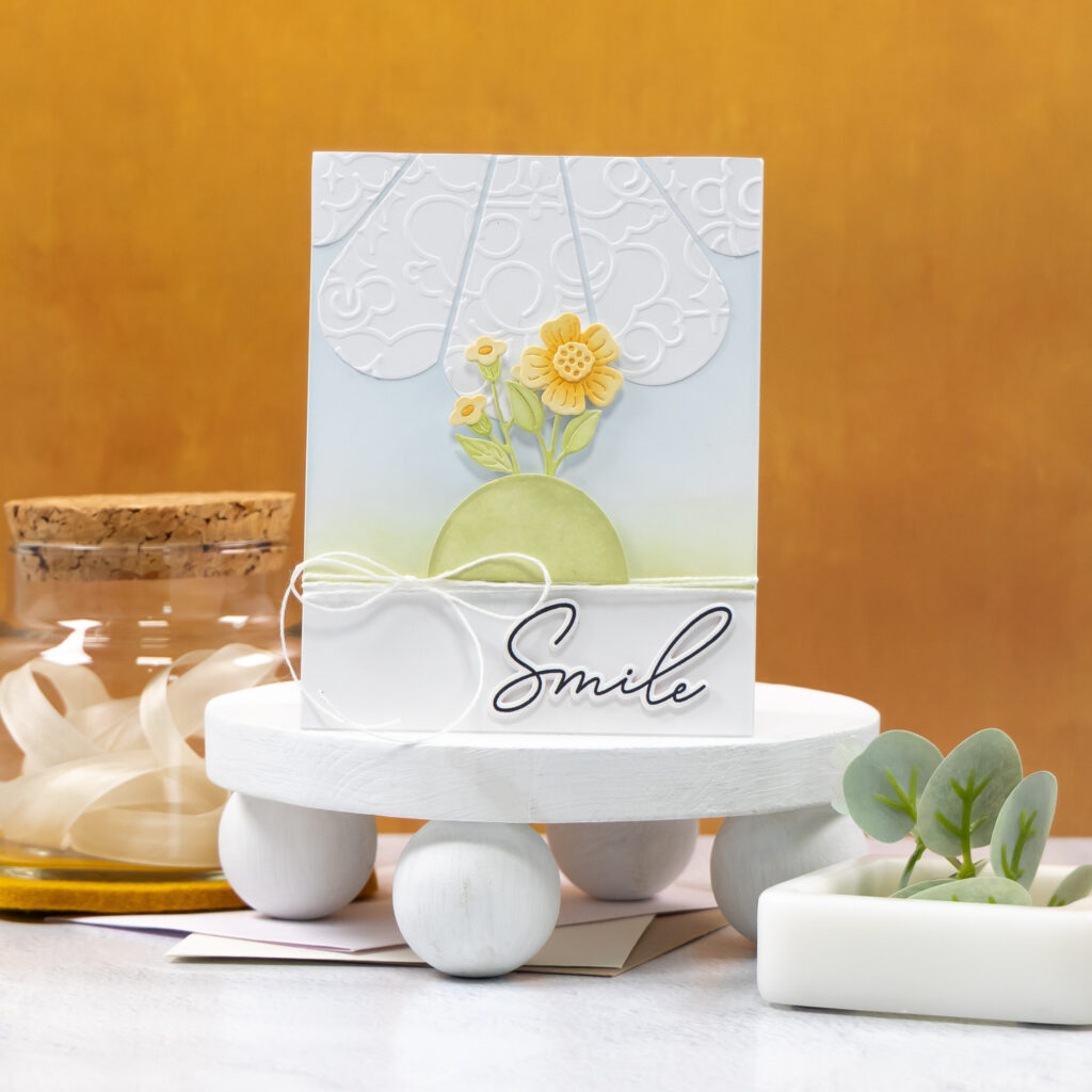
The first card features a soft, sky-inspired background with layered florals rising from a curved hill. Subtle embossed details add texture without overpowering the design, letting the florals take center stage. A simple sentiment and white twine keep the overall look light and serene.
Card Two: Hello, Sunshine ☀️

The second card leans into bolder shapes with oversized petals radiating across the background. Soft yellow shading adds depth while keeping the design clean and airy. A floral cluster anchors the layout, and the script sentiment brings just enough contrast and movement.
Design Highlights 🌸
• Coordinated Club elements used two different ways
• Soft ink blending for a calm January color story
• Layered die cuts for dimension without bulk
• Embossed backgrounds for subtle visual interest
• White twine details to tie both designs together
✂️Studio Tip: When working with Club supplies across multiple cards, keep the color palette consistent and change the scaleof your elements instead. Larger shapes feel bold and playful, while smaller layered pieces read softer and more refined. It is an easy way to get variety without needing extra products.
These cards came together easily and felt just right for the start of a new year. Quiet creativity, familiar tools, and a small hint of brighter days ahead.
Have a wonderfully creative day.

0 Comments