

There are certain themes that instantly bring a sense of nostalgia, and summer camp is one of them. I wanted these cards to feel like small snapshots of those moments—the quiet of fishing by the water, the glow of a campfire at dusk, and the simple joy of being outside with nothing on the agenda.
All four projects were created using Allison’s new Summer Camp collection from Spellbinders, and I leaned into building scenes that feel connected through color, movement, and story. Each one stands on its own, but together they create a cohesive little world.
Bobber-shaped Card
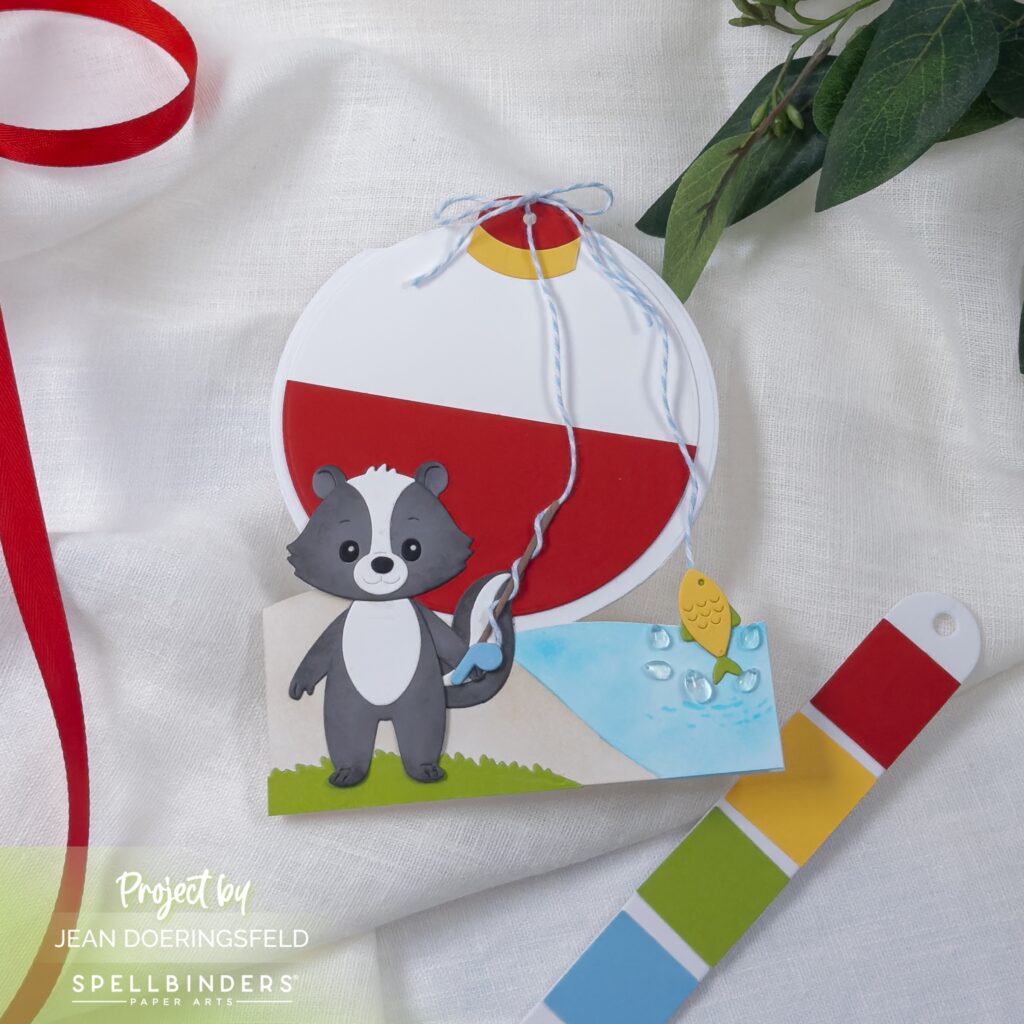
This fishing scene became my starting point, built around movement and interaction. I positioned the skunk slightly off-center so the eye naturally follows the fishing line outward toward the water and the fish. That curved line creates a soft visual path that ties the entire scene together, while the bold red bobber anchors everything at the top. Turning a simple circle die into a shaped card added a playful, unexpected element that reinforces the theme without adding complexity.
S’mores Treat Topper
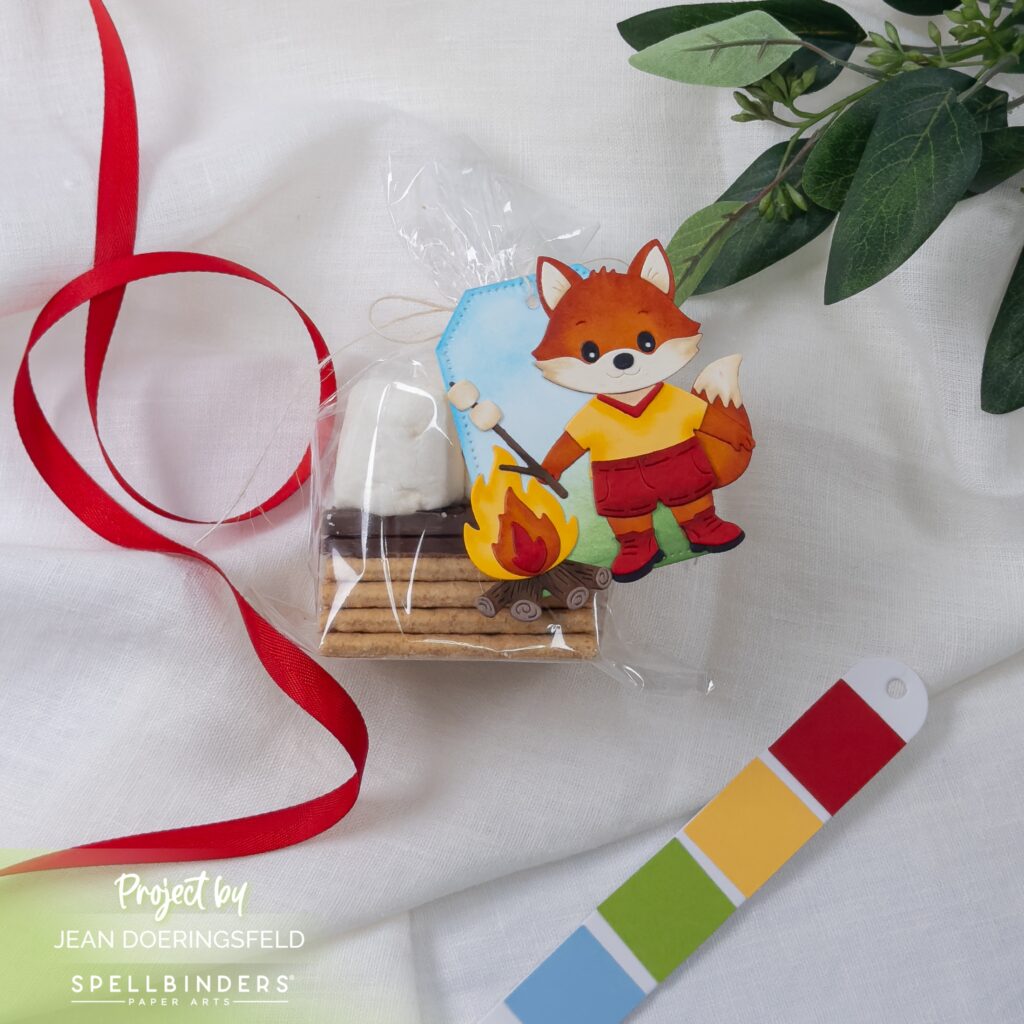
For the treat topper, I focused on layering and charm in a smaller format. The fox and campfire create an instant focal point, but it’s the scale contrast against the tag that gives it personality. I kept the background soft and minimal so the warm tones of the fire and outfit could stand forward, letting the packaging feel intentional rather than busy.
Campfire Card
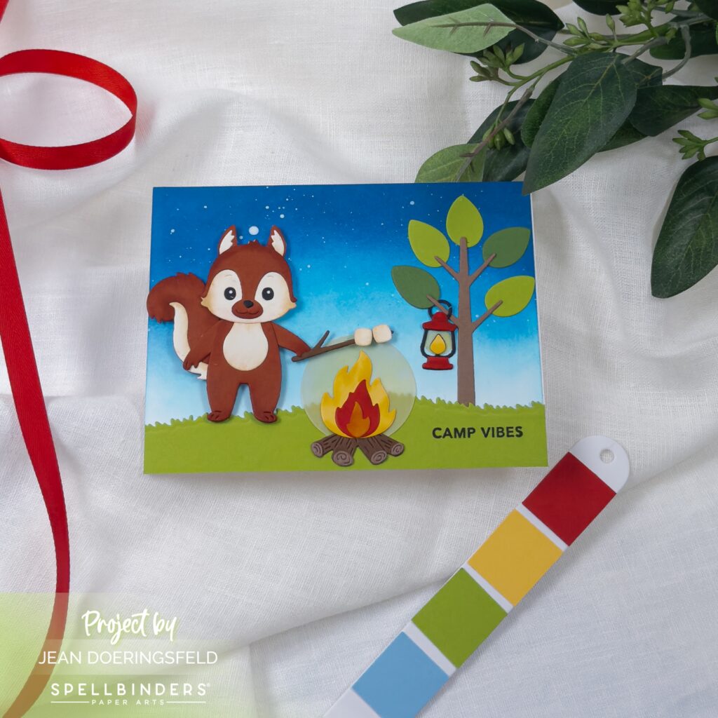
The campfire card shifts into atmosphere and color story. I wanted the background to carry more weight here, so I blended a deeper sky to create that transition into evening. The glow of the fire becomes the anchor, with the surrounding elements placed to support that central warmth. The tree and lantern add vertical balance while still leaving breathing room around the main scene.
Canoe Card
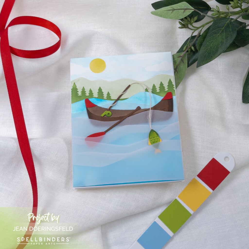
The canoe card leans into calm and open space. I kept the composition wide and airy, allowing the layered water to create gentle movement across the card. The fishing line again becomes a guiding element, drawing the eye downward and reinforcing that quiet moment on the lake. The simplified landscape keeps the focus on that sense of stillness.
Together, these designs build a cohesive summer narrative—each one highlighting a different moment, but all connected through color, scale, and thoughtful placement.
This collection makes it incredibly easy to mix and match elements while still maintaining a unified look, which is always a win when building multiple projects.

0 Comments