

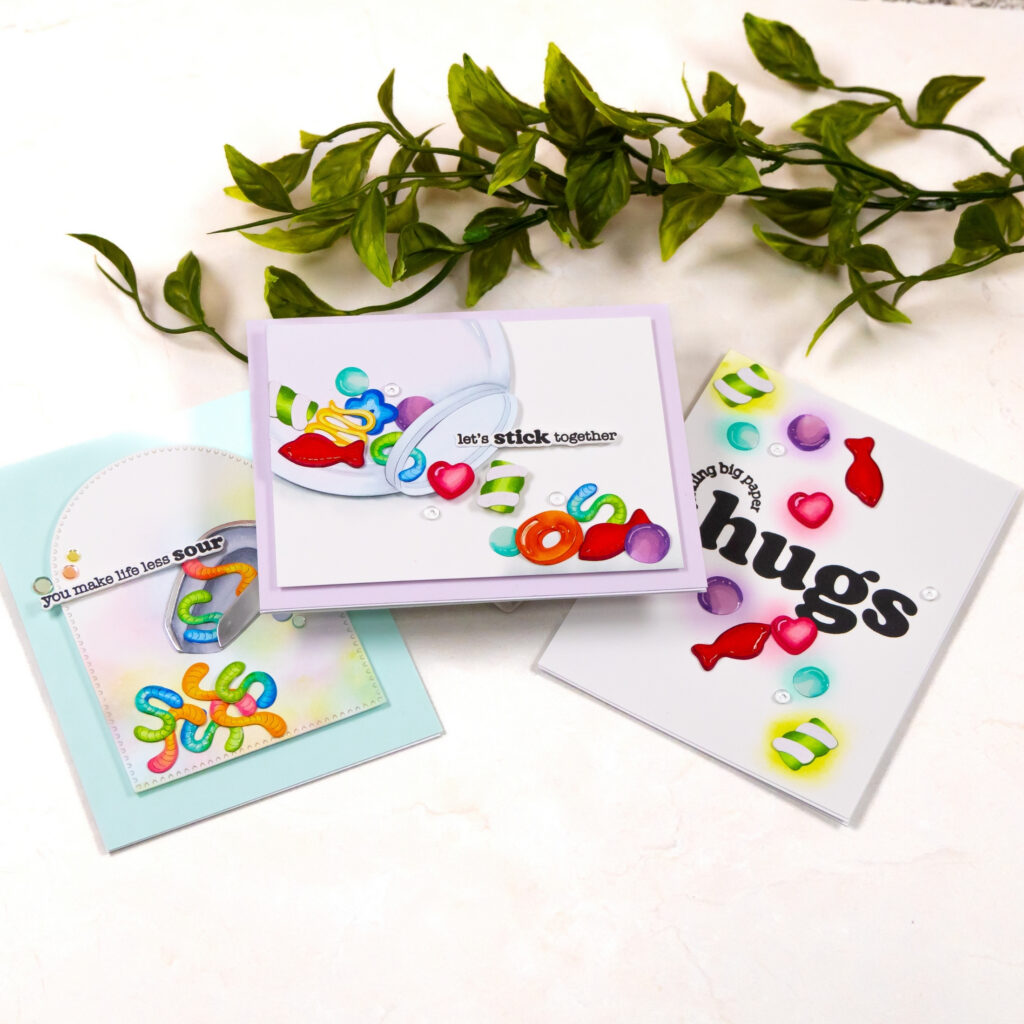
The Beary Sweet Collection by Carly Tee for Hero Arts immediately suggested bright candy colors and playful movement. I wanted these designs to feel like a small candy shop moment, where pieces tumble out of jars and scoops and scatter across the counter.
To support that idea, I finished the die cut candy with glitter spray and glossy glaze. The glitter creates the look of sugar crystals while the glaze gives some pieces a smooth, shiny surface that mimics real candy. That combination adds dimension and texture while keeping the overall cards clean and graphic.
Sour Worm Candy Scoop Card
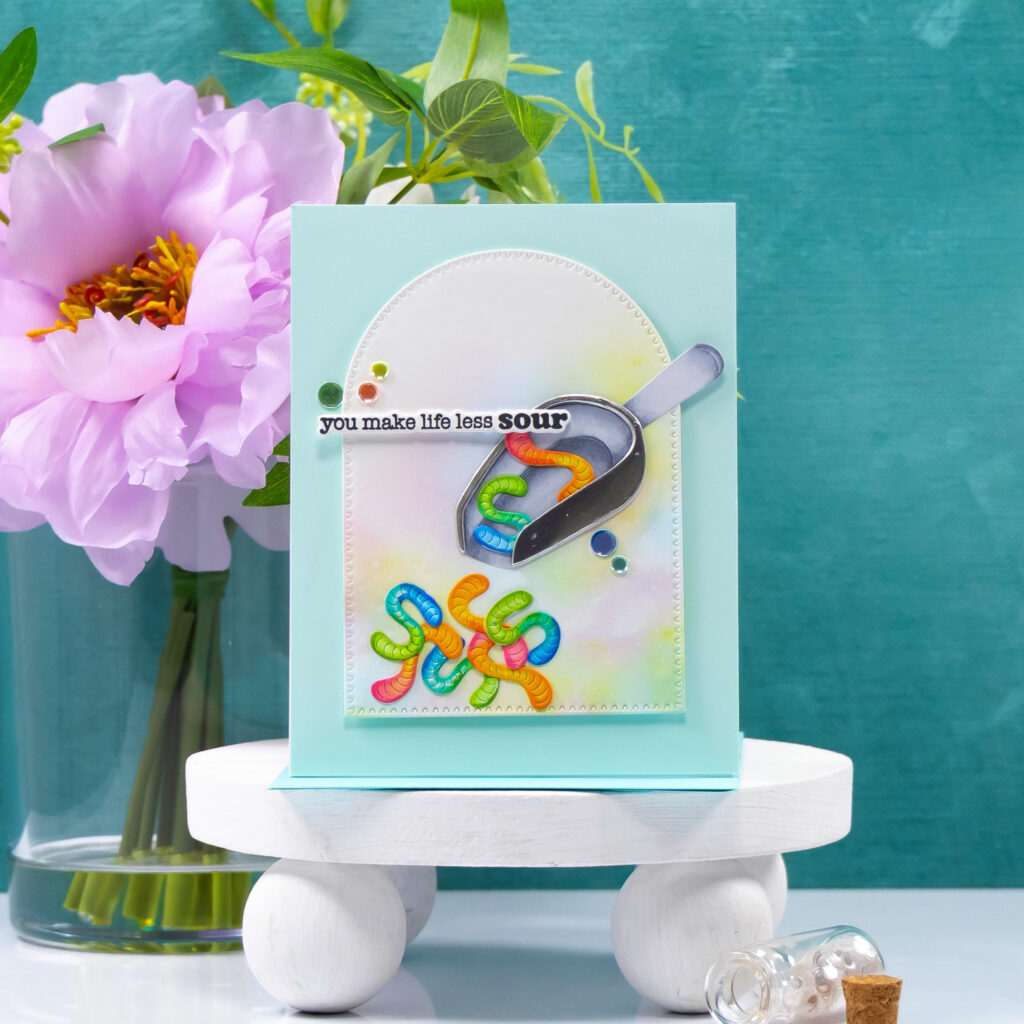
For this first card, I wanted the candy to feel like it was actually spilling out of the scoop, almost like someone had just tipped it forward. I angled the scoop so the sour worms tumble down toward the bottom of the panel and gather naturally in the focal area.
To keep that movement contained, I placed the scene inside a stitched oval and added a soft ink blended glow behind it. That subtle color helps the worms stand out without filling the entire background with ink. I also chose a pale teal card base to contrast with the candy colors while giving the eye some breathing room around the focal area. The sentiment you make life less sour felt like the perfect playful finish for the sour worm theme.
Candy Jar Spill Card
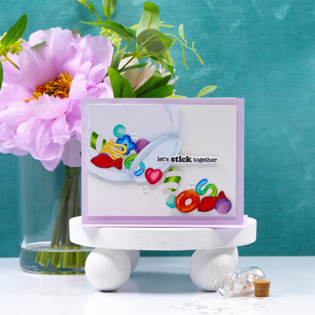
For this card, I decided to lean fully into the idea of a tipped candy jar. Instead of keeping the jar upright, I placed it on its side so the candy spills diagonally across the panel.
That diagonal line creates natural movement through the card and guides the eye from the jar opening through the scattered pieces. Because several candies overlap, the glossy glaze catches light from multiple angles and helps the pieces look more dimensional. I framed the panel with soft lavender cardstock to introduce a gentle color layer around the white background while keeping the center bright. The sentiment let’s stick together sits right in the path of the candy spill so it becomes part of the visual flow rather than sitting separately from it.
Sending Big Paper Hugs Card
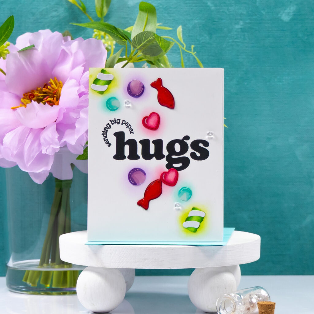
For the final card, I wanted the sentiment to take the lead and let the candy act as supporting accents. I started with the large hugs greeting and arranged the candy pieces around it so they feel almost like colorful confetti.
Instead of blending color across the entire panel, I added small halos of ink behind a few of the candies. That keeps the background open while still giving the pieces a sense of placement and depth. The glossy glaze and glitter spray bring the same sugary shine used on the other cards, which helps this design still feel connected to the rest of the set.
Design Highlights
• Glitter spray or glossy glaze → creates a sugary sparkle and realistic candy shine
• Angled scoop and jar placement → introduces directional movement that guides the eye through the layout
• Selective ink blended halos → add depth and placement while preserving clean white space
• Bright candy palette → builds a cohesive sweet shop color story across the cards
• Large simple sentiments → anchor each composition and balance the scattered candy elements
Adding the glossy finish to the candy was a small step, but it made a big difference in how the designs feel. That sugary shine helped turn simple die cuts into playful candy shop moments across the entire card set.

0 Comments