

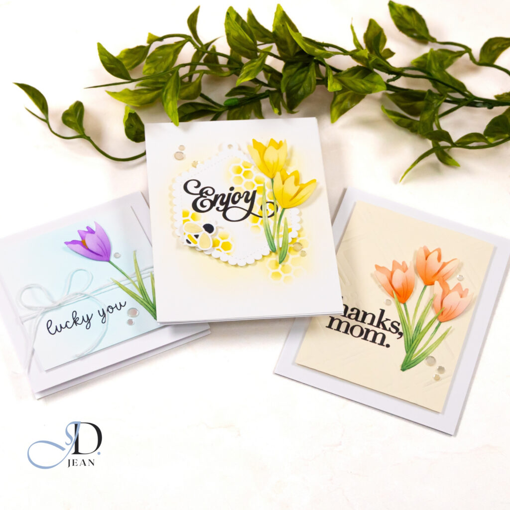
Spring floral cards always seem to signal the start of a new creative season for me, and these handmade crocus cards from the new Simon Says Stamp In My Heart release felt like the perfect way to welcome those early spring colors. Crocus flowers are one of the first signs of the season changing, and their thin stems and simple petals naturally create a sense of upward movement in a card design.
All three cards feature the same crocus flowers, but I wanted to explore how different design choices could give each card its own personality. By adjusting the layout, background texture, and color palette, the same floral element can feel playful, elegant, or softly layered while still maintaining a cohesive spring floral theme.
Honeycomb Crocus
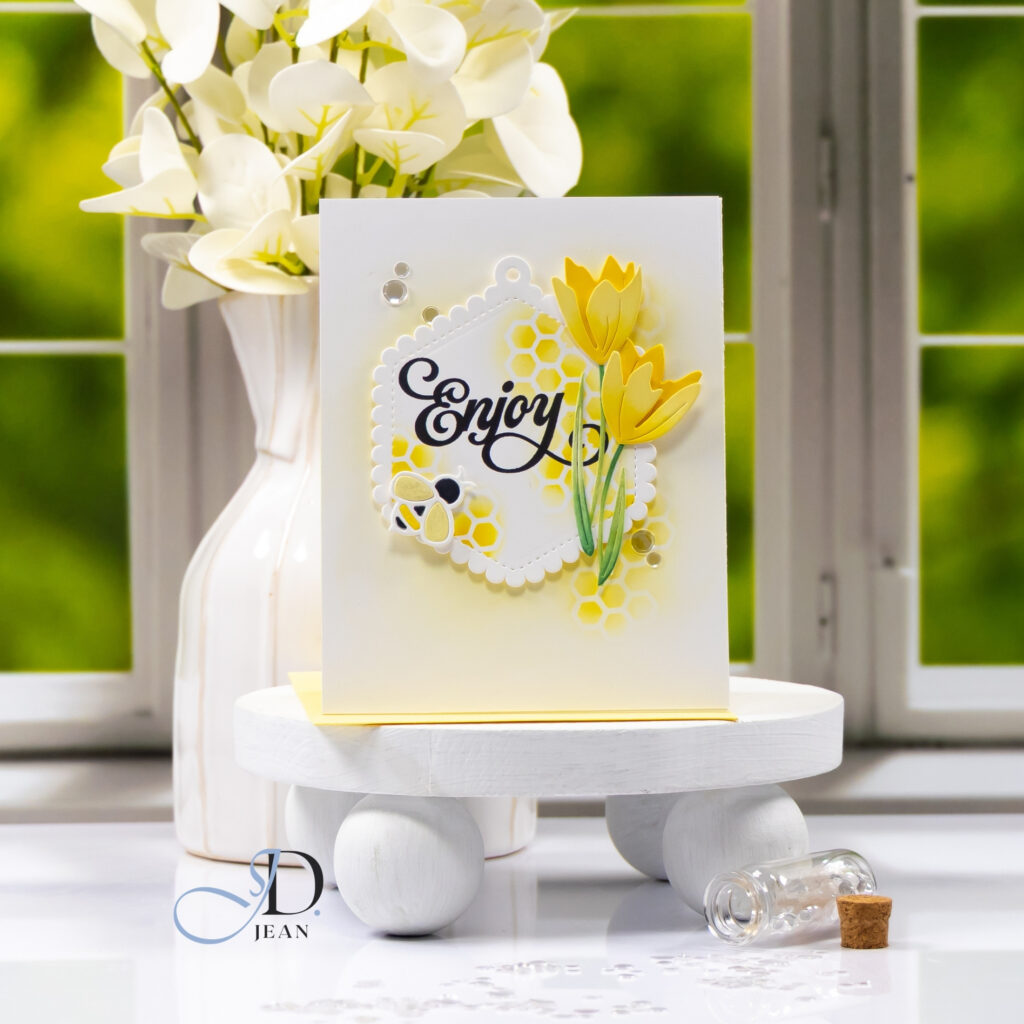
For this first card, I wanted the crocus flowers to feel lively and cheerful, so I built the design around a bright focal panel framed by a scalloped hexagon tag. That soft shape anchors the sentiment while leaving space for the flowers to climb upward along the edge of the panel, creating natural vertical movement.
To reinforce the playful spring theme, I added a light honeycomb pattern behind the focal element. Keeping the blending soft allows the yellow tones to echo the flowers without overpowering the design. A small bee accent introduces a bit of motion and helps guide the eye across the card, giving the overall composition a cheerful spring personality.
Peach Crocus Gratitude
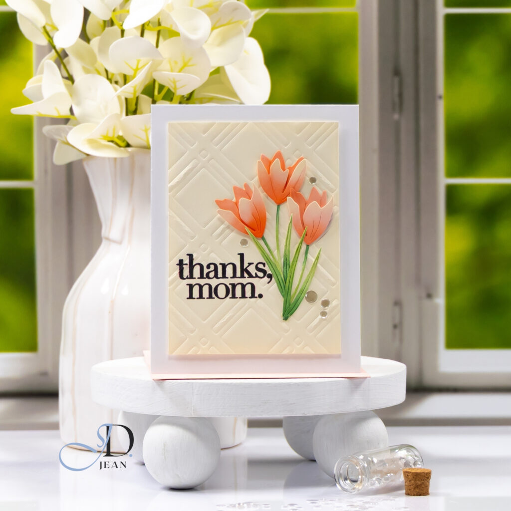
For this design, I wanted the crocus flowers to feel softer and more elegant, so I paired them with a textured background rather than building the layout around a layered focal panel. The subtle embossing (created using a die) creates quiet structure behind the flowers and adds depth while still keeping the palette calm and warm.
Placing the floral cluster slightly off center allows the stems to create a gentle diagonal line across the card. That diagonal movement keeps the design visually interesting while the sentiment balances the composition and anchors the layout.
Lucky Crocus
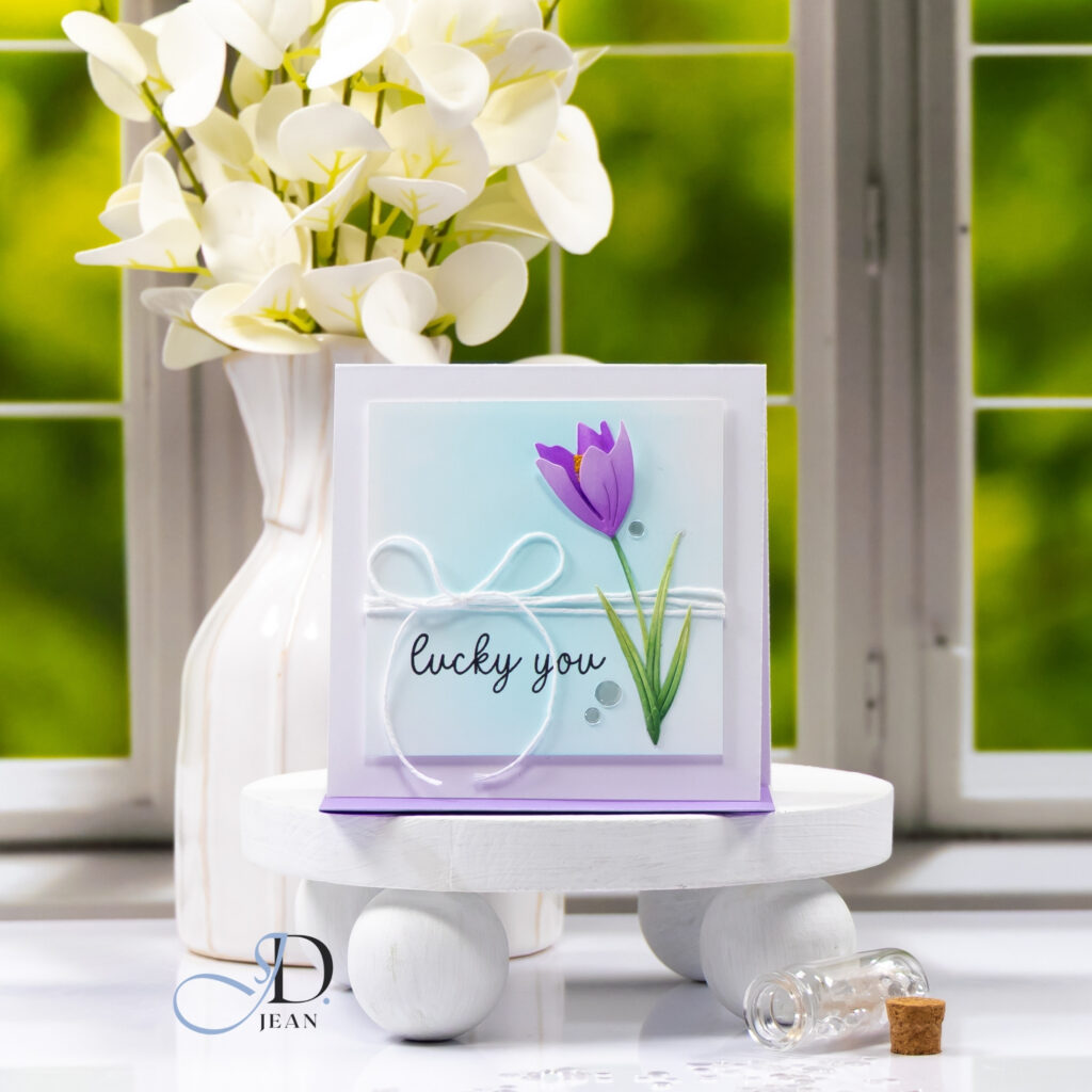
For the final card, I wanted to explore contrast and layering while still keeping the design light and open. A soft blue ink-blended panel creates a calm backdrop that allows the purple crocus to stand out as the focal point of the design.
Wrapping twine across the panel introduces a horizontal element that contrasts with the tall stems of the flower. That intersection between vertical and horizontal elements helps structure the composition while adding a small handcrafted detail that reinforces the clean layered style of the card.
Design Highlights
• Crocus flowers used as the primary design element → create natural upward movement in each card
• Varying layout structures → give three cards distinct personalities while using the same floral design
• Background textures such as embossing and stenciling → add depth without overwhelming the clean compositions
• Soft spring color palettes → reinforce the seasonal theme while allowing the flowers to remain the focal point
Working with the same floral element across multiple designs is always a fun creative challenge. These crocus cards were a lovely reminder that simple flowers, thoughtful placement, and subtle texture can create several different spring card styles from one beautiful design.

0 Comments