
")
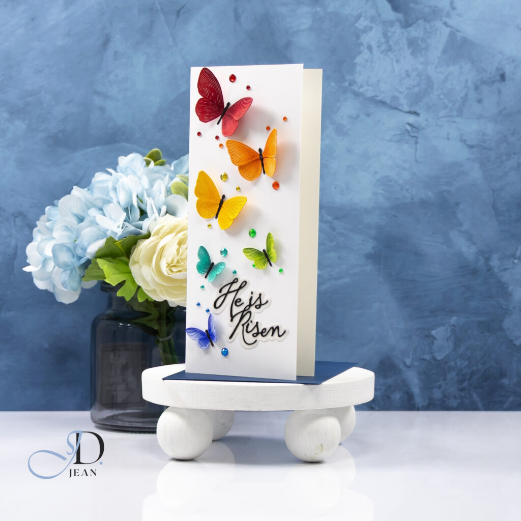
For today’s card I wanted to create gentle movement with both placement and color.
Each butterfly steps slightly higher than the last, creating a soft path of color that naturally carries the eye up the card.
The tall slimline format gives that movement room to breathe. Instead of crowding the butterflies together, the vertical space allows each one to feel intentional while still contributing to the overall cascade. It creates a sense of lift that pairs beautifully with the message of the “He Is Risen” sentiment.
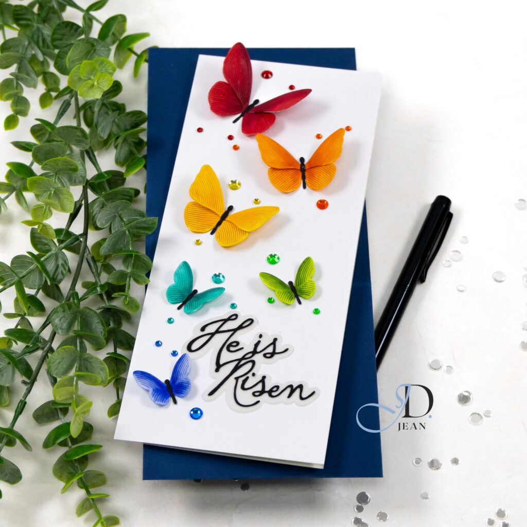
Color carries the story across the design. By using a rainbow progression and layering each butterfly for dimension, the delicate line texture in the wings adds subtle detail without disrupting the clean white background.
The color story continues with small coordinating gems. They echo the butterfly colors and help reinforce the movement across the card. That added sparkle introduces just a hint of energy while keeping the overall design light and uncluttered.
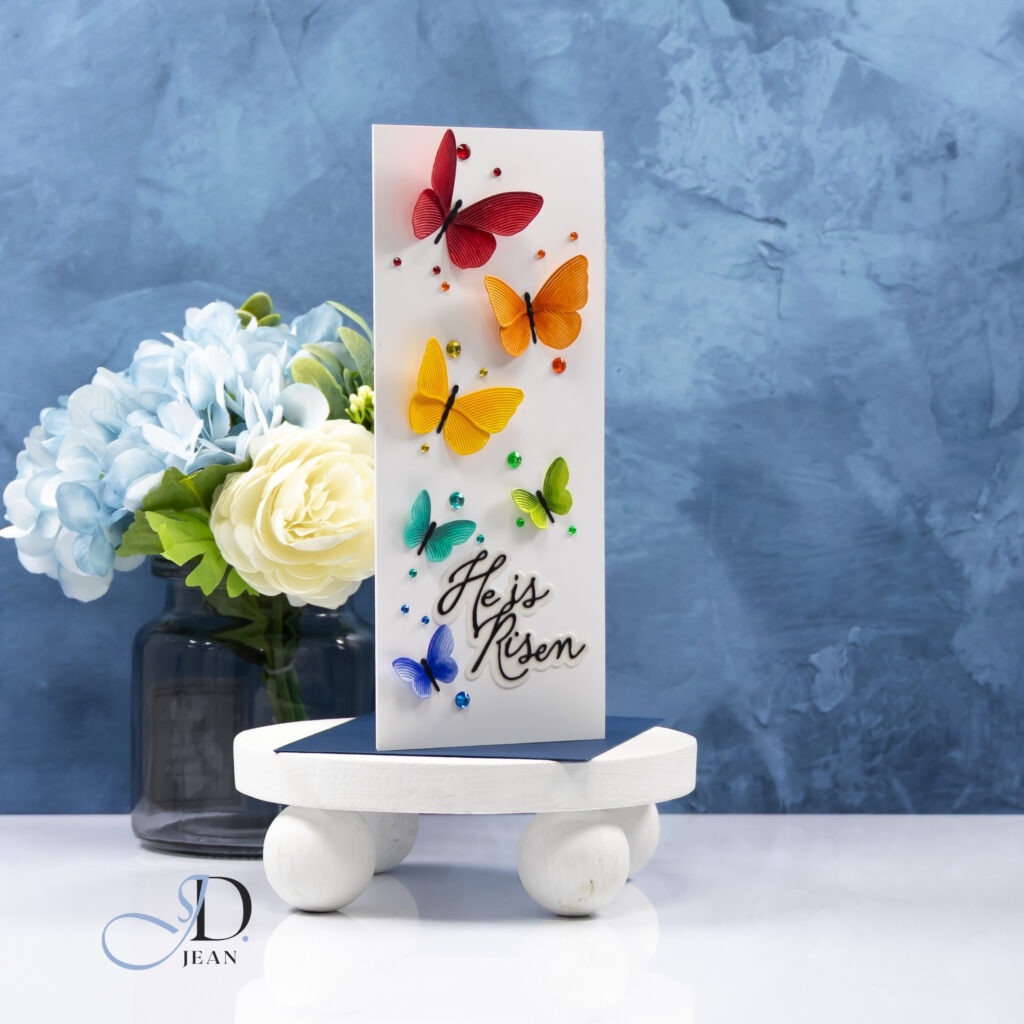
The sentiment anchors the composition near the bottom of the card. Its flowing script complements the organic shapes of the butterflies while grounding the upward motion created above it.
Design Highlights
• Cascading butterfly placement creates gentle upward movement
• Slimline layout gives the design room to breathe
• Layered butterflies add soft dimension and delicate texture
• Clean white background keeps the rainbow color story vibrant
• Coordinating gems echo the palette and reinforce the movement
It is a simple arrangement, but the combination of color, movement, and white space gives the design a joyful sense of renewal that feels especially fitting for Easter.

0 Comments