

Together by Design is a monthly collaboration where a small group of designers all create with products from the same featured brand. Each of us chooses a favorite product and puts our own creative spin on it, showing just how many different ways one brand can inspire. Follow along, explore every project, and discover new designers and new favorites along the way.
This month’s featured brand: Colour Cubes by Sarah Renee Clark
Here is a list of designers participating this month:
- Jessica: www.lovenotesbyjess.com/blog; @jessica.vasher
- Jean: www.studio-jd.com; @jean.studiojd
- Maggie: @teacher11494
- Tracy: https://redsas.co; @redsas
Color often sets the direction for my designs, and this month’s Together By Design collaboration felt like a true study in how far a single palette can stretch. Using Colour Cube palette #193 by Sarah Renae Clark, I wanted to explore how the same color story would translate across three different mediums.
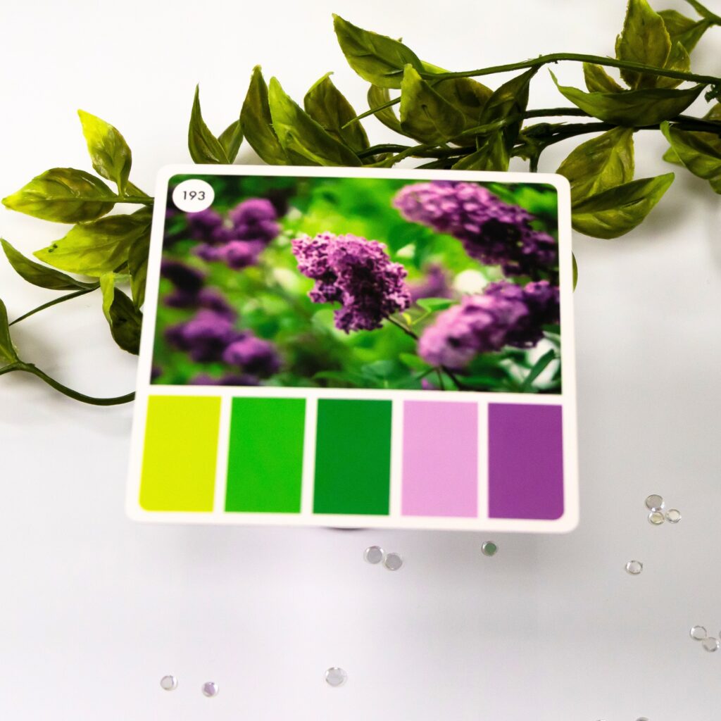
The palette itself leans into fresh greens paired with soft lilac and deeper purple tones. My goal was to keep that balance intact while allowing each technique to interpret the colors in its own way, rather than forcing a perfect match.
Card 1: Die Cut Cardstock Color Story
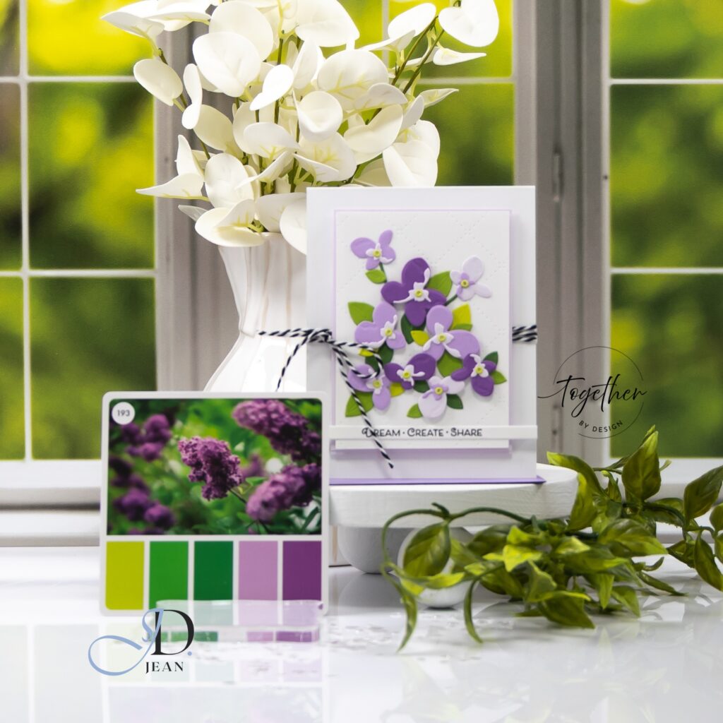
The die cut floral cluster card focuses on layered dimension and color placement. I used cardstock to build the flowers, letting the contrast between the lighter and deeper purples create natural movement through the cluster. The greens anchor the design, giving the eye a place to rest while still supporting the upward flow of the florals. Keeping the background clean allowed the color story to stay front and center without distraction.
Card 2: Stamped Watercolor Color Story
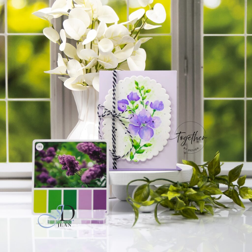
The watercolor stamped card shifts the palette into something softer and more fluid. Here, the same purples become more blended and atmospheric, with subtle variation in saturation across the petals. The greens feel slightly more organic and loose, which reinforces the watercolor style. The scalloped oval frame helps contain that softness and gives the design a gentle structure so it doesn’t drift too far visually.
Card 3: Copic Marker Color Story
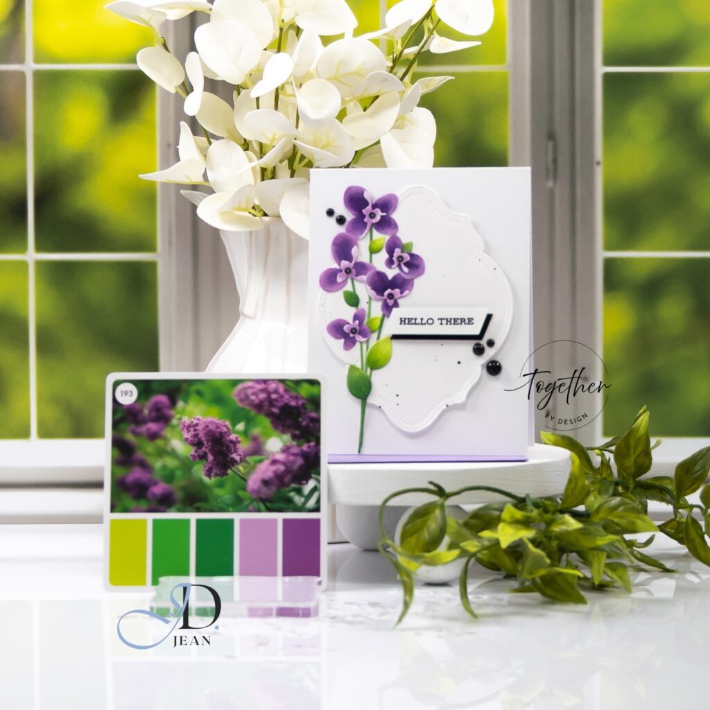
The tall stem card brings the palette back into a more defined, graphic interpretation. Using Copic-colored die cuts, I leaned into stronger contrast and cleaner edges. The vertical layout creates a clear sense of movement, guiding the eye upward along the stem. The deeper purple tones become more pronounced here, which helps ground the design against the white space and keeps it from feeling too delicate.
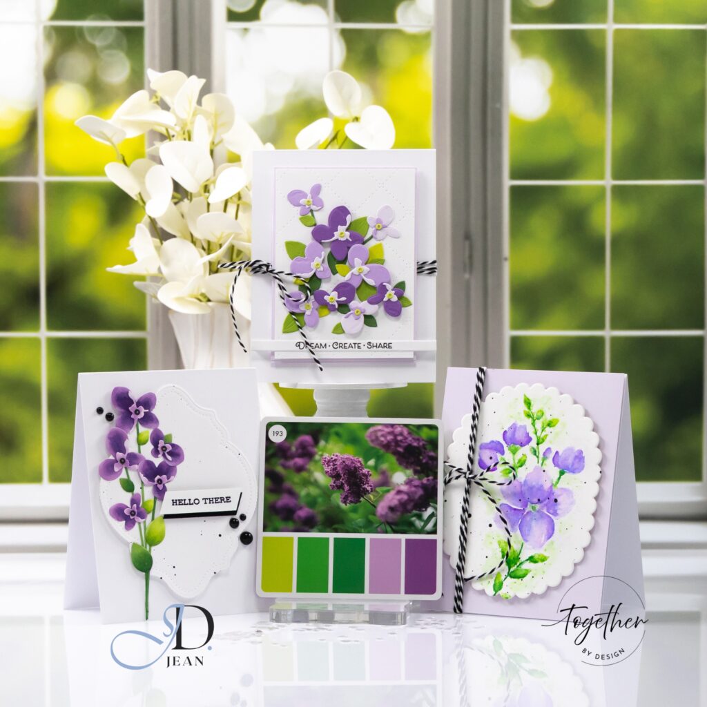
What stood out most to me in this set is how consistent the overall color story feels, even though each medium interprets it differently. The palette acts as the unifying thread, while the technique introduces variation in texture, intensity, and visual weight.
This was such a fun reminder that color doesn’t need to be exact to feel cohesive. It just needs to be intentional.

Super pretty! I love it and I agree w/ you about the consistency of the colors.
Lori S in PAPA