

My goal for these cards was to explore how small icon elements can create personality within a design.
The You’ve Got Flair collection from Spellbinders and Hero Arts is built around tiny pins, badges, and embellishment-style icons. Instead of using them as small accents, I wanted to see how they could become the storytelling element of the card.
Working with miniature images shifts the design challenge slightly. Placement, balance, and white space become even more important because each element carries visual weight.
Card One – Shirt Pocket Design
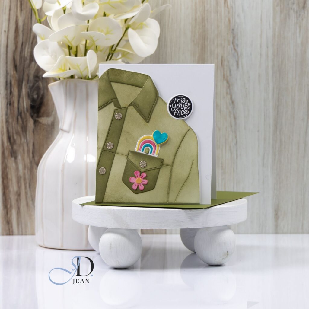
For the first card, I wanted the icons to feel like personal items tucked into a shirt pocket.
The die-cut shirt becomes the foundation of the composition while the pocket creates a natural focal point. Placing the rainbow and heart partially inside the pocket helps build a sense of depth and playfulness.
The layered ink blending on the shirt also adds subtle dimension and texture without overwhelming the clean layout.
Highlights
• Die-cut shirt creates a strong focal structure that anchors the design
• Pocket placement allows the icons to feel interactive and dimensional
• Soft ink blending adds texture while maintaining a clean composition
• Bright icon colors stand out against the neutral shirt palette
The result feels a little like a favorite jacket decorated with meaningful pins.
Card Two – Craft Tag Design
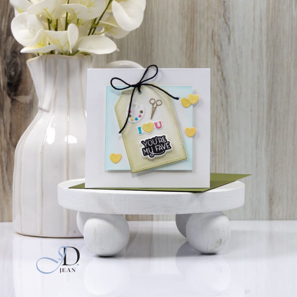
For the second card, I leaned into a craft-themed story using a stitched tag as the focal element.
The tag naturally frames the tiny craft icons while the layered panel underneath helps separate the focal area from the white card base. A simple twine bow reinforces the handmade theme and introduces soft texture.
Keeping the icons clustered near the center allows the hearts to act as supporting accents that carry the eye outward through the design.
Highlights
• Stitched tag shape frames the miniature craft icons
• Layered panel creates separation and visual depth
• Twine bow introduces texture and a handmade feel
• Small hearts extend the visual movement across the card
This design celebrates the playful side of creativity while still keeping the overall layout clean and balanced.
Bonus Card – Icon Cluster Design
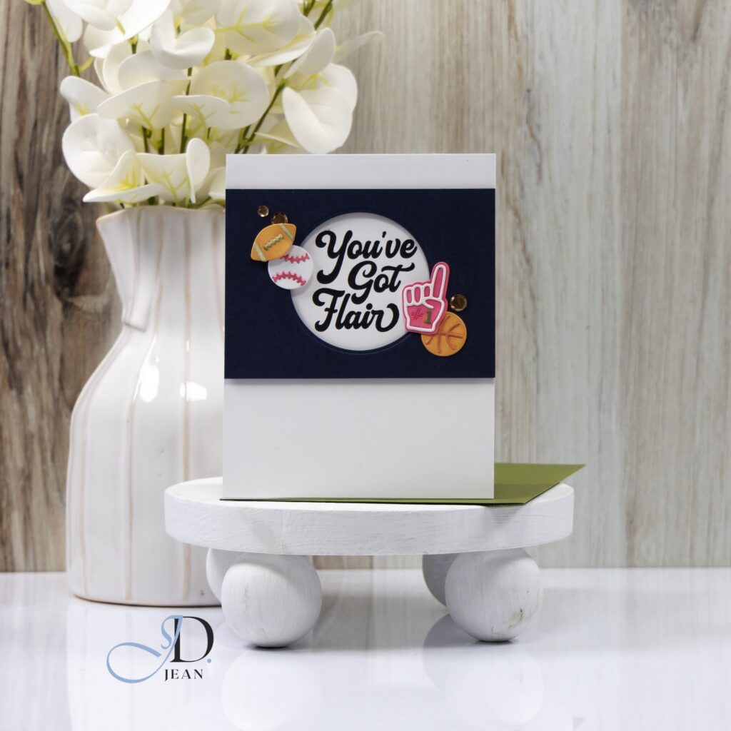
The final card takes a more graphic approach by clustering several icons around the sentiment.
Instead of building a scene, the icons act as decorative accents that support the bold typography. The dark horizontal band helps anchor the design while the circular opening frames the sentiment.
Sometimes the simplest layout is the most effective way to highlight playful elements like these.
Working with tiny icons can feel challenging at first, but it’s also a great reminder that even the smallest design elements can tell a story when placement and balance work together.

0 Comments