Studio Notes is a space where I share small observations about card design — the quiet decisions that shape how a card feels. These posts aren’t tutorials, just reflections from the studio.
White space is one of those design choices that rarely calls attention to itself, yet it quietly shapes how a card feels the moment you see it. When a layout feels calm and effortless, it is often because space has been allowed to do some of the work.
In the studio, I often think of white space as a pause. It gives the focal point room to speak and keeps the eye from feeling rushed. Instead of filling every area, the design becomes more intentional when certain areas are left untouched.
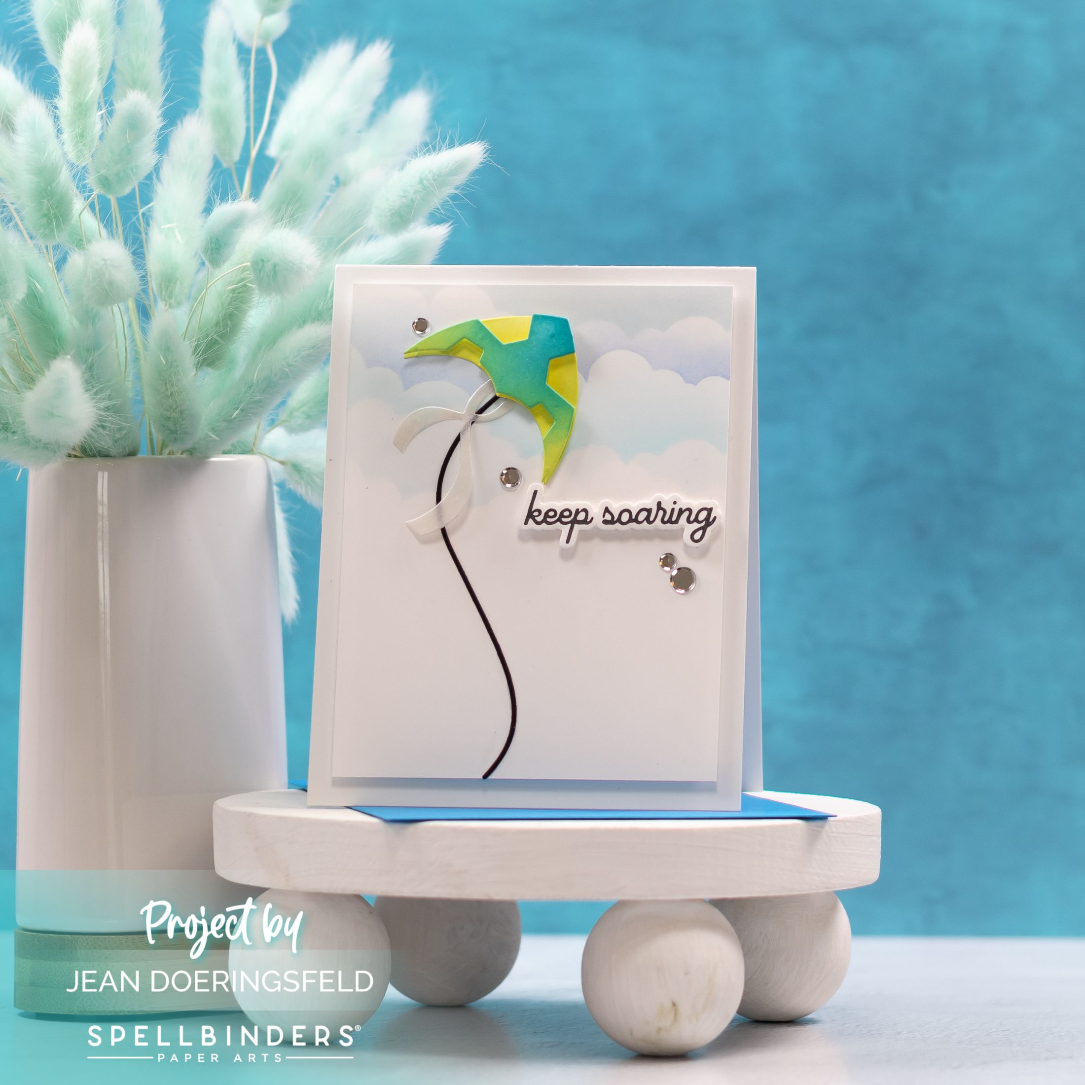
This card is a great example of how white space can support a simple scene. With a single focal element and plenty of open space around it, the design feels light, balanced, and easy to take in.
View the original card post here.
This card was originally shared as part of the Keep Soaring post. The full supply list has been reused here for reference.


0 Comments