

For these two cards, my goal was to explore how the same small bunny die could support two completely different design directions. As I started sketching out ideas, I realized that the surrounding layout and color story would end up shaping the personality of each card.
Both cards feature the small bunny die from the Simon Says Stamp Beautiful Moments release, and it turned out to be the perfect focal image for experimenting with different compositions.
Small character images often rely on the surrounding design to set the tone. In one card I leaned into a layered spring composition with soft pattern and seasonal details. In the other, I kept the layout more focused so the bunny could become the center of a playful magical moment.
Card One – Spring Bunny Card
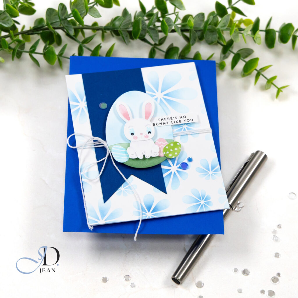
For the first card, I wanted the bunny to feel like part of a cheerful spring scene while still keeping the overall design clean and balanced.
The vertical banner acts as a strong structural anchor that guides the eye through the composition. Placing the bunny inside the soft oval frame establishes a clear focal point while the pastel eggs extend the story outward and reinforce the seasonal theme. Behind the focal elements, the stenciled background introduces soft pattern and movement without competing for attention.
Texture adds another layer of balance to the design. Wrapping twine across the card introduces a gentle horizontal element that offsets the vertical banner while adding a bit of tactile detail. Small gems echo the cool blue palette and bring a subtle sparkle that keeps the design lively without disrupting the calm spring feeling.
Card Two – Magical Bunny Card
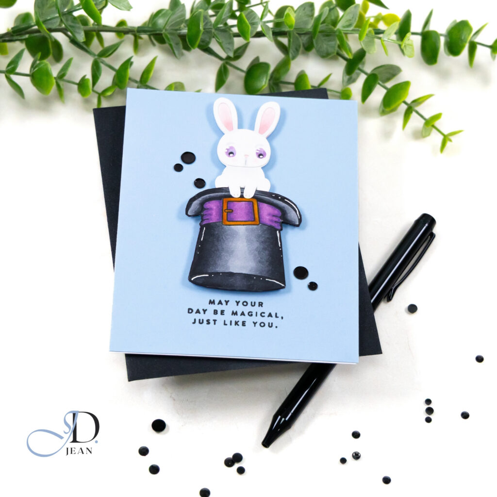
For the second card, I wanted the bunny to feel like the star of a playful magical moment.
Instead of building a layered scene, the design centers on a single focal illustration. The bunny peeking out of the magician’s hat creates an immediate sense of personality while the soft blended background keeps the surrounding space calm and uncluttered.
Contrast plays an important role here. The darker hat anchors the composition and allows the lighter bunny to stand out clearly against the background. With fewer surrounding elements, the eye moves directly to the focal image and the whimsical story it suggests. A few simple embellishments add a touch of sparkle while keeping the overall layout clean and intentional.
Design Highlights
• Vertical banner anchors the spring composition and guides the eye through the layout
• Oval frame creates a clear focal point for the bunny character
• Stenciled background adds soft pattern while keeping the design light and balanced
• Strong focal illustration highlights the playful magician theme
• Limited embellishments keep both designs clean and intentional
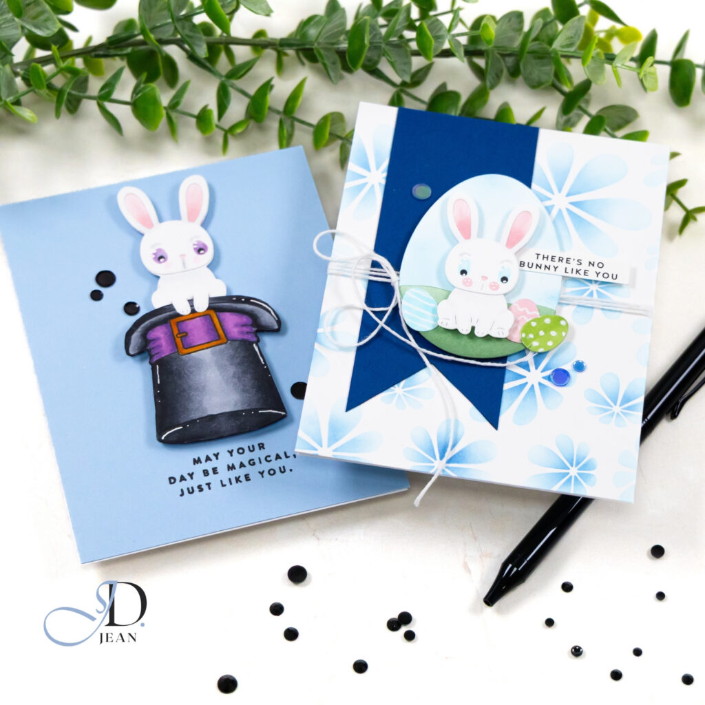
Using the same focal image in multiple ways is one of my favorite ways to explore layout and color. Small shifts in structure can completely change the personality of a card design.

0 Comments