Hello everyone!
I really needed something cheery and Spring-like today. Wisconsin winters get to me – and this one has barely even started! Ugh – I think I’m going to need lots of crafty therapy to get me through.
Today’s card doesn’t involve any stamping – just die cutting and “dipping”! This was a super easy card to make but it fit my cheeriness criteria for today. If you haven’t tried dipping, you definitely need to!
For my background, I die cut the Simply Diamonds cover die from Pink Fresh Studios out of white cardstock and adhered it to my card base. Here I go again with that tone-on-tone background! I can’t help it!
Next, I die cut the flowers and leaves from the Altenew Sakura Blossoms die set out of watercolor paper. These dies are the coordinating dies from the stamp set – which is so beautiful – but for today’s card, I only needed the dies.
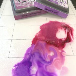
Next, I created my “dip” for my dipping technique by smooshing several colors of Distress Oxide Ink onto my Tim Holtz glass mat and then spraying them with water to get the colors to move and mix a bit.
When I say “smooshing”, I mean it: I took the cover off the ink pad and smooshed the top of the ink pad down directly onto the glass mat so that the ink came off the pad onto the glass.
The beauty of this technique is that you can do it with just one color – or with several – so you don’t have to have a ton of supplies to make it work. And – you can do this with dye ink, oxide inks (like I did with this card) – or you can even use watercolor paint or other color mediums that mix with water.
For my flowers, I used the following Distress Oxide color combinations and created my “dips” in batches, cleaning my glass mat in between to make sure that I wouldn’t get a mud-like color (I learned this the hard way!):
- Purple flowers: Seedless Preserves, Wilted Violet
- Orange flowers: Fossilized Amber, Antique Linen, Wild Honey, Abandoned Coral
- Leaves: Iced Spruce, Peeled Paint, Peacock Feathers
Next, I started dipping! I used a tweezers and took each flower or leaf and dipped it into the watered-down ink mix. I would the die into the mix, lift it up and check the coverage, then put it down in a different part of the color mix to make sure that I got a good coverage and some unique tones throughout each die cut. The Distress Oxide inks are unique in that they layer their color – so whatever color you dip in last will be on top. If you are dipping with die inks, this is not the case – they will mix more. Either way is beautiful – it’s just something you’ll want to be aware of as you are creating.
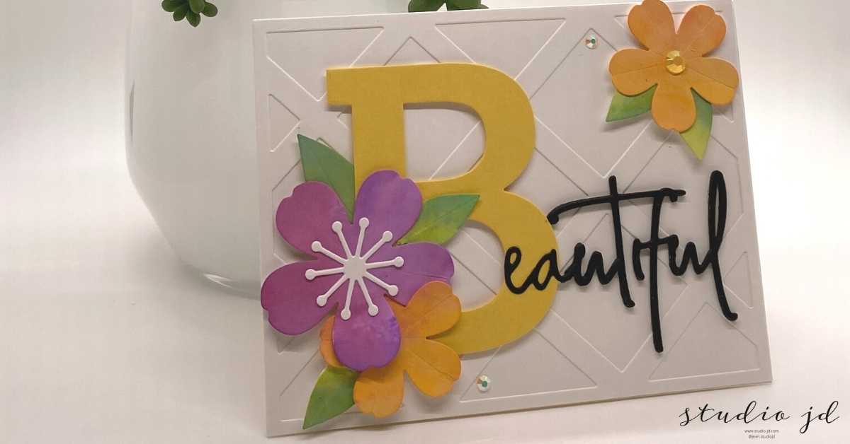
Once each die was “dipped” I set them aside to dry.
While the flowers and leaves were drying, I die cut the large “B” from the Altenew Mega Alphabet die set. I purchased this entire set during Altenew’s Black Friday sales (but you can purchase individual letters if you like). I felt like I’d won the lottery! I just love alphabet dies and I’ve had this mega alphabet set on my list FOR-EV-ER! The sale was all the excuse I needed to treat myself. I’m so happy I did! I have tons of ideas for these dies!
Once my flowers and leaves were completely dry, I started arranging and adhering them on the lower left corner of the mega B. I then used foam squares to pop the mega B with the flower clusters up on the card front.
The obvious use for the mega alphabet letters is to make a card monogrammed for the recipient but since I didn’t have anyone in mind for this particular card, I decided to use it to create a word and make it a card that I could send to anyone for nearly any occasion.
I searched my inventory and found the Beautiful Word Die from Pink Fresh Studios. I thought that the scripty lettering and the size would work perfectly with the mega B. I cut the “beautiful” die out of black cardstock and decided how I wanted it placed in relation to the mega B. When I cut the Beautiful die, the “B” in Beautiful is separate, which worked out perfectly since I didn’t need it anyway!
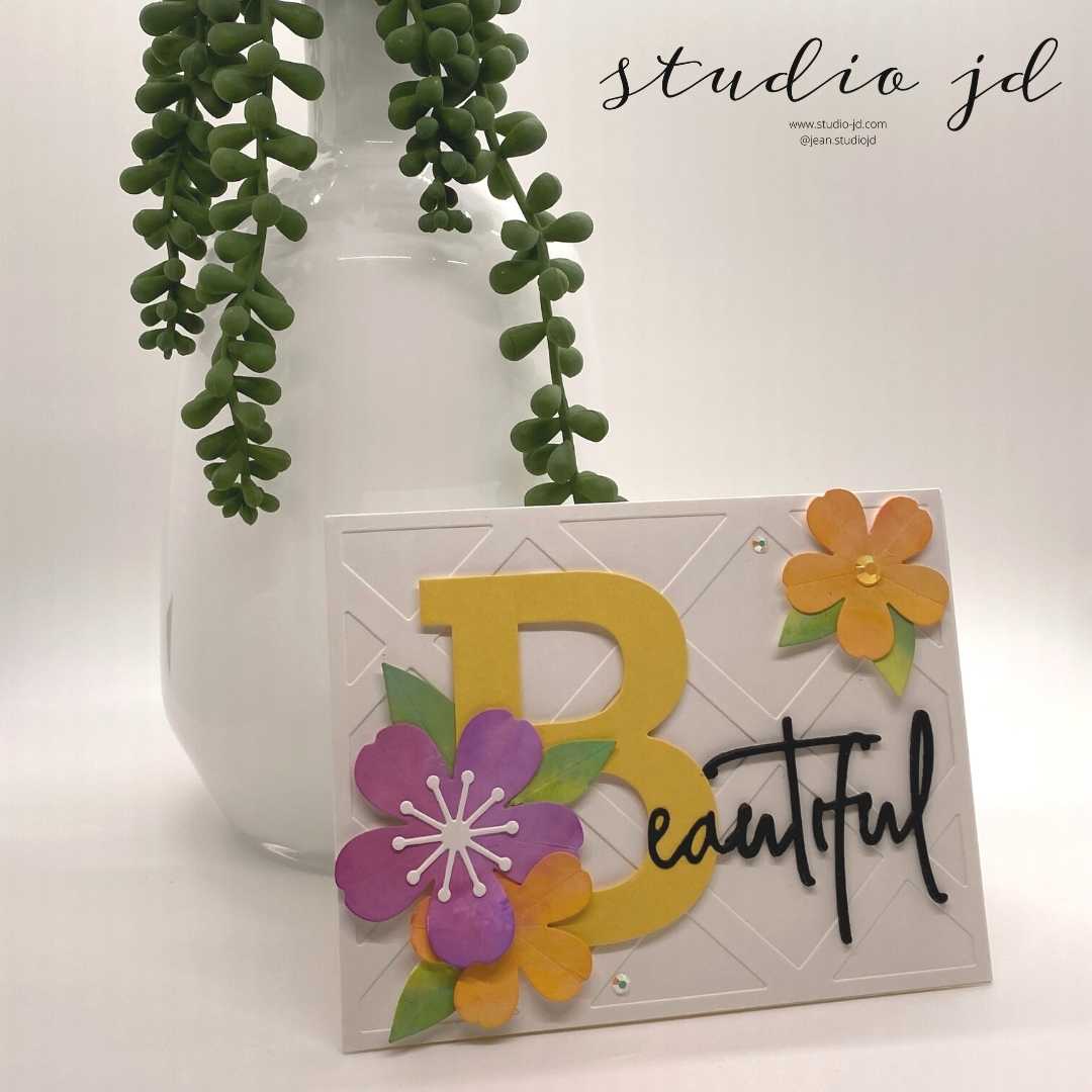
I adhered the Beautiful die cut to my card front to complete the word Beautiful.
At this point I could have just added a few gems and this card would have been just fine, but I felt like the upper right of the card needed something more so I created another small flower and leaf cluster and adhered it to my card front using foam squares.
As usual, I added a few gems to give it a little sparkle!
This card did exactly what I was hoping – it added just the right amount of cheerfulness to a long, cold winter day and reminded me of sunshine. I hope it brought a little brightness to your day too!
All the best,





0 Comments