

Hi there!
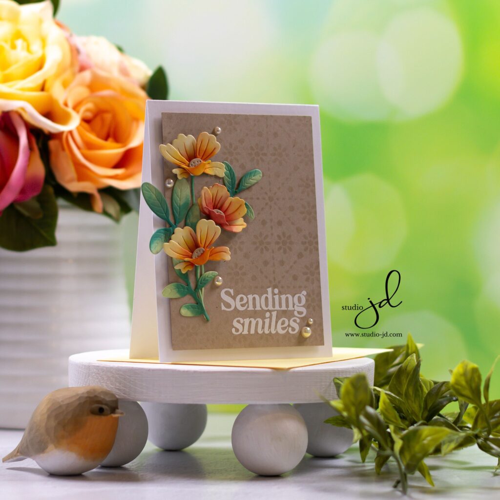
I just love how yellows and oranges pop on Kraft card stock. How about you?
For my card today, I created some dimensional flowers with the new Icelandic Poppies dies from Simon Says Stamp. I die cut the pieces of the petals an ink blended them to allow for light and shadows (darker in the middle, lighter at the tips of the petals).

When layering the petals together I separated the layers with foam adhesive to give the flowers even more dimension.
I ink-blended the stems and grabbed some foliage dies from my stash to add a bit more green to the arrangement.

Once my flowers were ready, I created my Kraft cardstock panel by placing a stencil over it and ink-blending it with Simon Says Stamp Pawsitively Saturated Ink in Latte. I’ve found that Latte is the perfect ink for giving a tone-on-tone effect. You can achieve this same effect using a Versamark or other clear embossing ink.
I heat embossed my sentiment in white, arranged and adhered my flowers, and added a few iridescent white pearls for a bit of shine.
I absolutely love how this card turned out and I hope you do, too! Be sure to leave a comment and let me know your favorite way to use Kraft card stock.
Have a wonderfully creative day, everyone!

OBSESSED!!!!
Thank you so much!
Simply obsessed with this card, Jean!
Aw! Thank you!