Hi everyone!
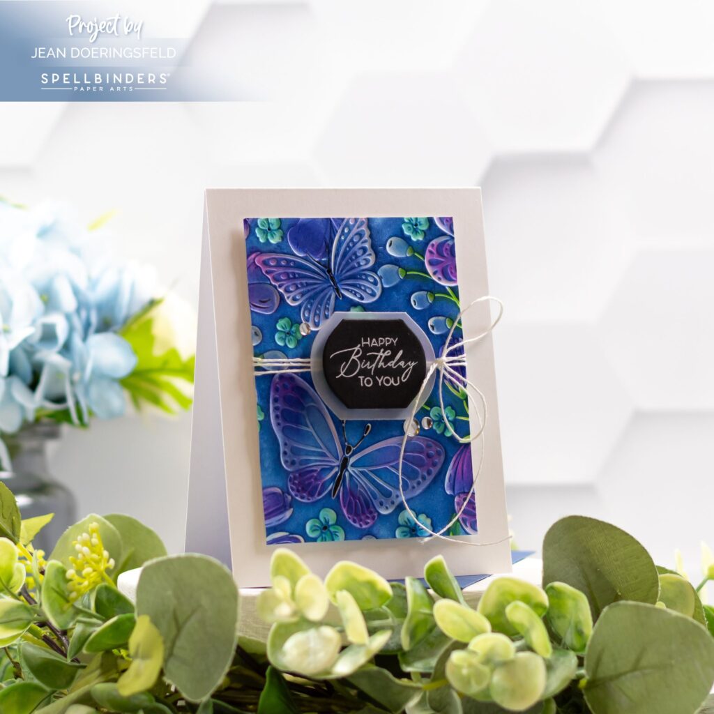
I’m excited to share my card with you today because it features two twists on a couple of techniques you probably already know:
First, for my background, I used the popular (and gorgeous) blackout technique – but instead of swiping my card with black ink, I used blue. While I love the look of a blackout (so much drama!), sometimes I want a different feel for the card I’m making. I think using blue (or other dark color) is still impactful, but the feel of the card becomes a bit more…dreamy…or soft. What do you think?

Second, for my sentiment, I used an opaque white foil and a BetterPress (letterpress) die on black cardstock. Most of the time when I foil, I use gold or silver or some other lovely, shimmery foil with my hot foil and BetterPress plates. But sometimes I just want a sentiment that looks like it’s stamped or heat embossed. I love that I can get that stamped or heat embossed look from my BetterPress (and hot foil) plates just by using white foil. Pssst: you can also use black foil on white cardstock for a stamped look! This is a great way to get even more use out of your hot foil and BetterPress (LetterPress) plates!

Let me know in the comments if you have tried the blackout technique or if you have ever used white foil on a project! If you haven’t tried either technique, I hope my card today inspires you to try at least one of them!

Thanks for stopping by and I hope you have a wonderfully creative day!


I haven’t tried the blackout technique yet, but this is making me want to give it at try! I love how you’ve done it with the blue instead of black.
Gorgeous! Love this!
Wow! Love this!
Thank you!!!
Thank you so much!