

Together by Design is a monthly collaboration where a small group of designers all create with products from the same featured brand. Each of us chooses a favorite product and puts our own creative spin on it, showing just how many different ways one brand can inspire. Follow along, explore every project, and discover new designers and new favorites along the way.
This month’s featured brand: Pinkfresh Studio
Here is a list of designers participating this month:
- Jessica: www.lovenotesbyjess.com/blog; @jessica.vasher
- Jean: www.studio-jd.com; @jean.studiojd
- Maggie: @teacher11494
- Tracy: https://redsas.co; @redsas
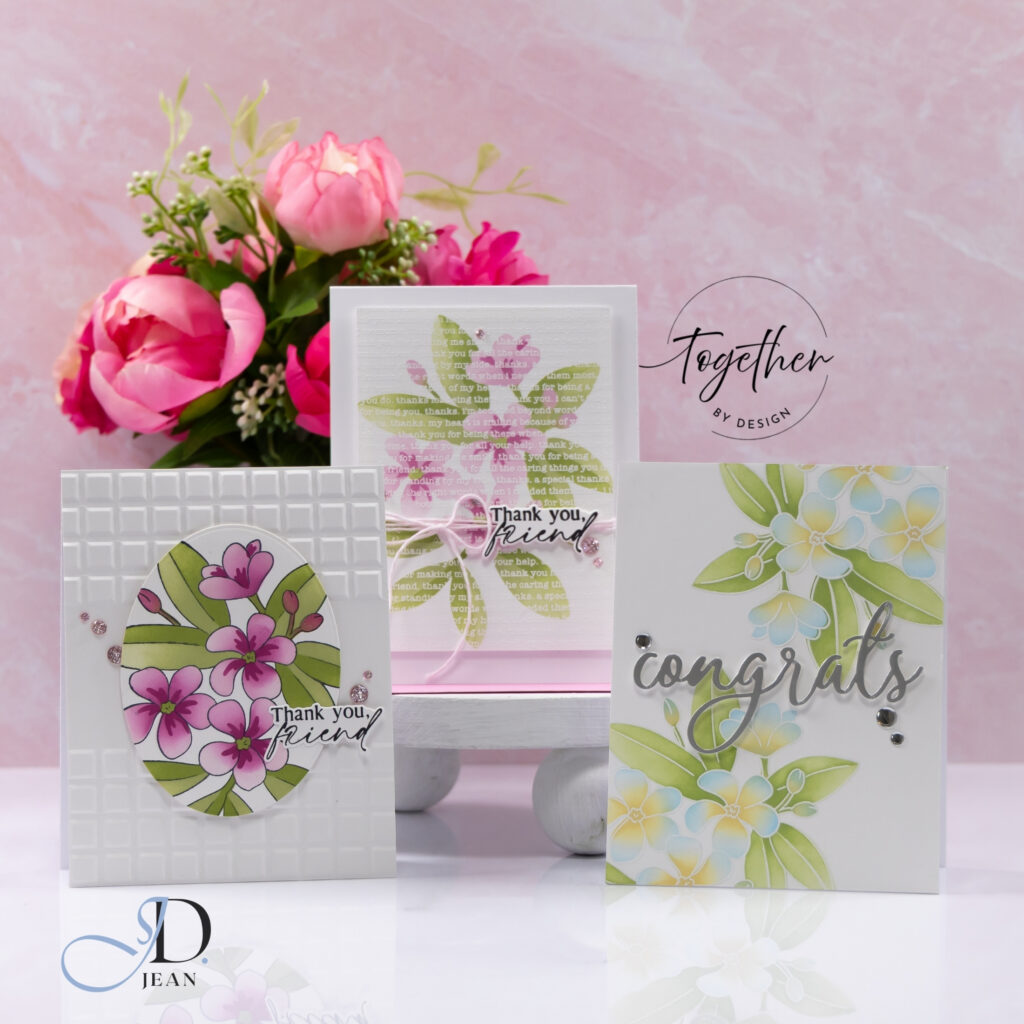
For this month’s brand feature I went with something I consider to be classic Pinkfresh – florals! I chose to work with the stamps, stencils, and coordinating dies from the Plumeria collection, exploring how the same floral design can shift dramatically with changes in color, texture, and layout.
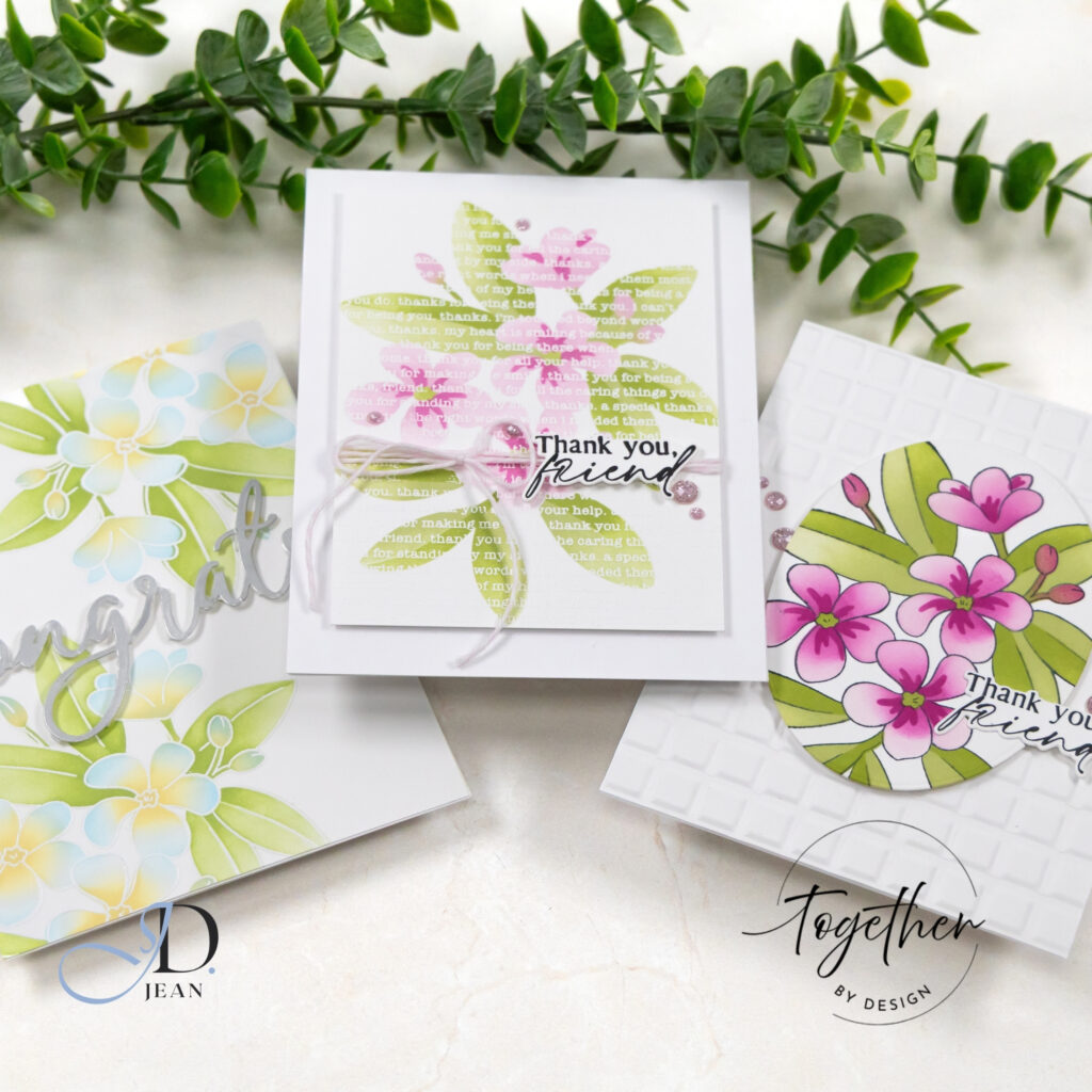
Using one product suite across multiple cards is always an interesting exercise. It pushes the design decisions beyond “what should I use?” and into “how can I use it differently?” These three cards share identical core products, yet each tells its own visual story.
Card One: Soft Blue Congrats
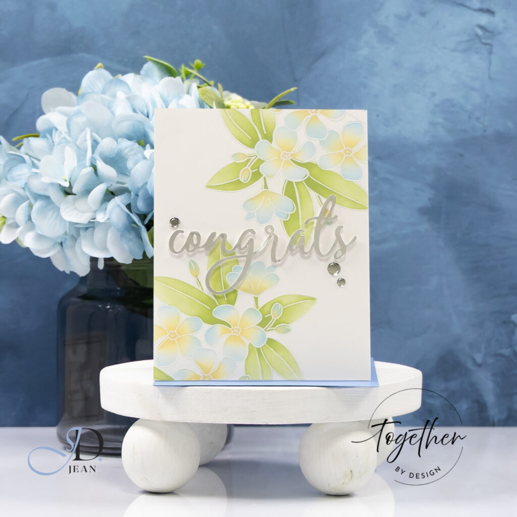
This design leans into openness and restraint. The florals are softly blended in pale blue and buttery yellow tones, with the white outline of the die cuts keeping everything crisp.
By placing the florals diagonally and allowing generous negative space, the card feels light and modern. The silver “congrats” sentiment adds a reflective contrast that catches the light without overpowering the softness of the ink blending. A few clear embellishments echo that shine and complete the composition without adding visual weight.
The key here was subtle stencil blending. Light pressure and gradual layering allow the color transitions to remain airy rather than saturated.
Card Two: Bold Pink Florals with Texture
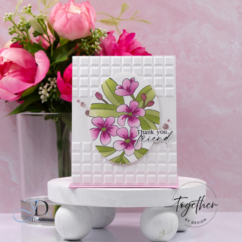
For the second card, I increased contrast and introduced texture. The plumeria blooms are colored in vibrant pinks with deeper centers, framed inside an oval die cut.
The background embossing adds structure without competing for attention. Its geometric pattern contrasts beautifully with the organic curves of the florals. Scattered gems repeat the circular shape of the oval and help guide the eye across the design.
This card demonstrates how the same stamped image can feel entirely different when the color intensity is amplified.
Card Three: Layered Gratitude with Soft Dimension
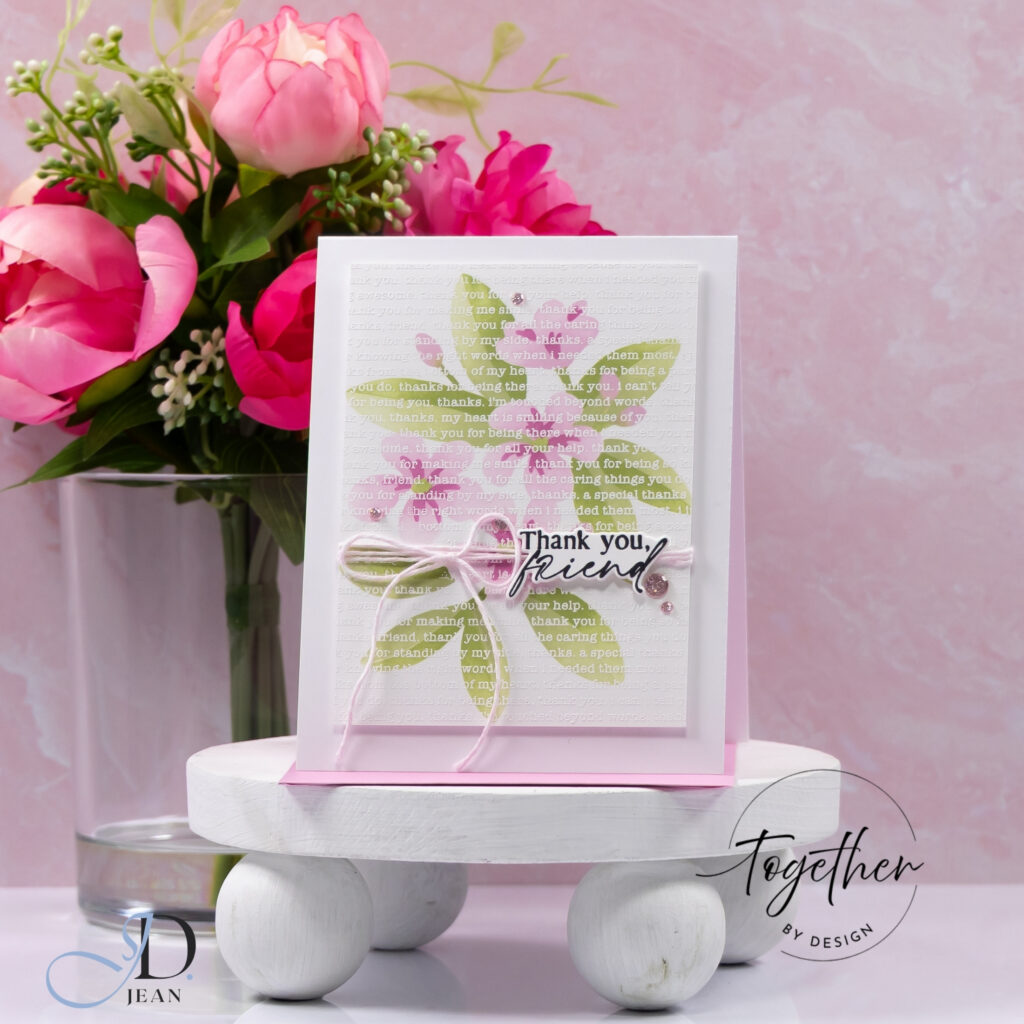
The final card embraces layering and softness. A blended pink and green panel sits over a tone-on-tone stamped background filled with gratitude sentiments. The subtle white heat embossing creates texture without visual noise.
Wrapping twine across the center introduces tactile warmth and gently anchors the “Thank you, friend” sentiment. The panel is slightly lifted for dimension, allowing shadows to add quiet depth.
Here, the stencil blending is more concentrated in the center and fades outward, creating a focal glow effect that keeps the eye anchored.
Design Highlights
- Coordinated stamping, stenciling, and die cutting from the Pinkfresh Studio Plumeria collection
- Three distinct color stories using the same floral imagery
- Varied use of negative space, embossing, and layering
- Subtle embellishments that reinforce each composition’s tone
- Consistent product suite with intentionally different results
Working within one collection across multiple designs highlights how versatile layered stencil systems can be. Small adjustments in saturation, placement, and texture dramatically shift the mood of the finished card.

0 Comments