

The Dot Petal Pattern stencil from Simon Says Stamp’s Always There release immediately became the design anchor for this entire card pair.
The moment I started working with it, I knew it had far more potential than a single background. Using it both as patterned detail inside the glasses and as the spotlight feature on the margarita card created the kind of built-in cohesion I’m always hoping for in a multi-card series. It allowed these designs to feel intentionally connected without veering into overly matched territory, which, much like overly themed party décor, can sometimes become a bit much.
For this pair, I wanted to explore how one product could create very different visual outcomes simply through placement, color, and scale. That kind of versatility always feels especially satisfying because it stretches both the release and my crafting budget, which frankly deserves more respect.
Featured Supplies
- Dot Petal Pattern Stencil
- Classic Friendship Stamp Set
- Wine Glass Die
- Margarita Die
- EZ Strips Reverse Traditional Wedding
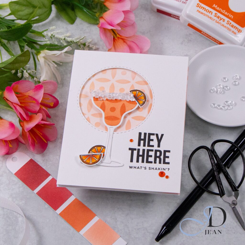
The margarita card leaned into the brighter, more playful side of the stencil design. Using the pattern as a soft spotlight element gave the card a fresh, energetic foundation while still keeping everything clean and intentional. It created just enough structure to anchor the focal point without competing for attention, which is really the design equivalent of knowing when to be the fun one and when to simply hold the glass.
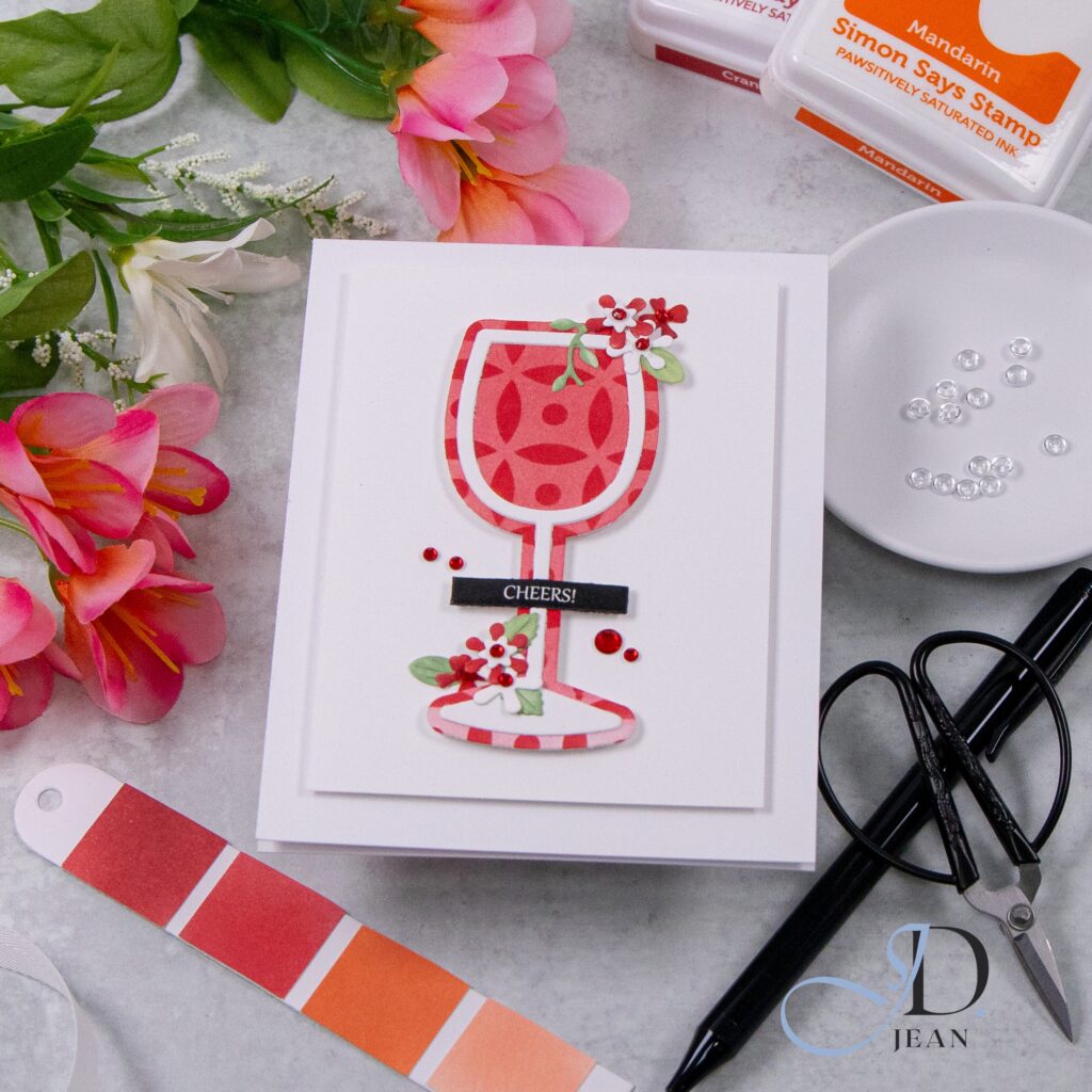
For the wine card, I shifted the stencil into a stronger supporting role by incorporating it directly into the glass itself. This approach gave the design a bolder personality while still maintaining continuity with the first card. It’s one of my favorite ways to use stencils beyond traditional backgrounds, especially when a pattern is strong enough to function almost like a custom paper.
What I loved most about these cards was how a single stencil became the true thread holding the collection together. The imagery may set the theme, but the stencil really became the design driver. That subtle repetition created visual consistency while still allowing each card to develop its own distinct personality.
Also, any time one product works this hard, I feel obligated to appreciate it publicly.
This release was such a good reminder that sometimes the standout supply isn’t the largest focal point. Sometimes it’s the versatile supporting player quietly carrying the entire collection.

0 Comments