


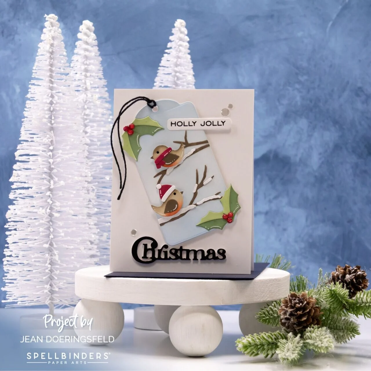
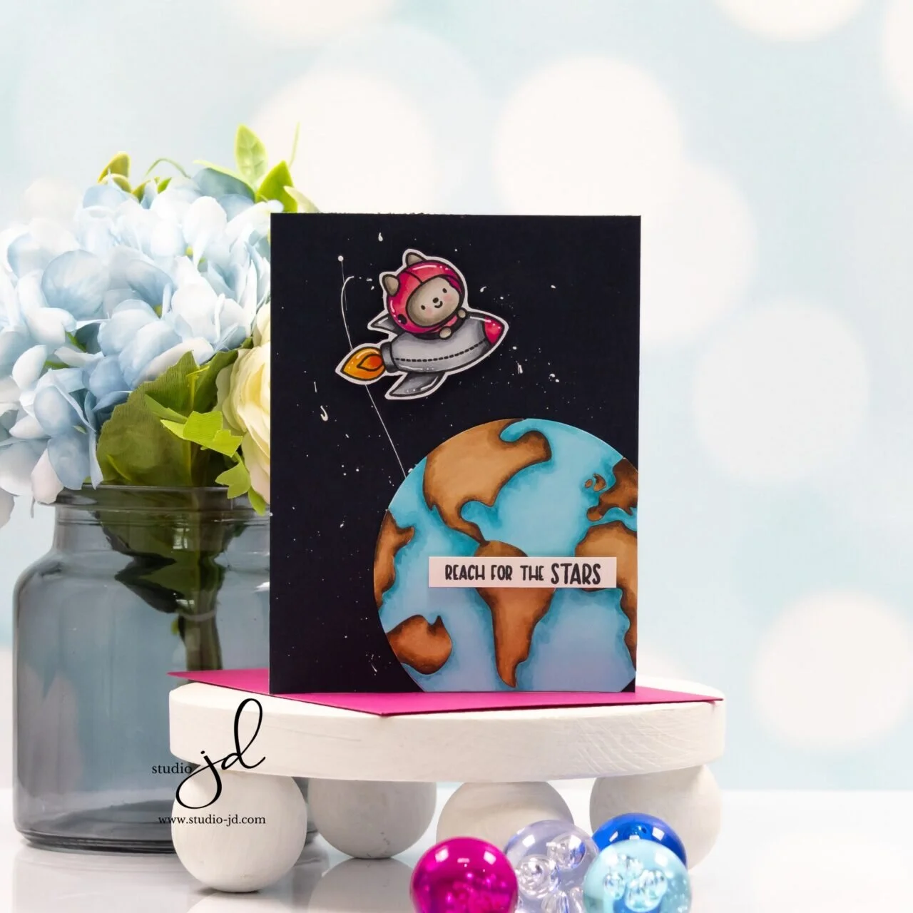
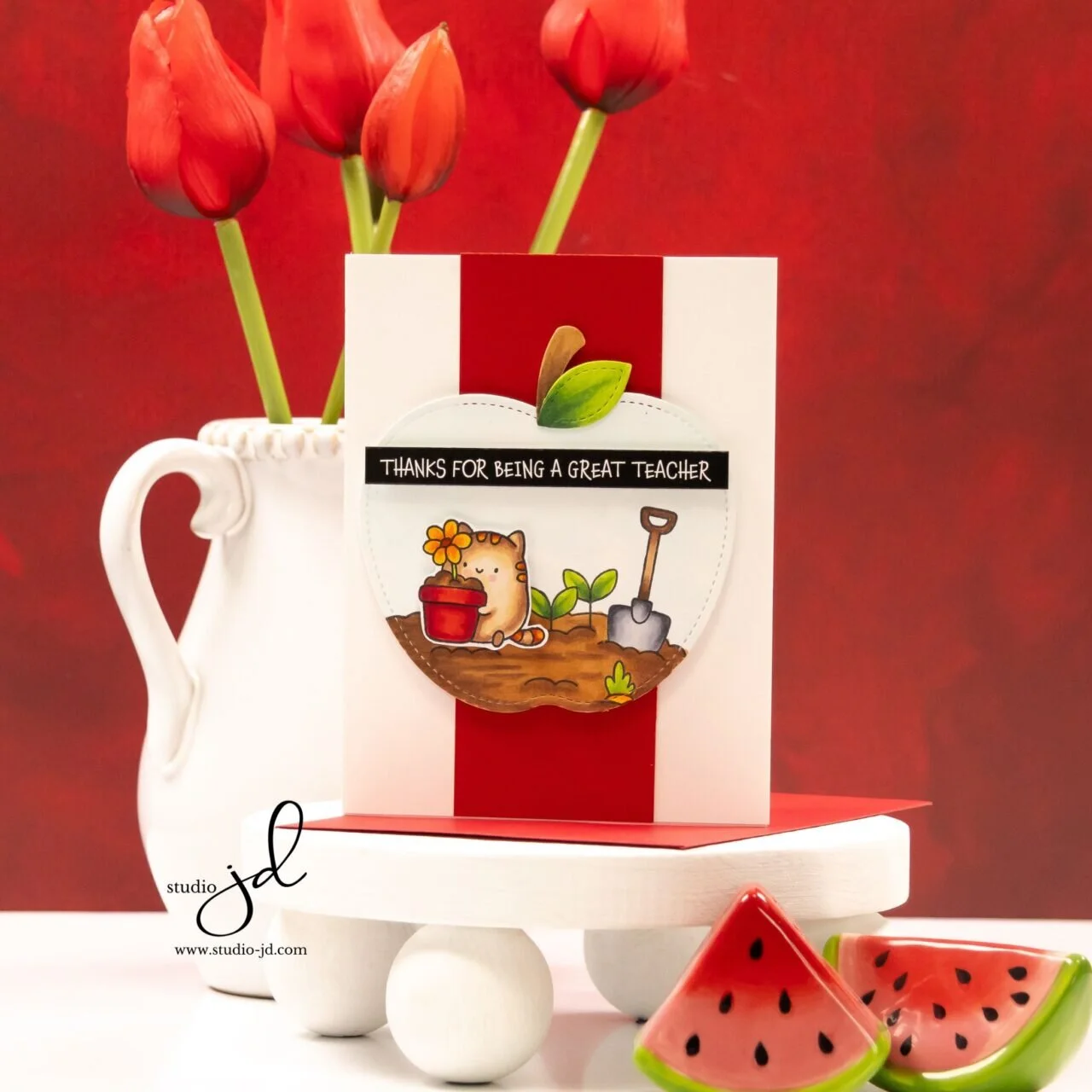
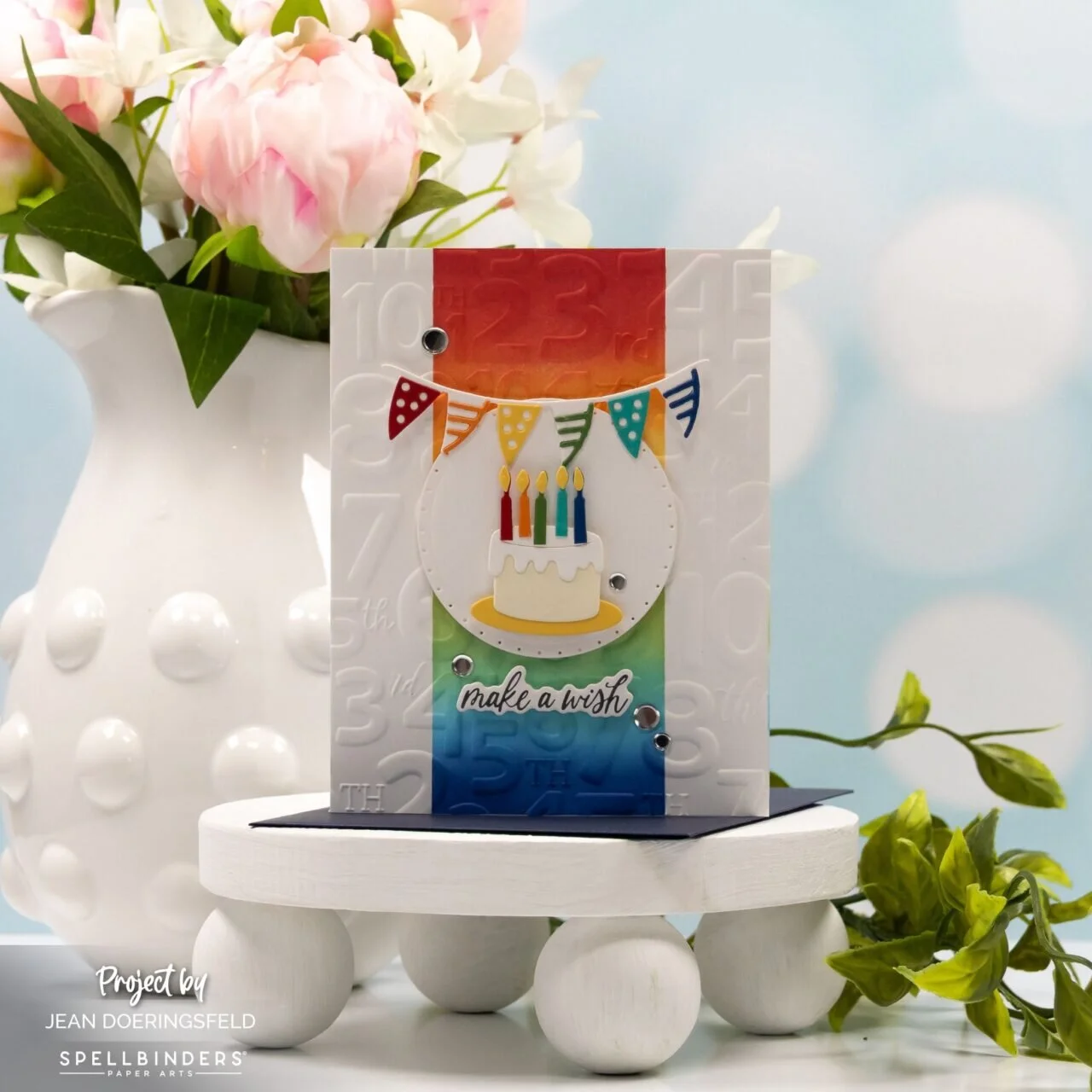

I’m Jean
I fell in love with card-making many years ago and I’ve been hooked on it ever since.
Recent Posts
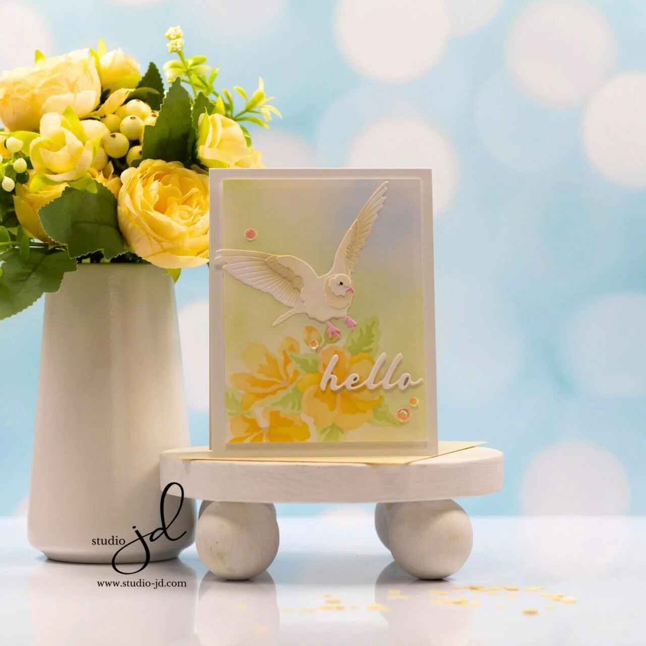
Studio Notes | Soft Contrast for a Calm Design
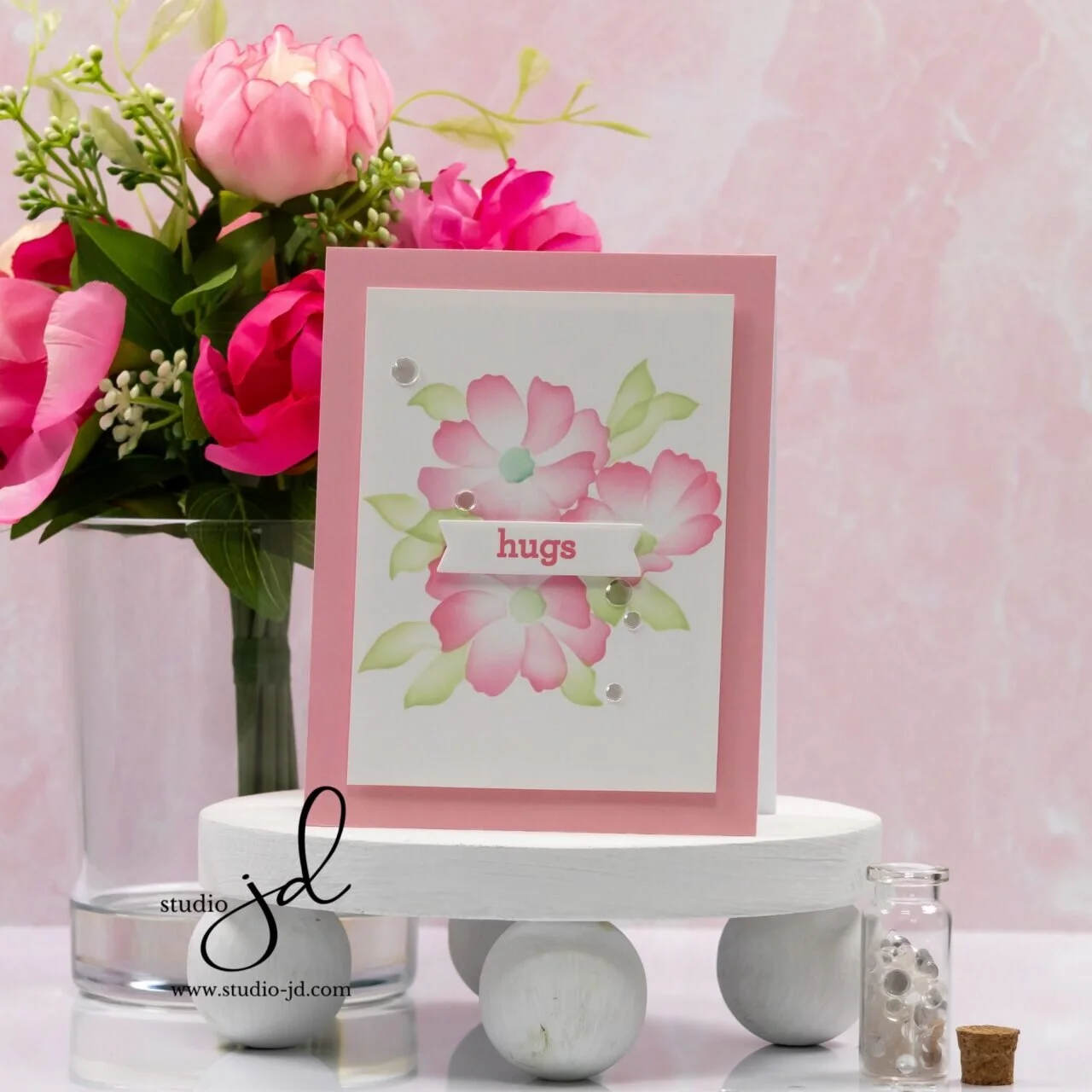
Soft contrast creates harmony without sacrificing clarity. By using gentle shifts in tone and color instead of dramatic light and dark differences, a design can feel calm, cohesive, and inviting.
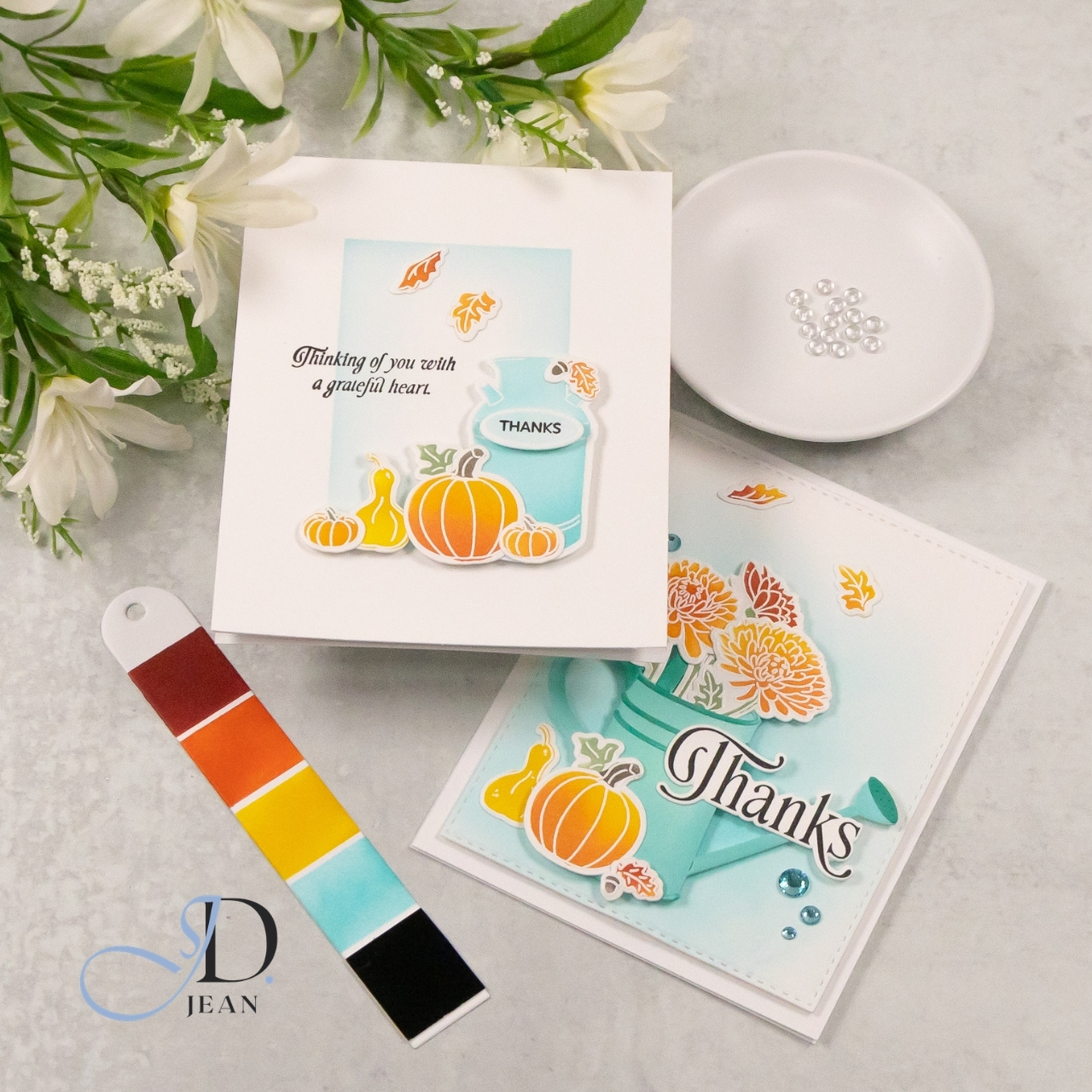
STAMPtember® 2026: Exclusive Stamps + Stencils Spotlight
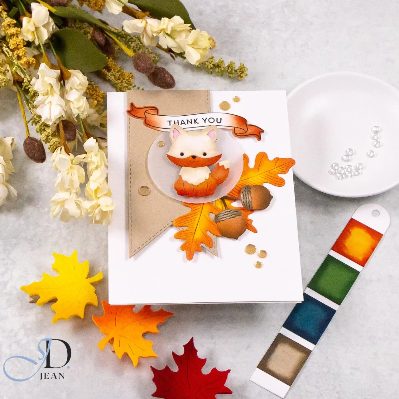
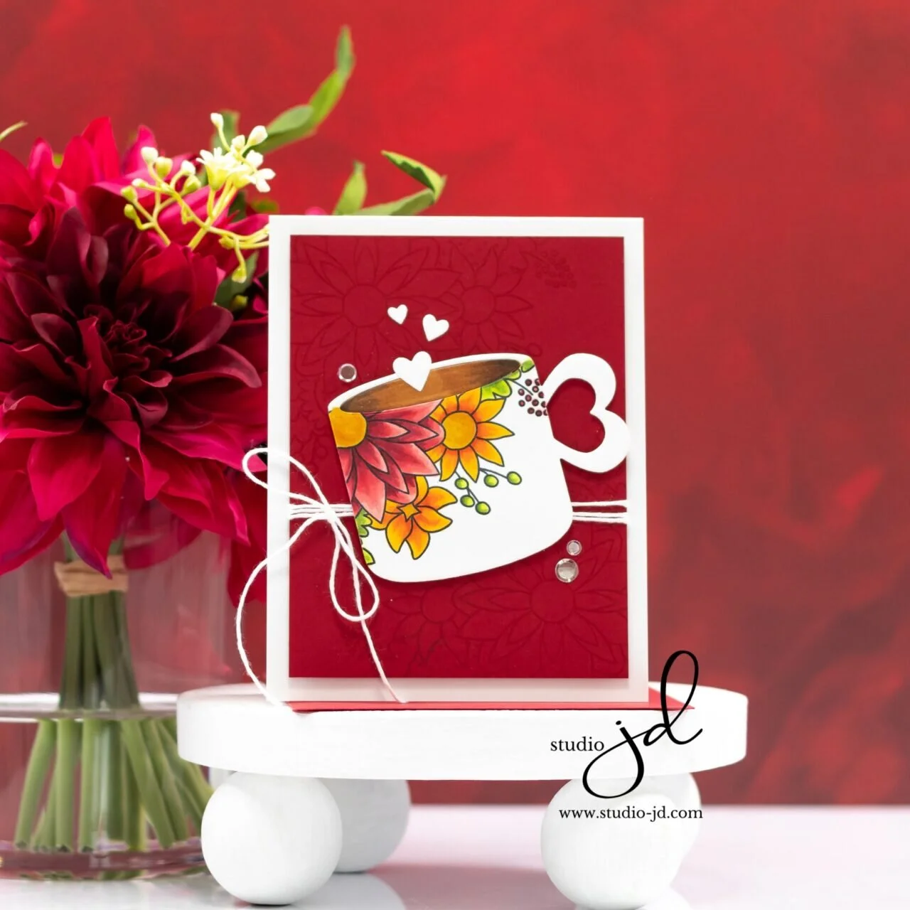
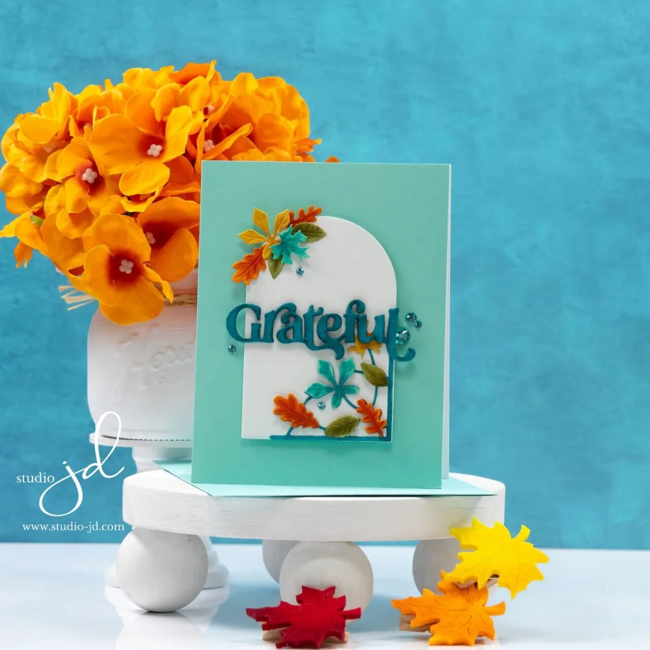
Warm autumn oranges and yellows get a fresh twist with soft aqua in two cards featuring Simon Says Stamp’s new Graceful Moments stamps, stencils and dies and Watering Can die set.
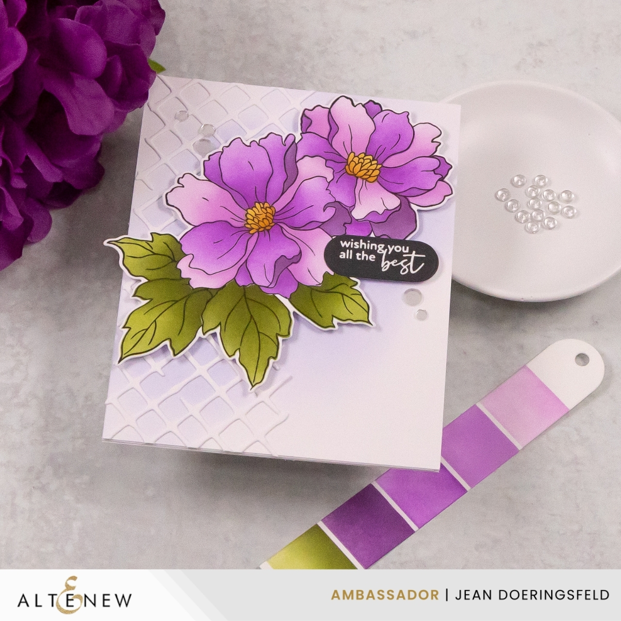
Room to Bloom
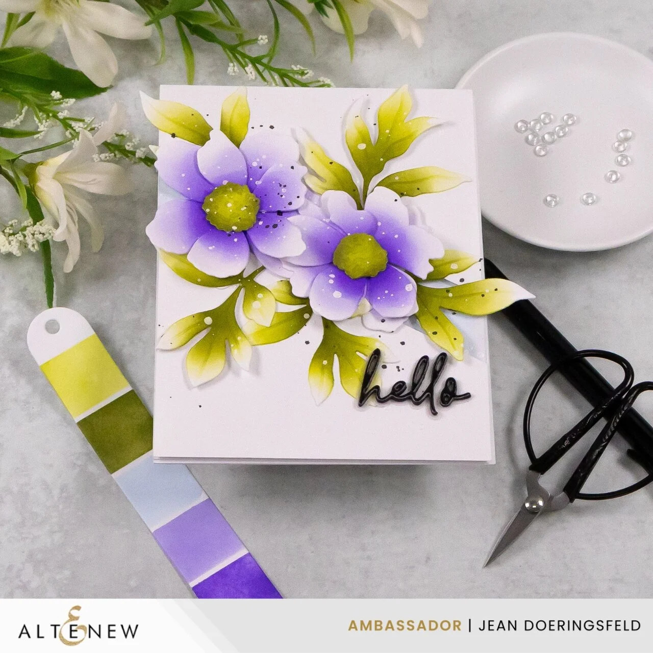
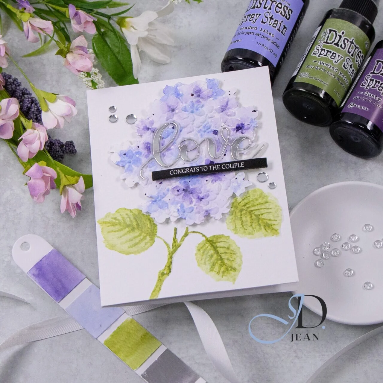
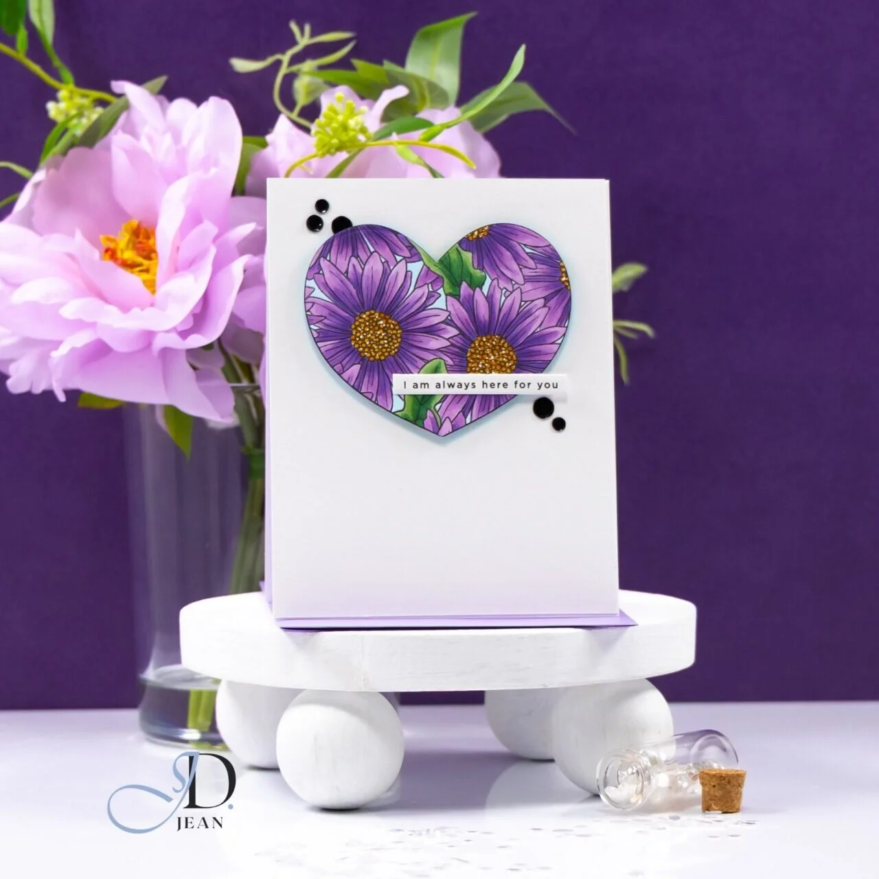
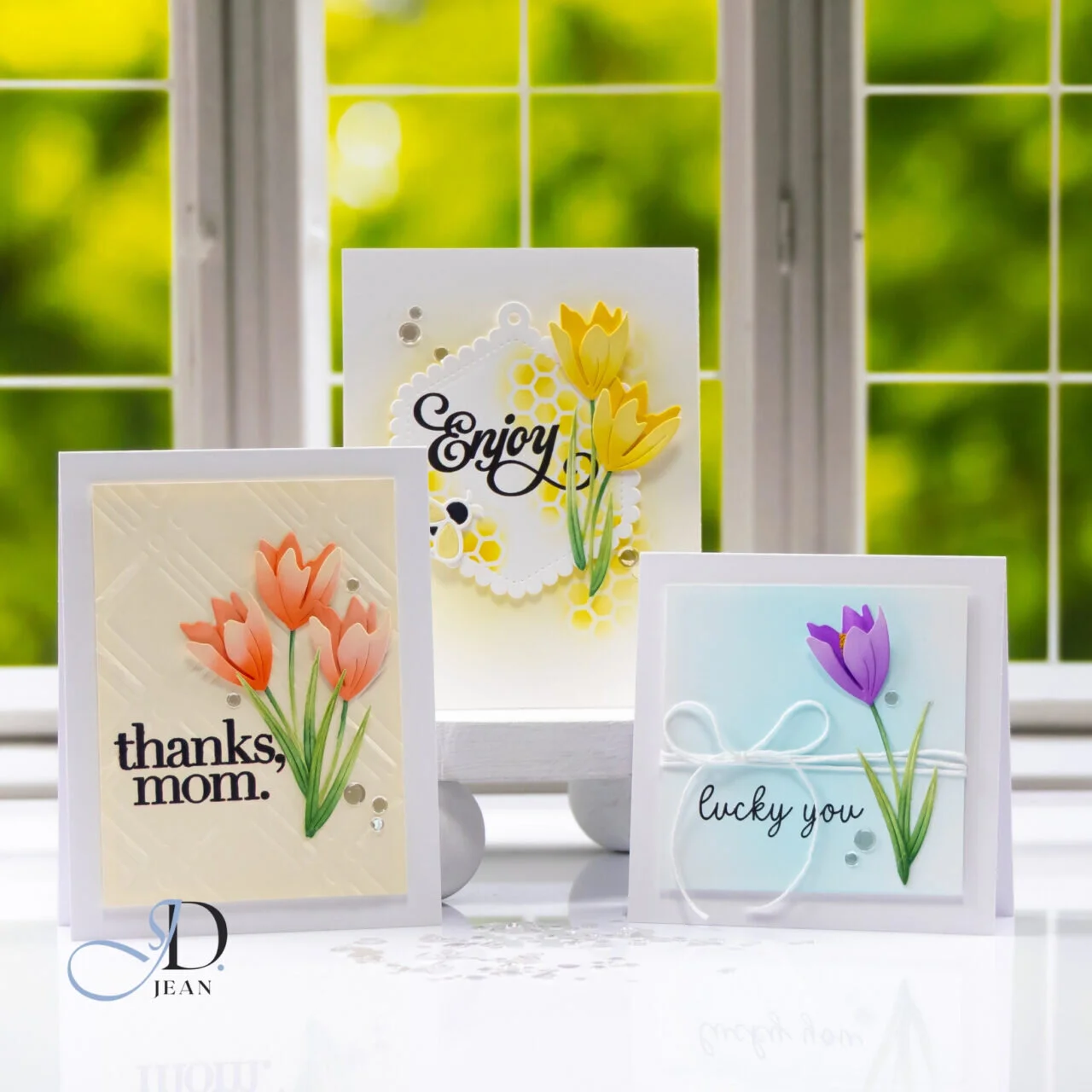
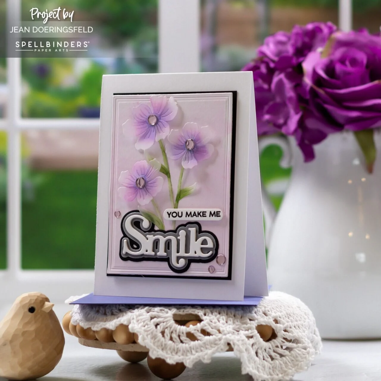
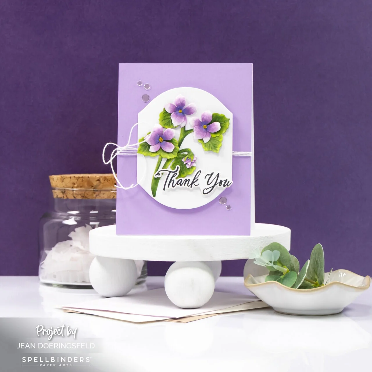
I have a definite weakness for flowers with big, open petals. Give me plenty of room to play with color and shading, and I’m a happy camper.
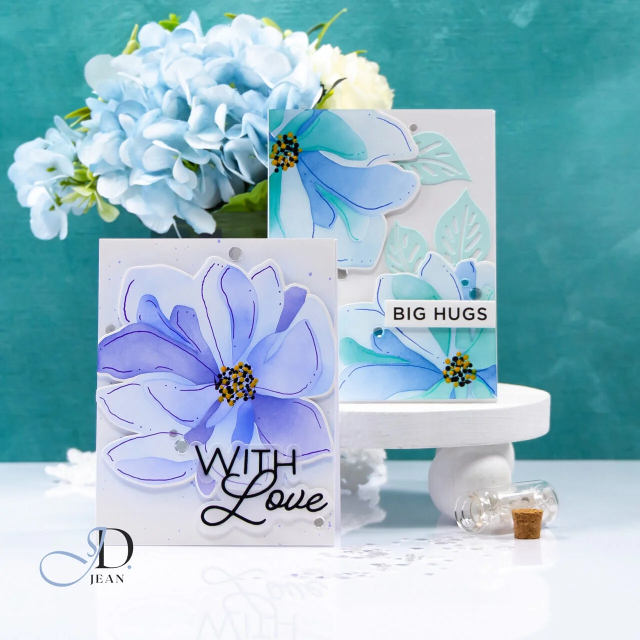
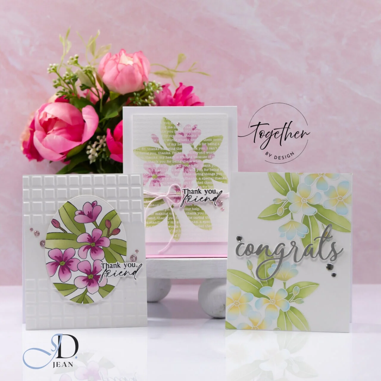
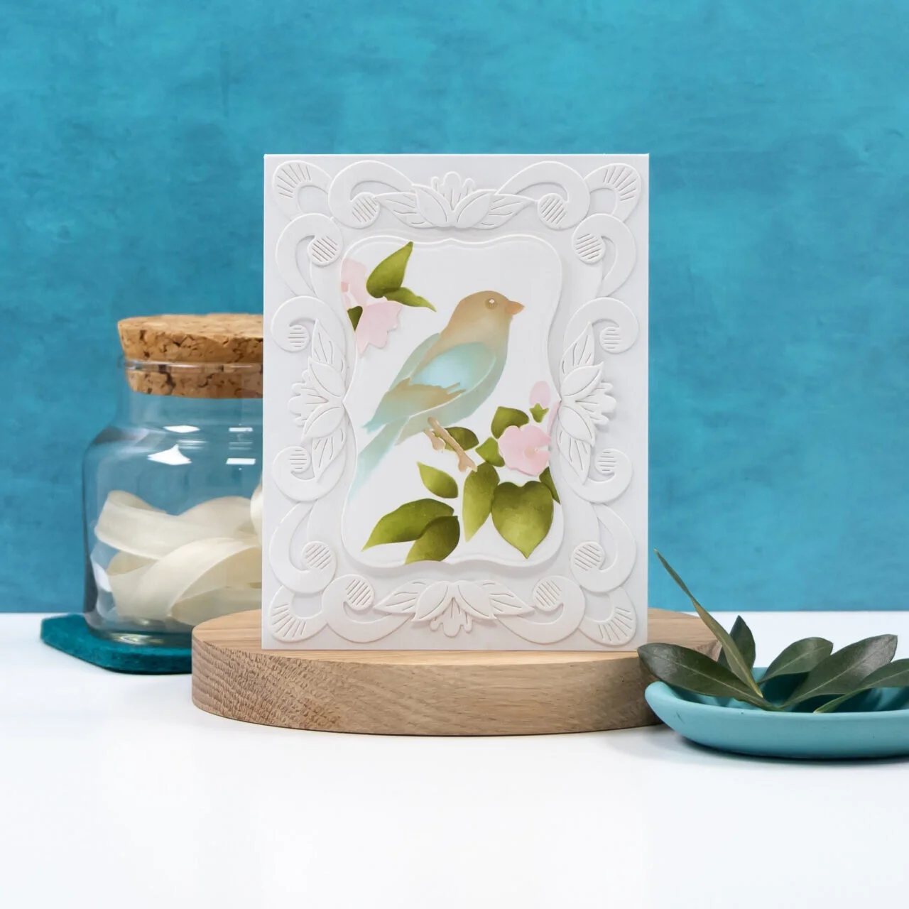
For my latest project as an Altenew Ambassador, I used the Flowers & Flourishes stamp, die, and stencil bundle. I love how the large blooms can carry the entire design, so I let them take center stage and kept the rest of the card quiet. The soft lattice texture adds interest without asking for any attention of its own.
And yes, I chose purple. Some flowers just make the decision for you.
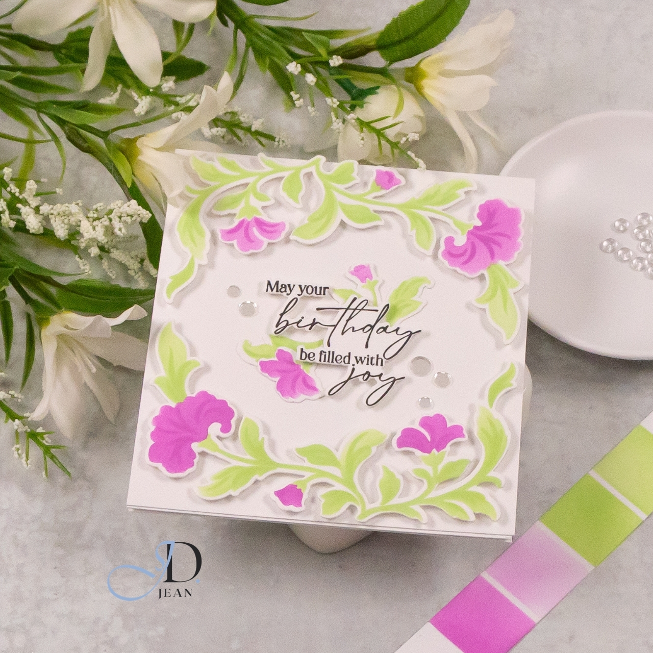
STAMPtember® 2026Collaboration: Pinkfresh Studio
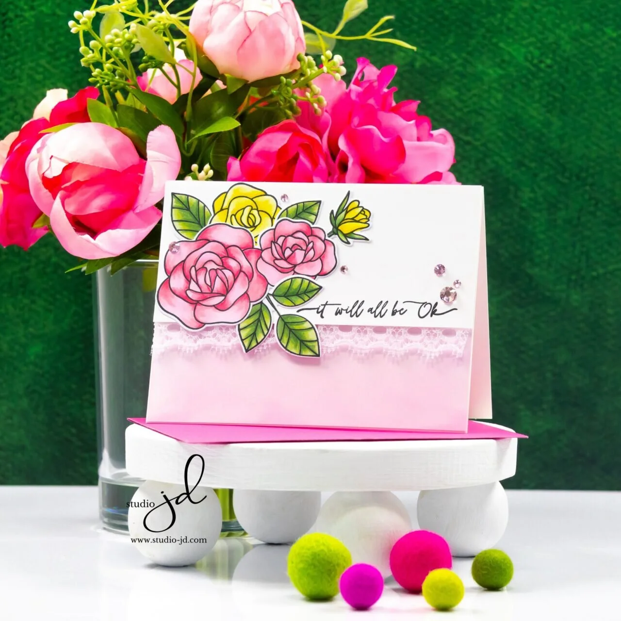
Bright pinks, fresh greens, and plenty of white space give the Grace and Gratitude set from the Simon Says Stamp STAMPtember® 2026 collaboration with Pinkfresh Studio a cheerful, modern feel.
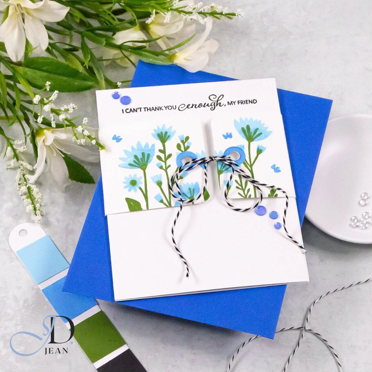
Just Enough
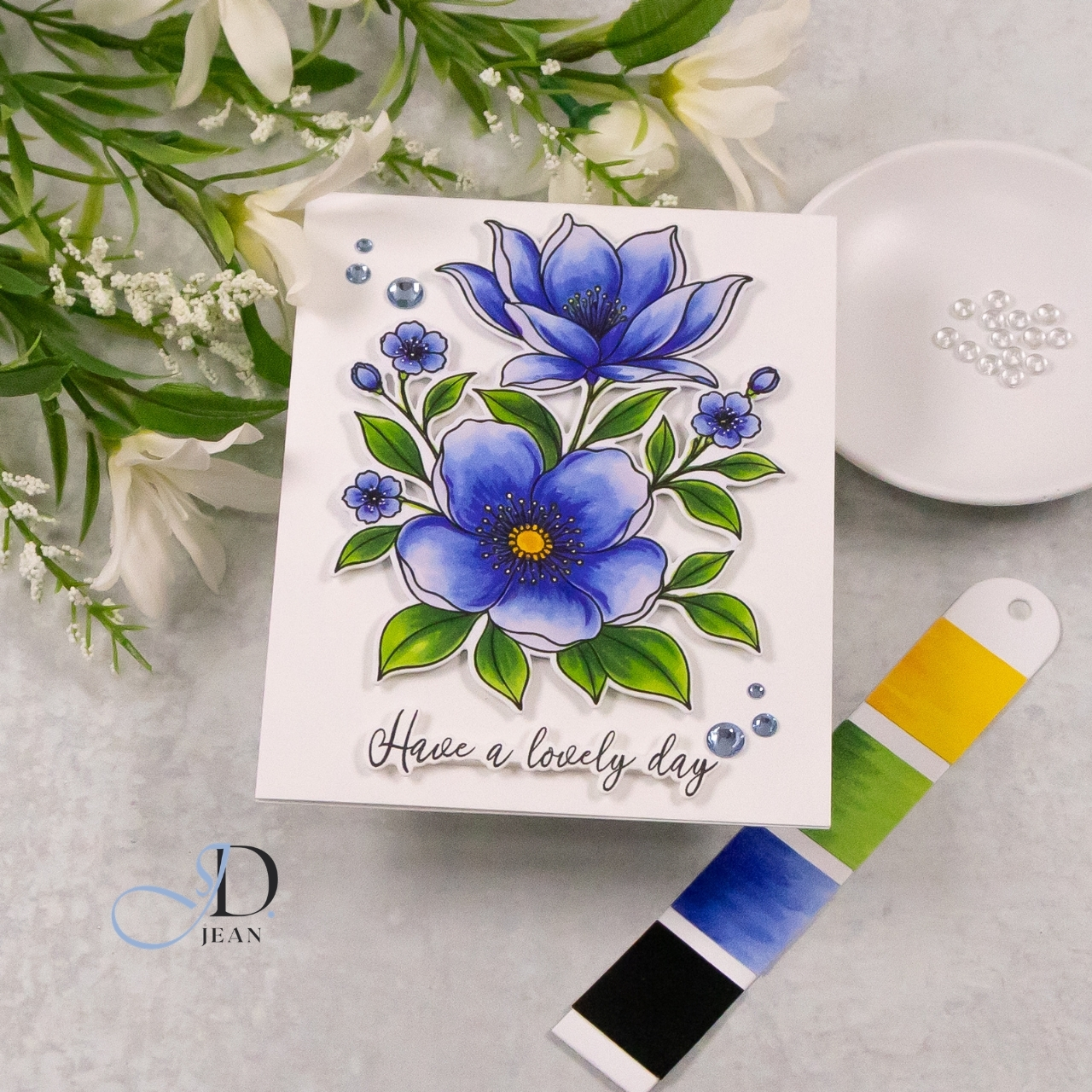
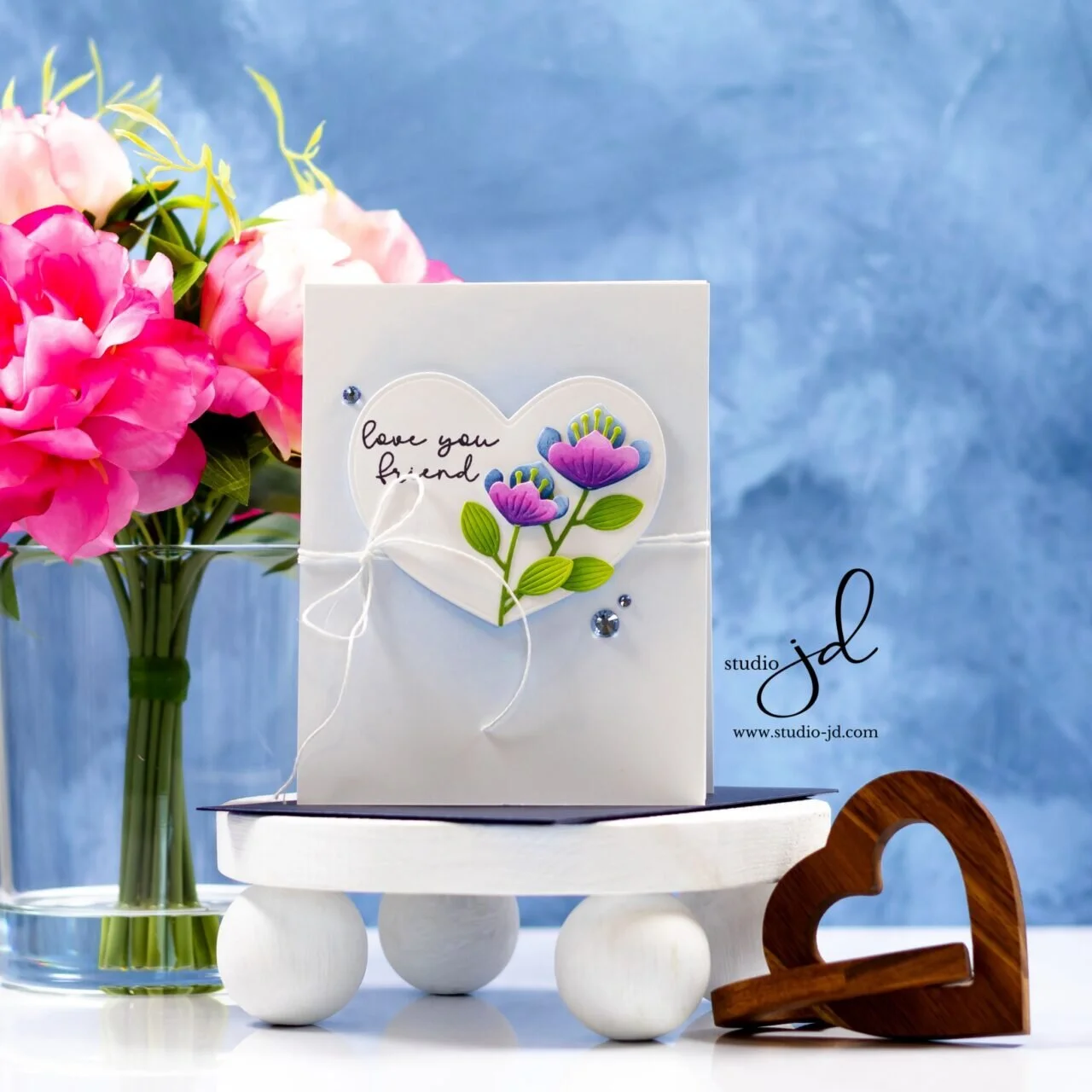
Knowing when to stop might be an underrated card-making skill! Fresh blue and green florals, plenty of white space, and a simple belly band came together for this clean STAMPtember® friendship card.
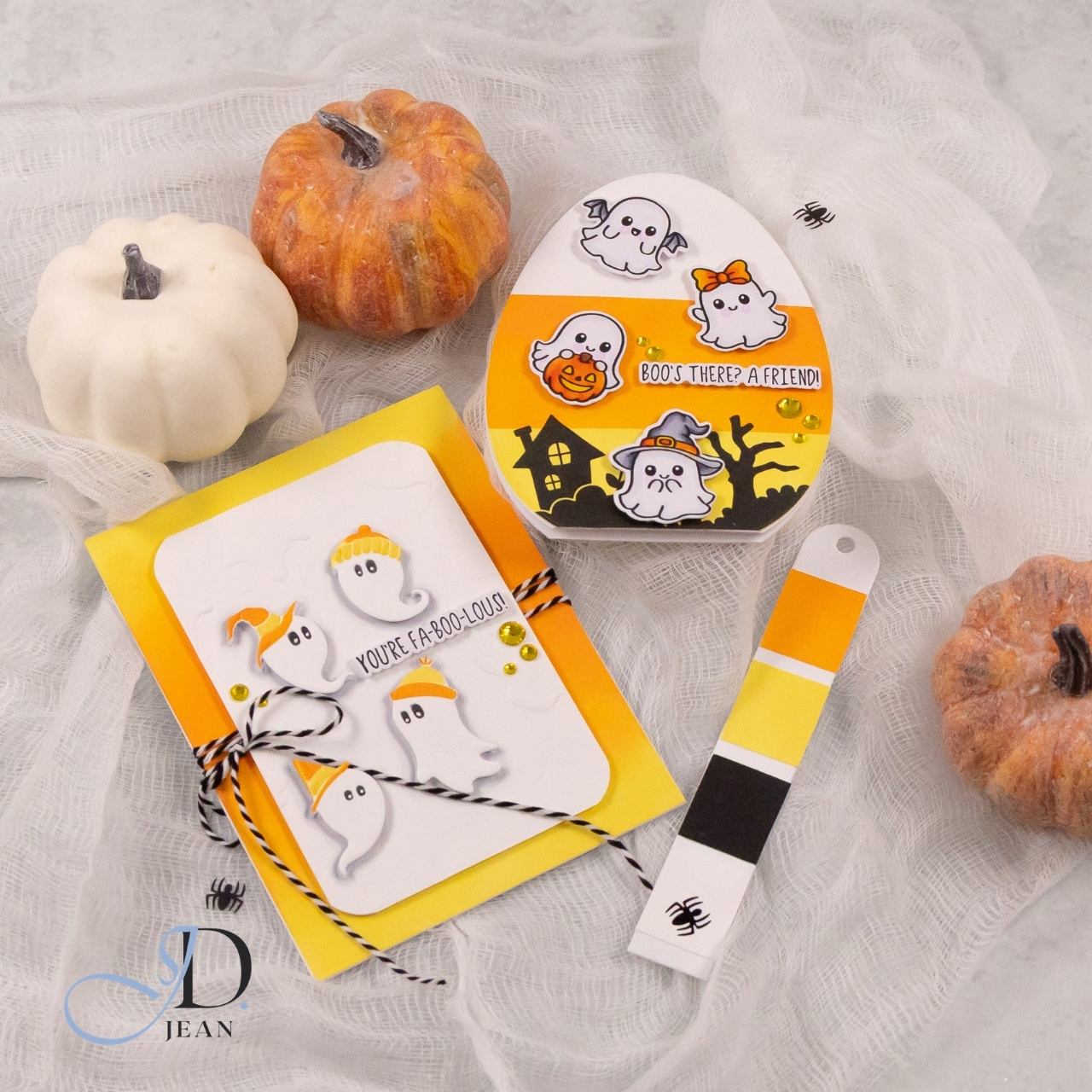
STAMPtember® 2026: Exclusive Boo!
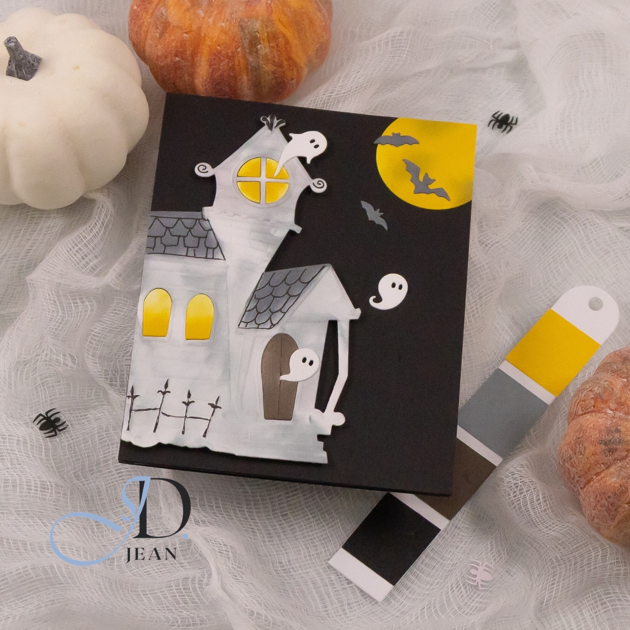
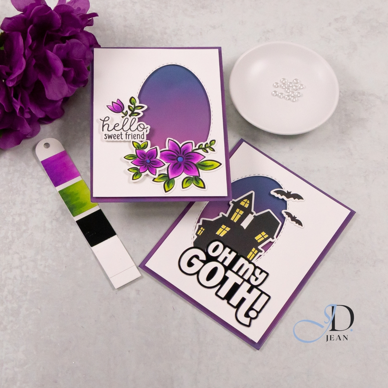
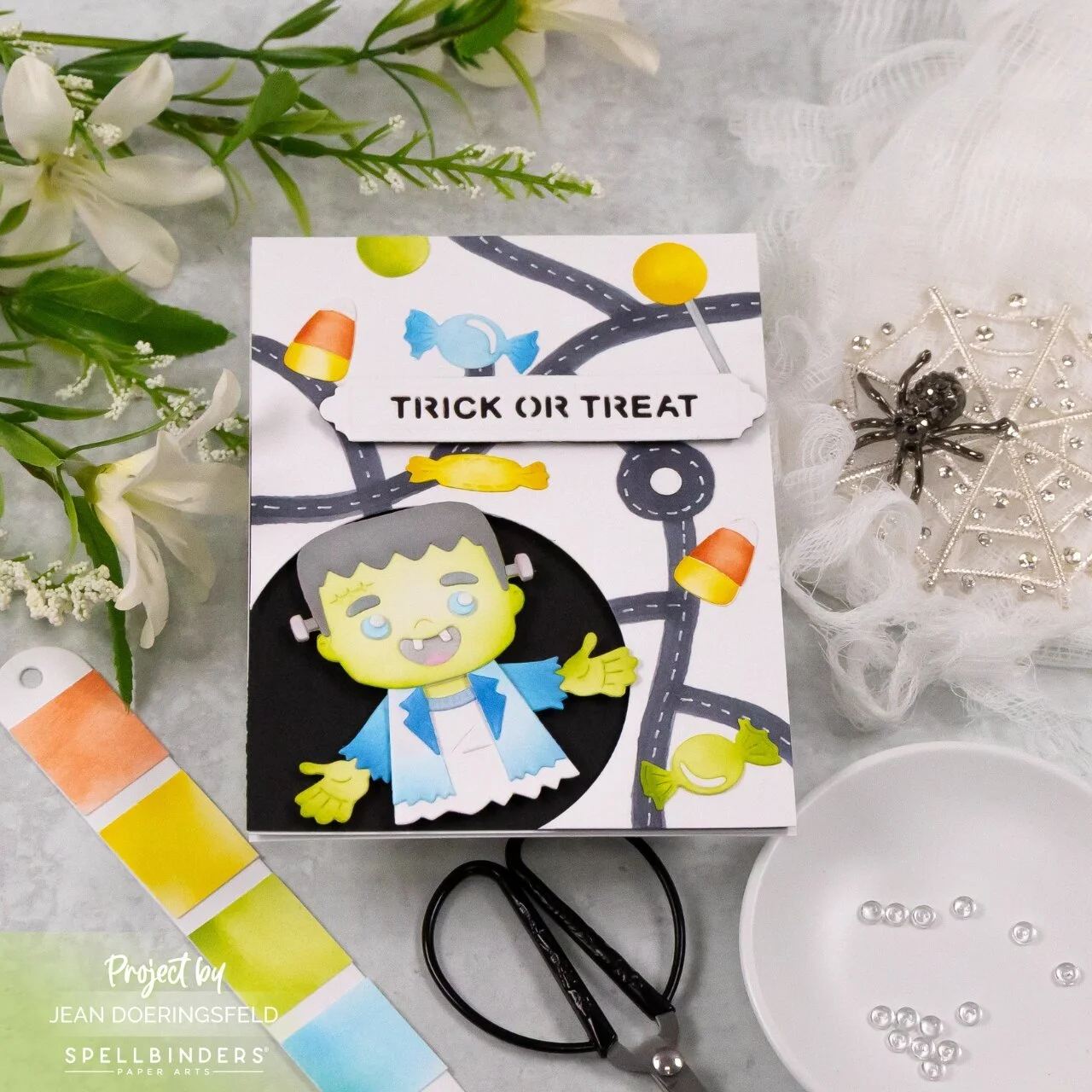
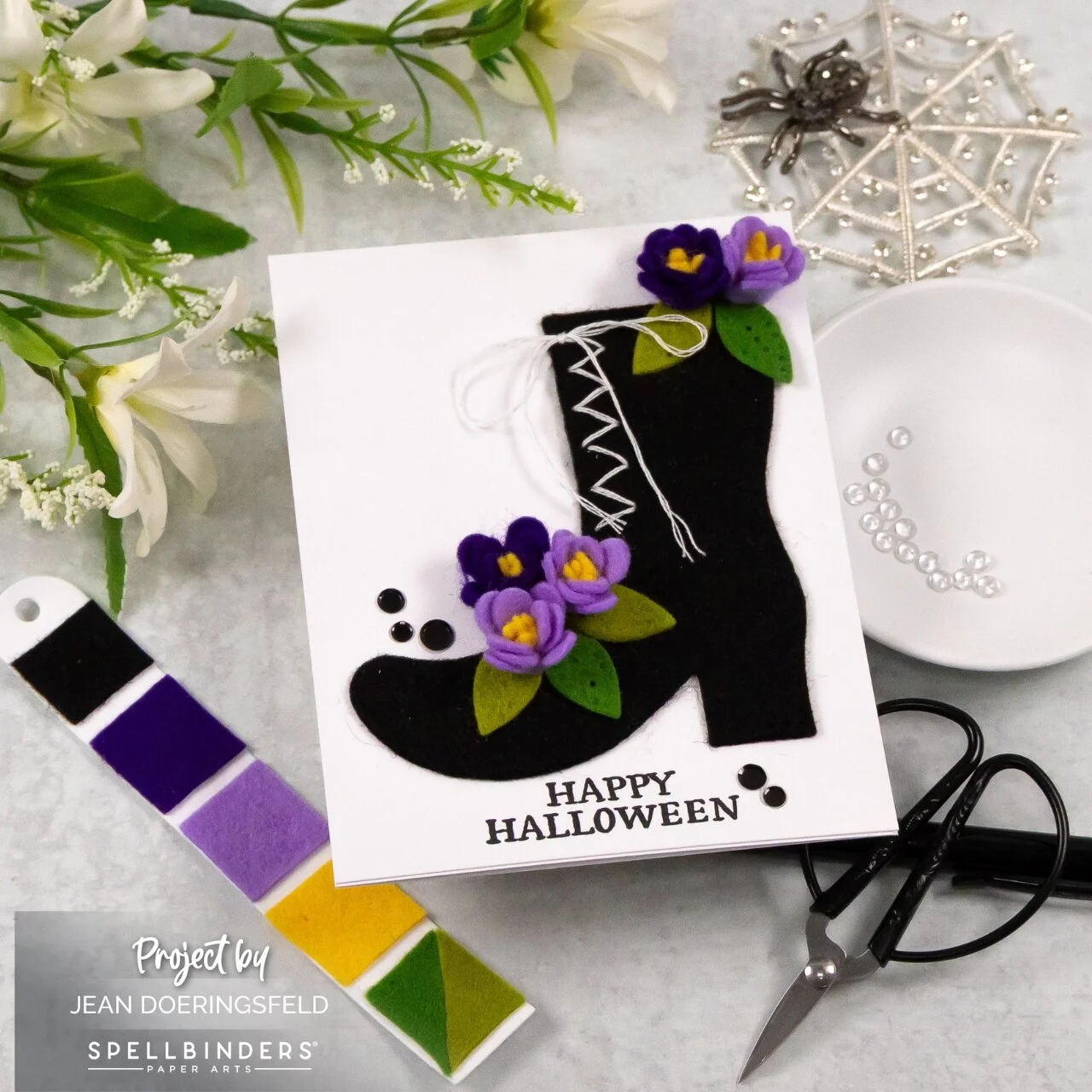
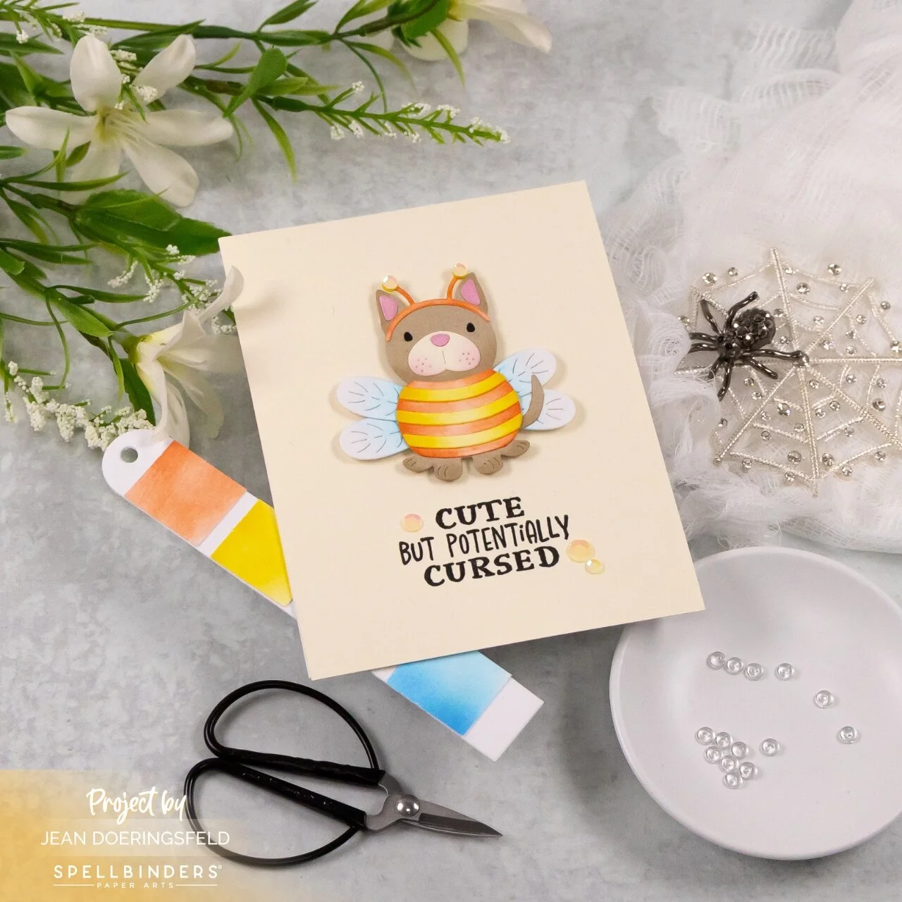
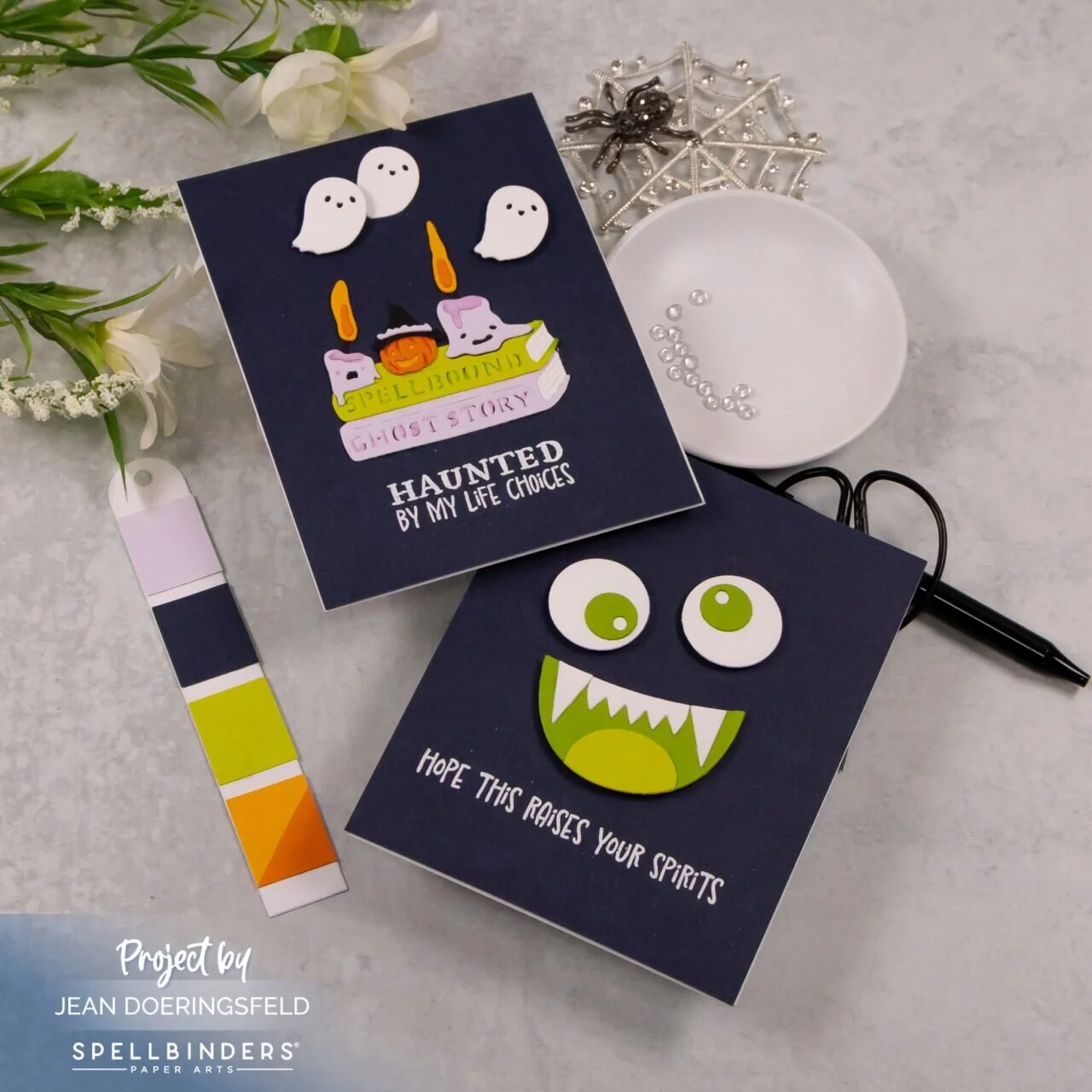
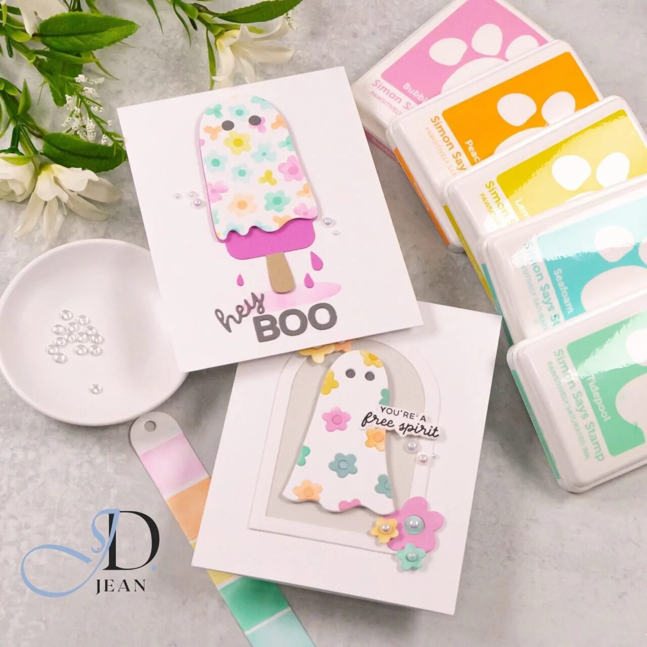
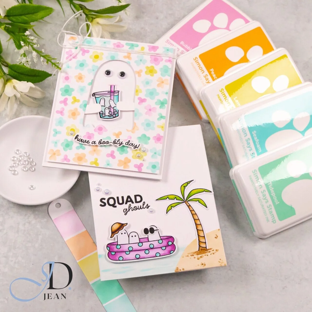
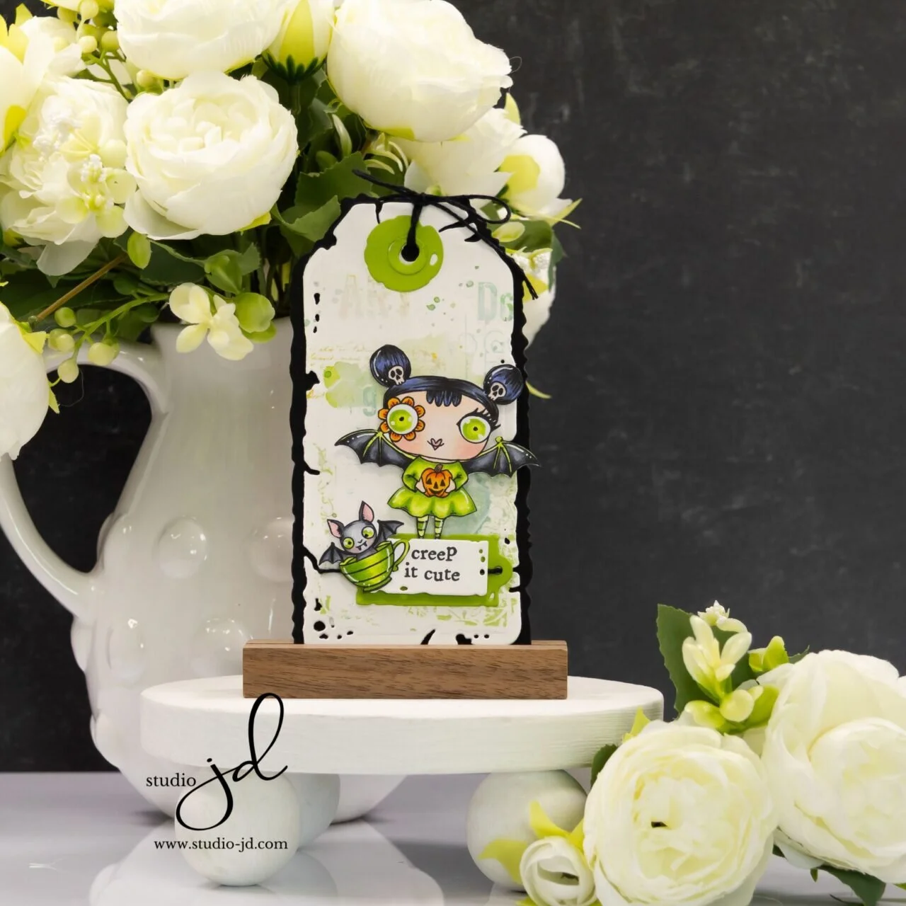
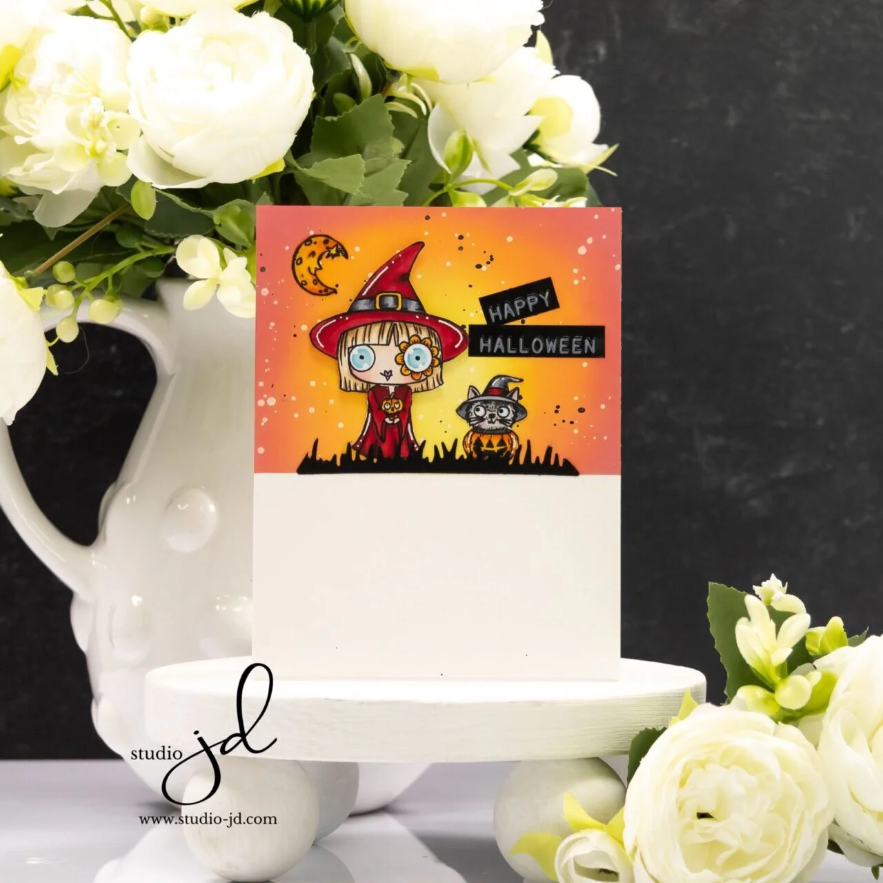
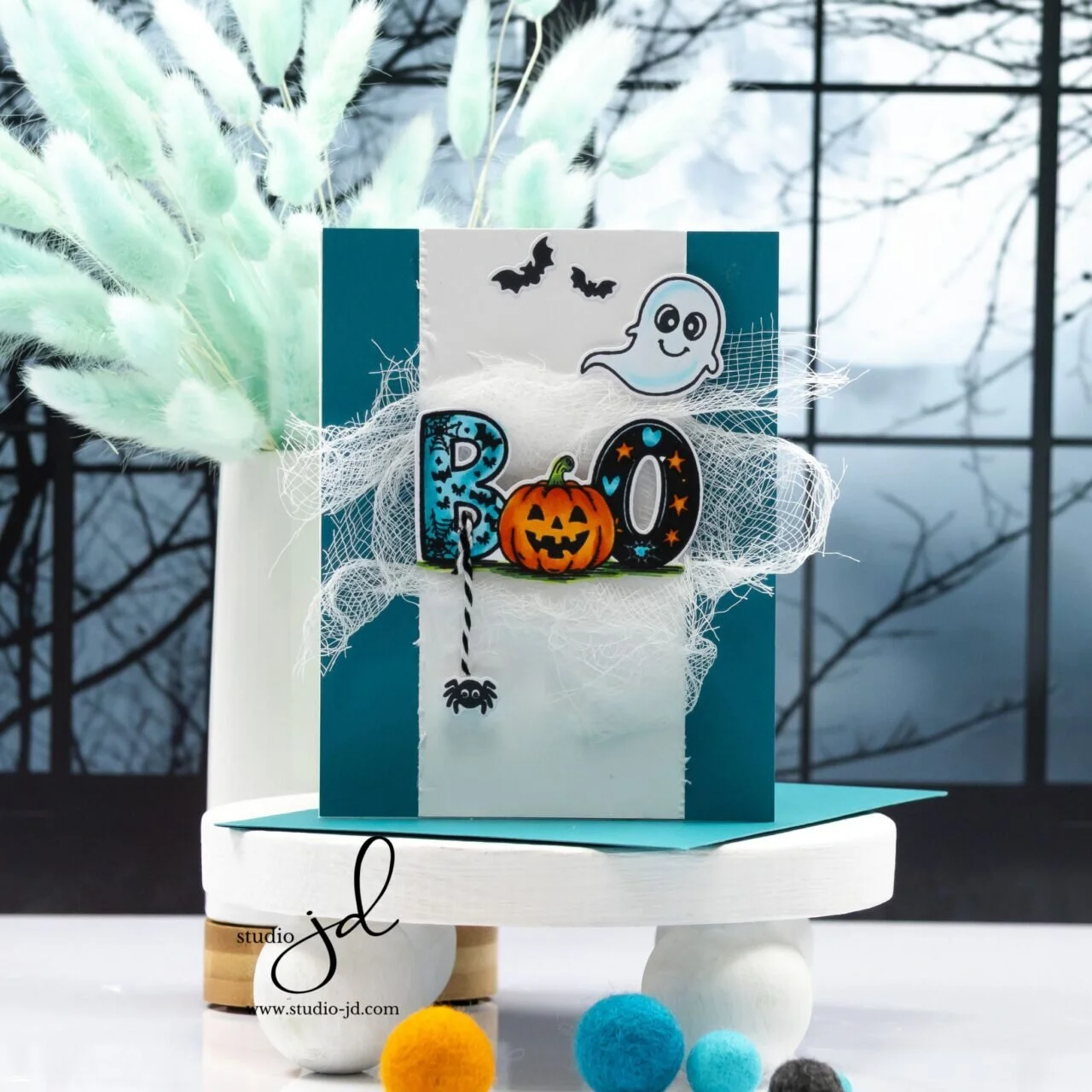
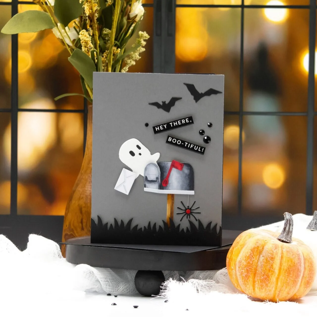
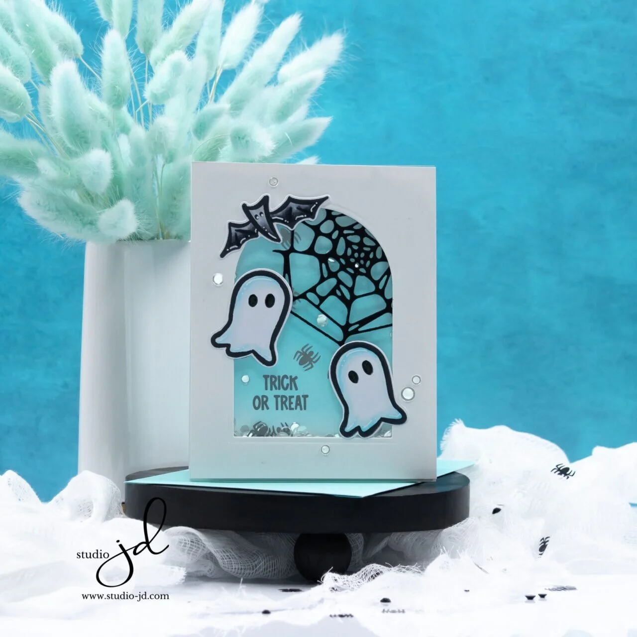
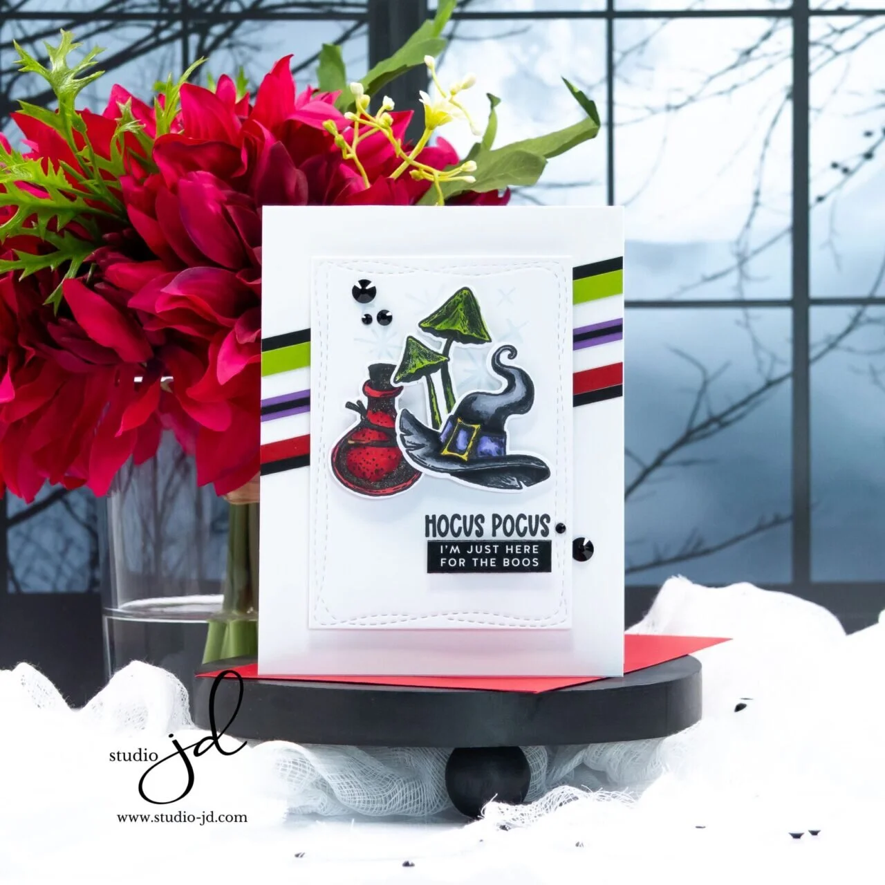
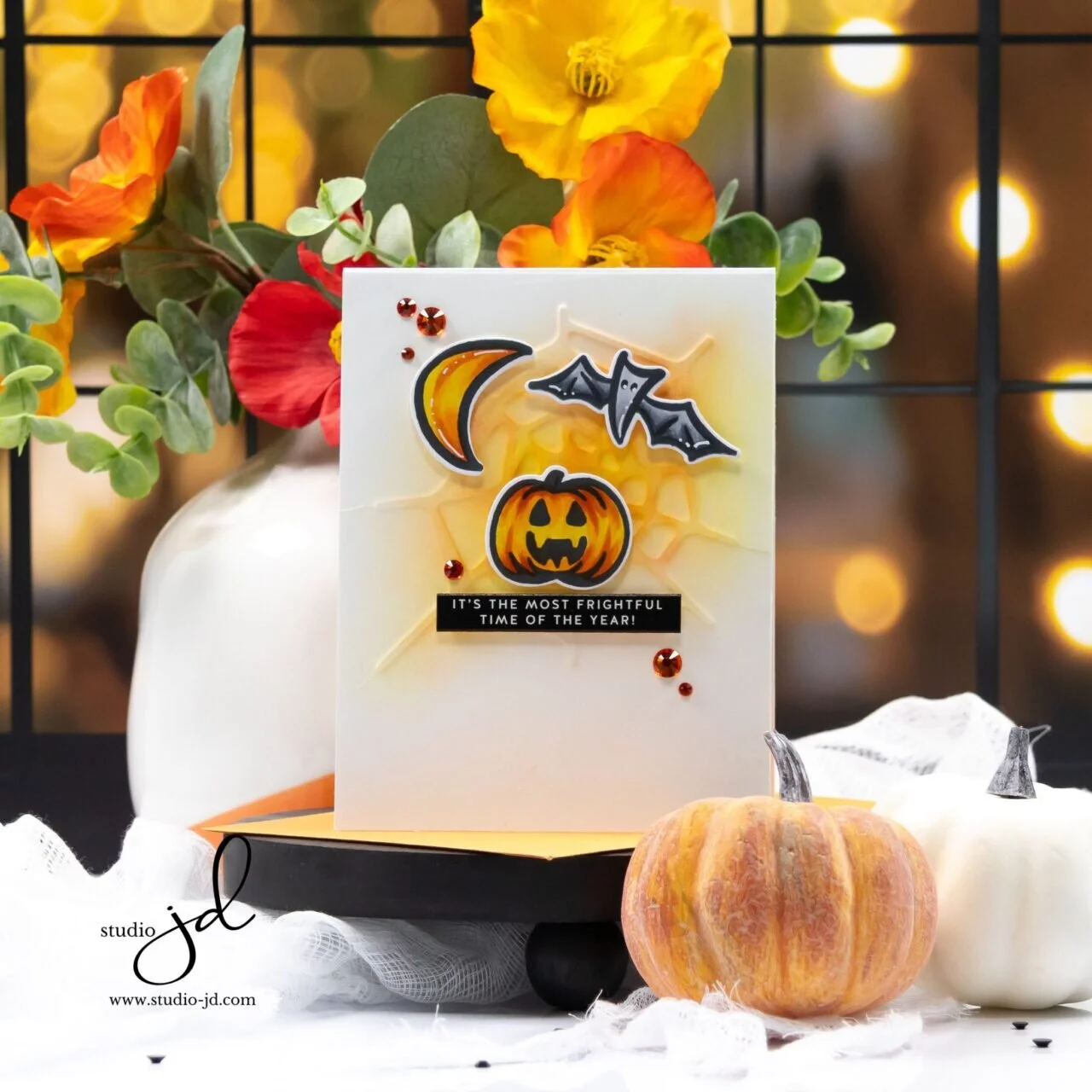
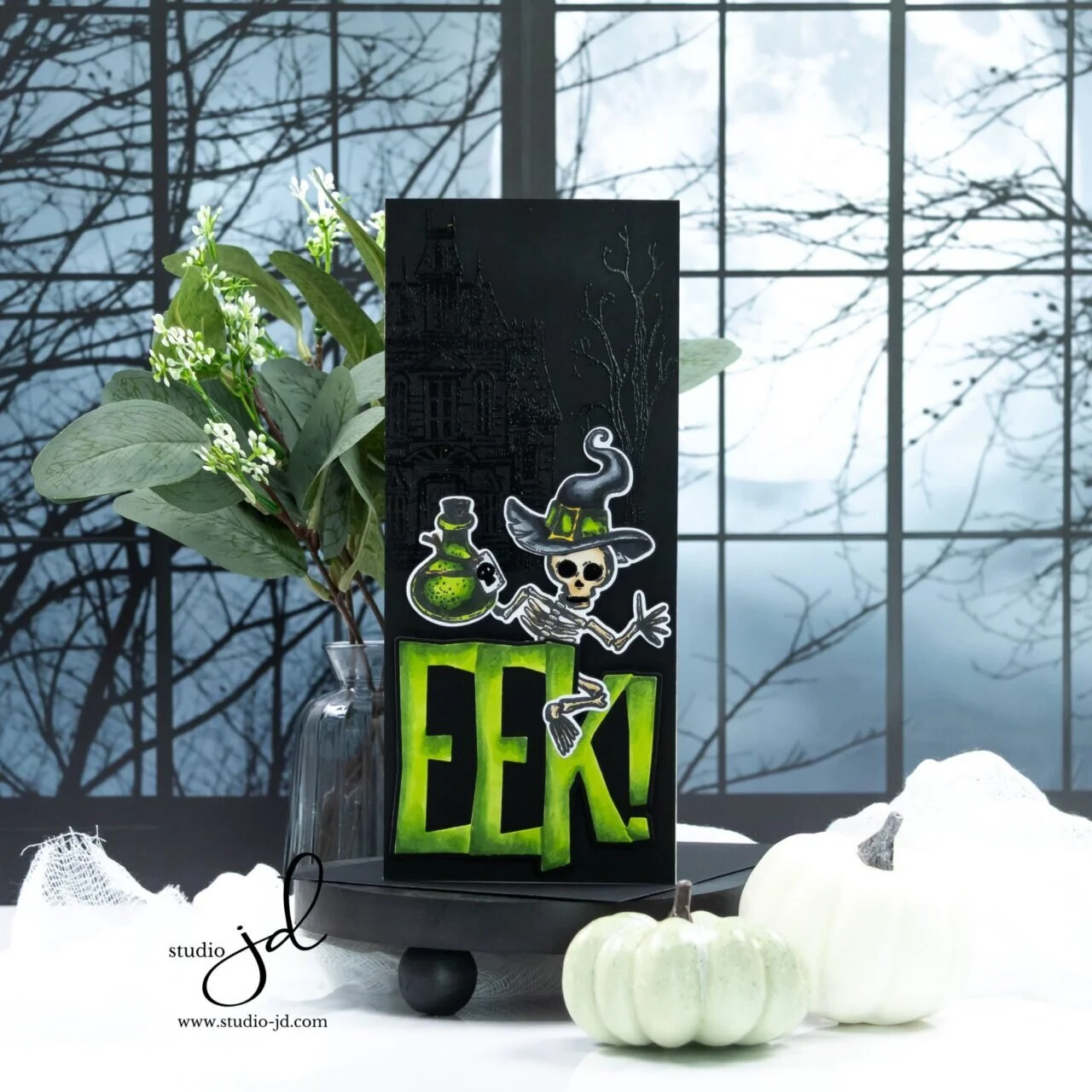
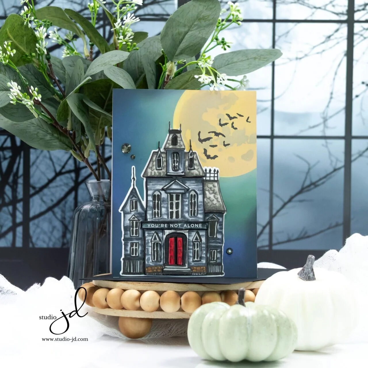
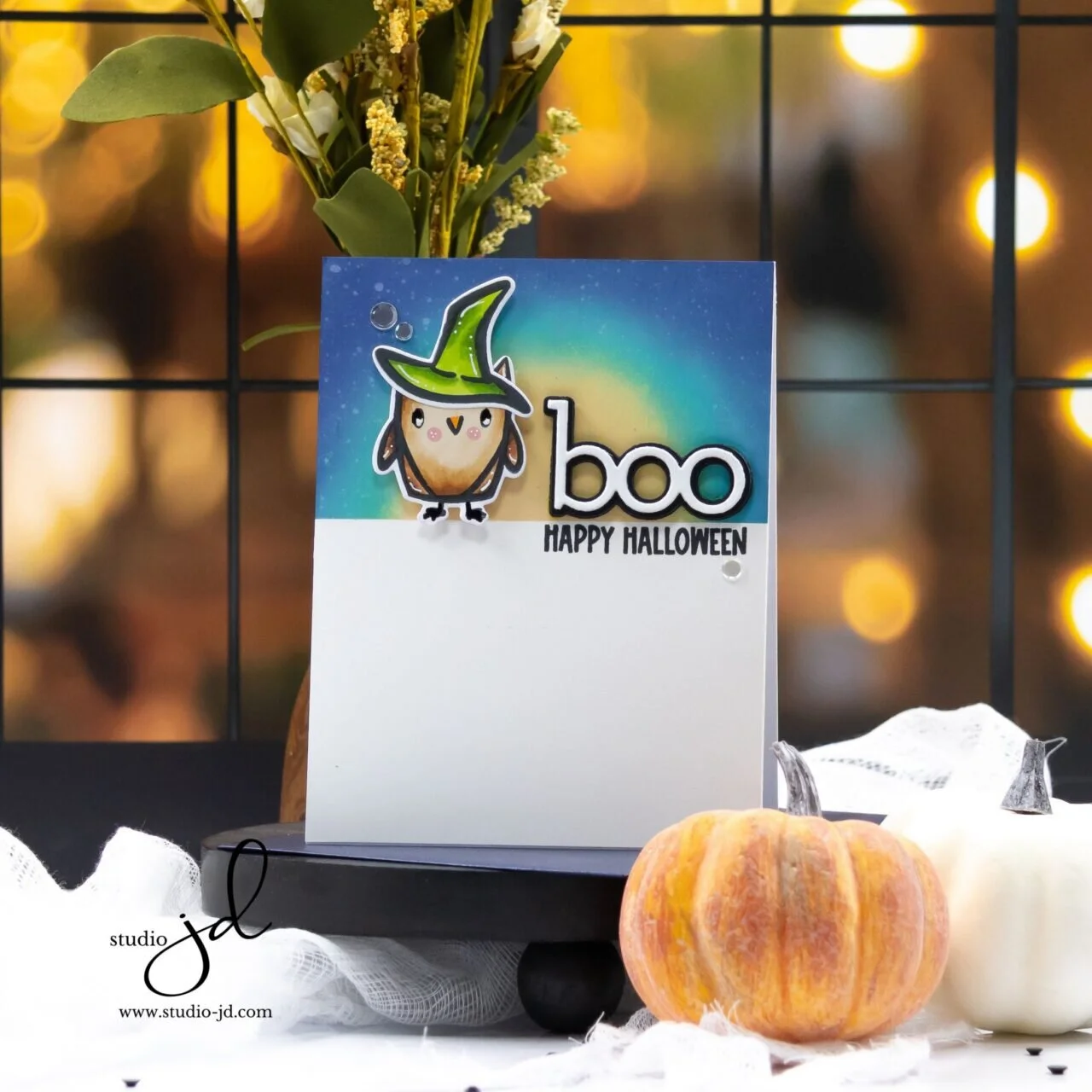
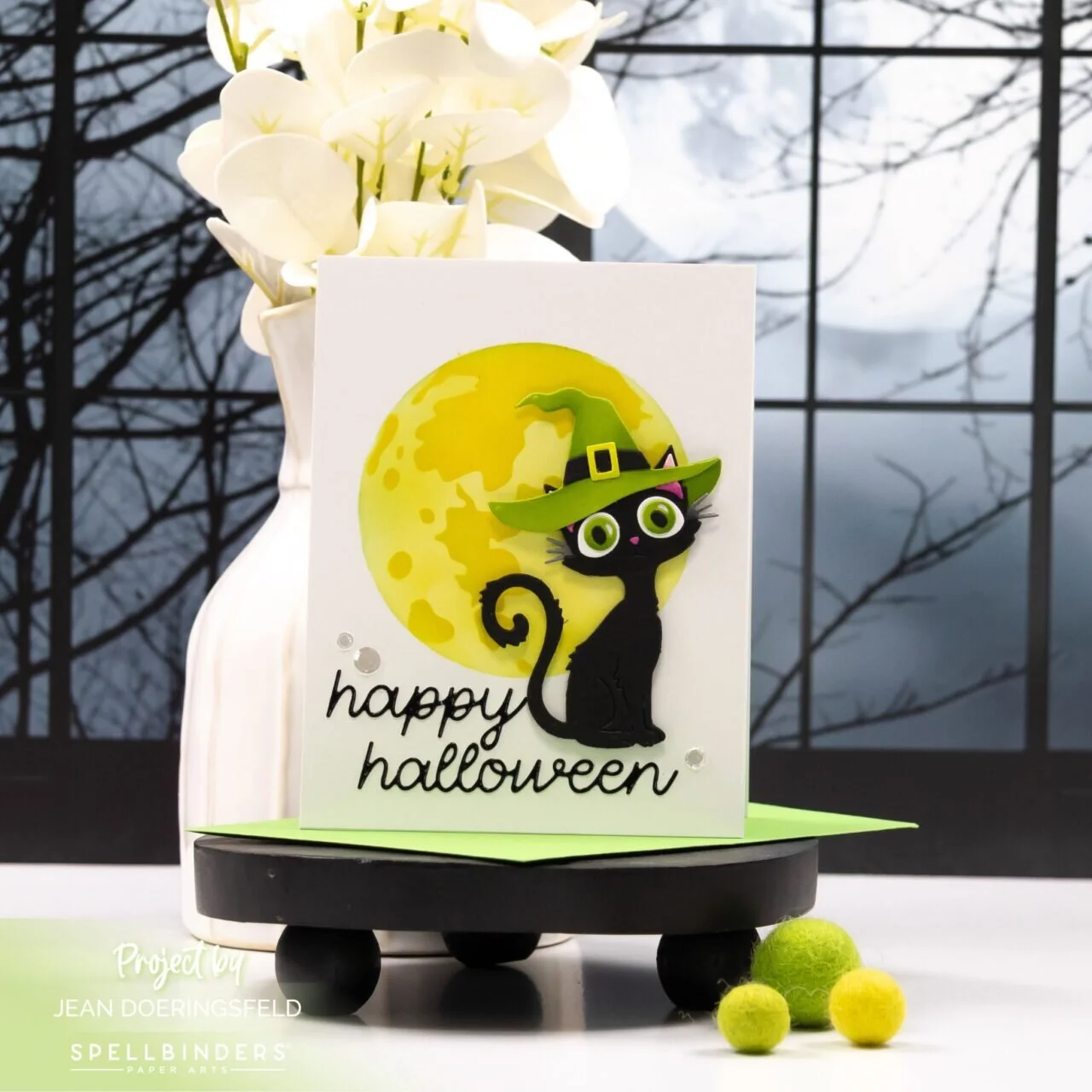
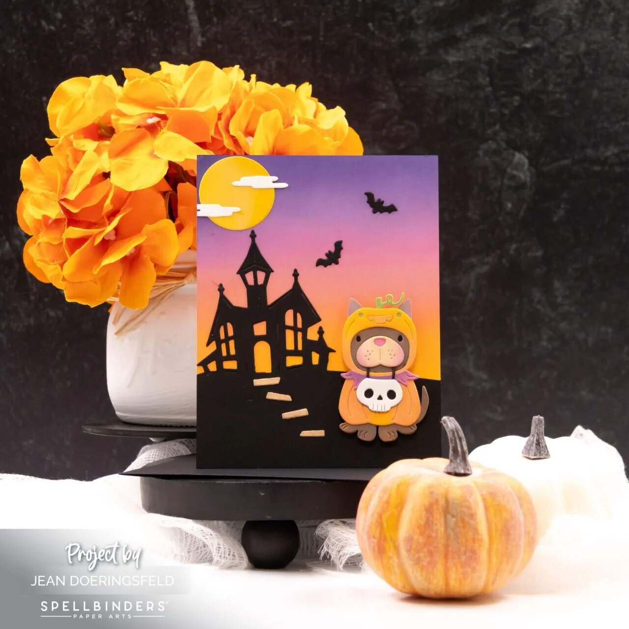
The special Simon Says Stamp STAMPtember® 2026 BOO Bundle is here! I used the new Sweet Spirits and Boo Crew products to create two bright and playful Halloween cards with plenty of personality.
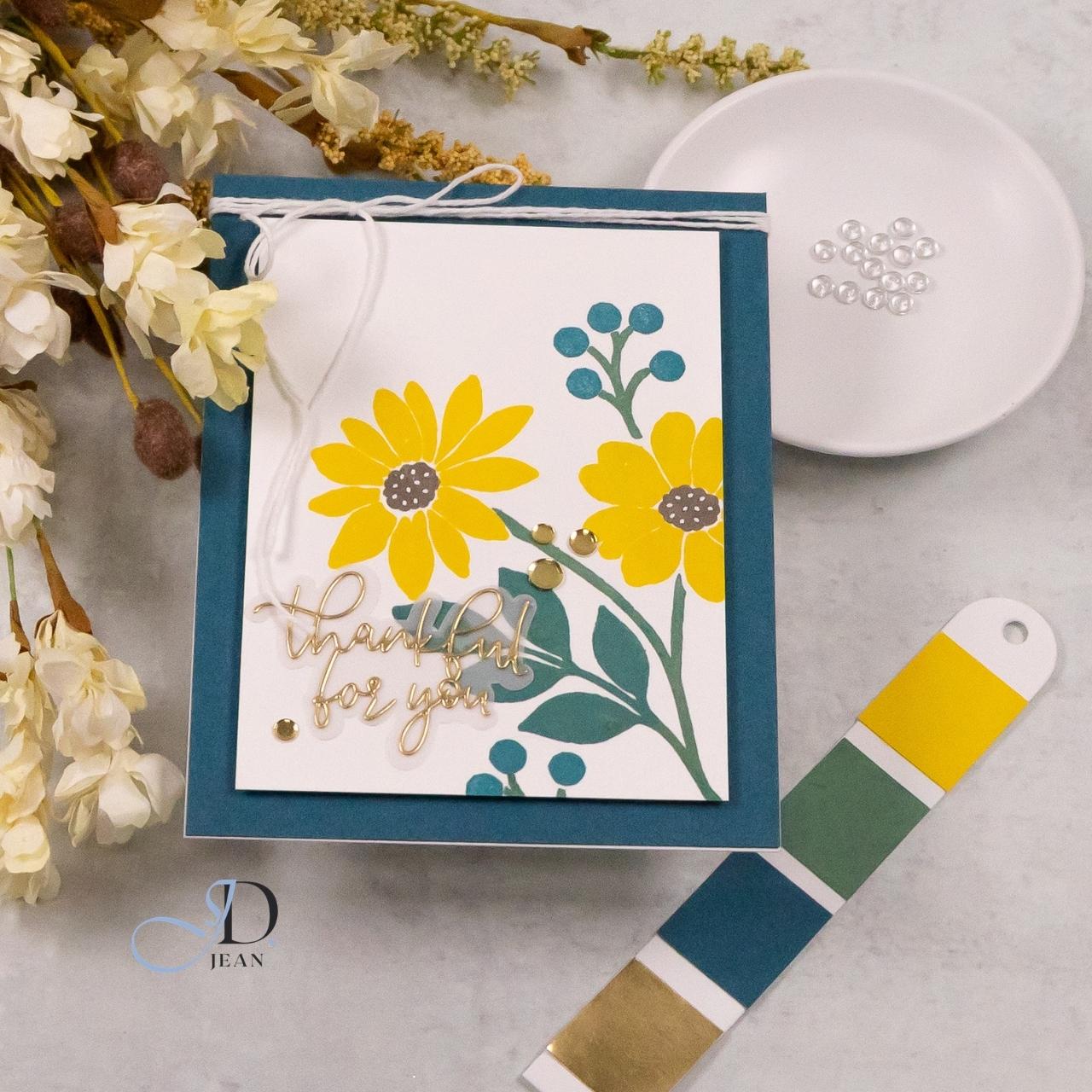
STAMPtember® 2026 Collaboration: Concord and 9th
The Concord & 9th × Simon Says Stamp STAMPtember® 2026 collaboration is here! I skipped one of the layers in the new Incredibly Grateful stamp set and let the bold yellow flowers and deep teal foliage take center stage.
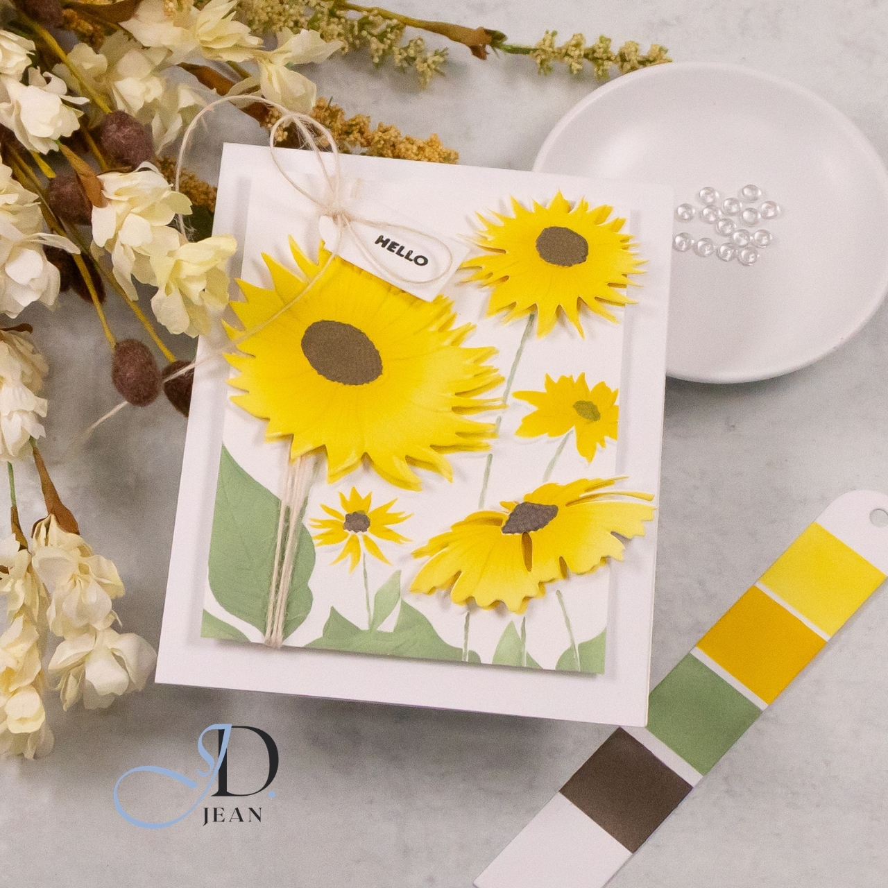
STAMPtember® 2026: Spotlight on Embossing Folders with Stencils!
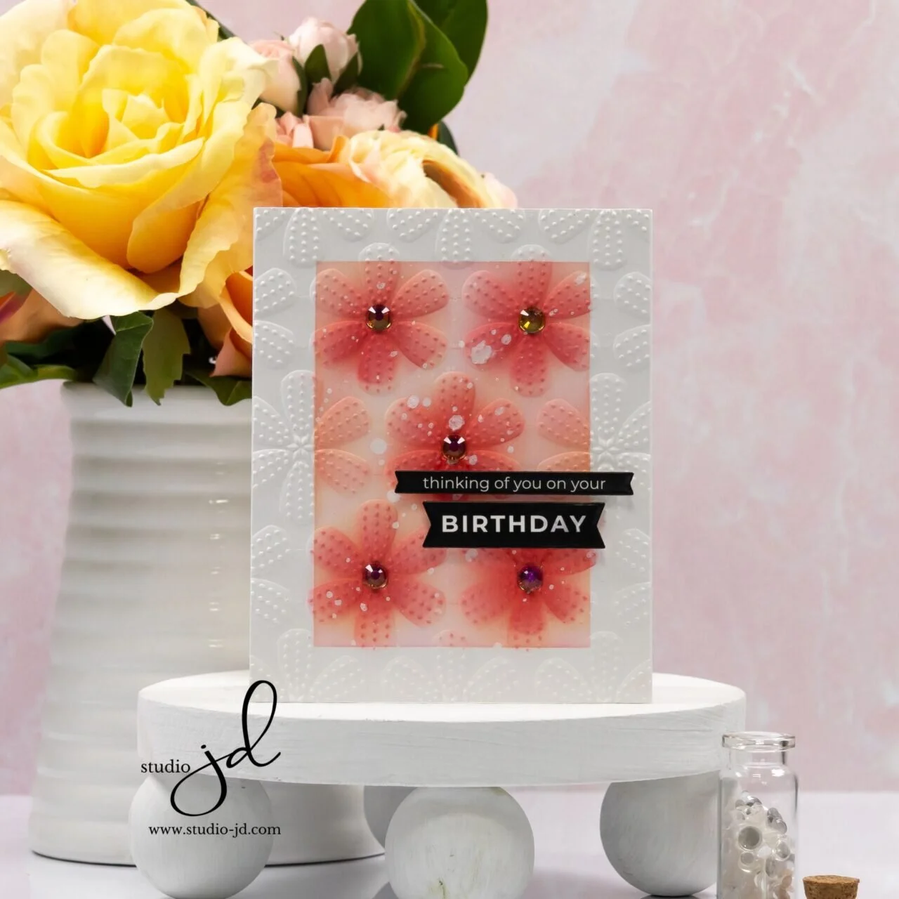
It’s another special STAMPtember® 2026 release! I used the new Splendid Daisies Embossing Folder, Stencils and Dies to create a sunny floral design with a few of the blooms lifted right off the background for extra dimension.
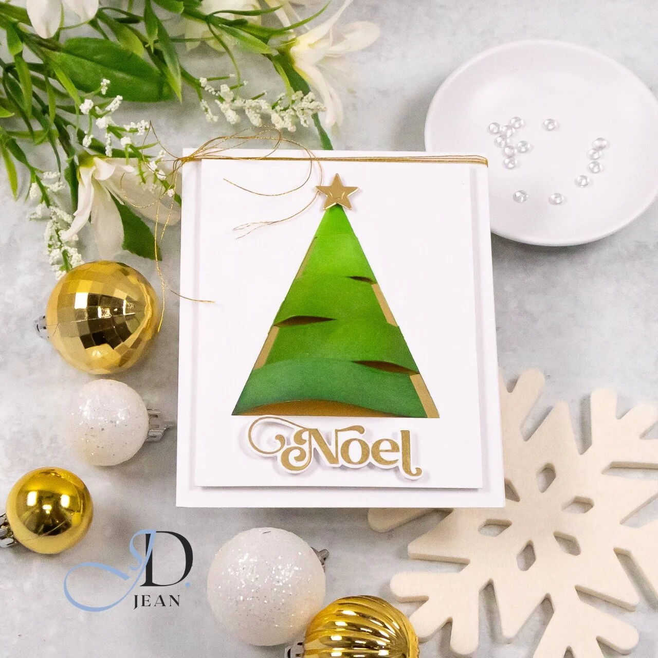
A Little Peak of Gold
A dimensional Christmas tree gave me the perfect excuse to sneak in a little extra shine. Metallic gold peeks through the curved sections for a clean and modern STAMPtember® design.